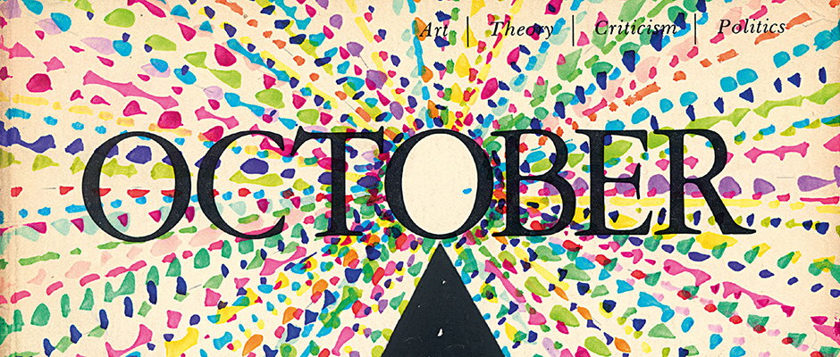
David Batchelor defaces esteemed art journal October with colour and flair
If you go down to the Whitechapel Gallery anytime between now and early April you’ll be sure to come across a huge breadth of work chronicling the adventures of the black square, from 1915 all the way up to the present day. It’s fairly monochromatic, as you might expect. Upstairs, however, things get drastically more colourful – especially once you come to David Batchelor’s specially “disrupted” issue of October, one of the most respected art journals out there, first published in 1976 and edited by esteemed writers Michel Foucault, Richard Foreman and Noël Burch.
Having previously written the book Chromophobia, which deals with the subject of the western world’s fear of colour, David took it upon himself to introduce some decidedly bright shades to the strictly black and white publication, which is devoid of any imagery in order to “devalue the visual in favour of the verbal.” His disruption takes the form of brightly coloured geometric shapes doodled in an orderly fashion around the magazine’s format. This kind of fun, mischievous endeavour is exactly our cup of tea (obviously) so we spoke to David about the idea behind the project, and his own personal thoughts on doodling.
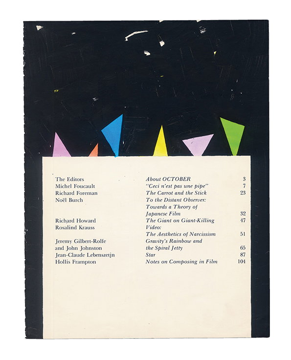
David Batchelor: The October Colouring-In Book
What made you decide to draw all over October?
In the 40 years since it was first published, there has not been a single colour image in any issue of October. This is no accident: it is a part of their campaign to devalue the visual in favour of the verbal, to privilege text over image. Mine is a small act of Technicolor revenge.
Are you a big doodler? What kinds of things do you usually doodle?
I really wouldn’t distinguish doodling from any other kind of drawing, and I draw all the time. Drawing for me is a kind of dreaming – it’s entirely absorbing, and then it’s gone; it doesn’t respect the logic or the laws of the rest of the world because it is a world of its own.
"In the 40 years since it was first published, there has not been a single colour image in any issue of _October_ ... Mine is a small act of Technicolor revenge."
David Batchelor
What influenced the patterns and colours you used when drawing in October?
Most of the shapes are either circular or triangular or rectangular: the basic vocabulary of the kinds of abstract art I love. I use the most vivid colours I can find and often combine them with areas of black. In the city bright colours are often accompanied by forms of darkness, and it is the colours of the city rather than nature that interest me.
Which is your favourite spread from the modified version of the journal?
Page seven – Ceci n’est pas une pipe – because it is an allusion both to Kasimir Malevich’s Black Square, and Laurence Sterne’s Tristram Shandy. Or pages 80-81 – Darkening and awful – because it’s drawn over an essay about Thomas Pynchon’s Gravity’s Rainbow.
What do you think editors Foucault, Foreman and Burch would think of your project?
Without doubt they would be delighted that someone had spent three months quietly absorbed in studying every square centimetre of their texts.
David Batchelor: The October Colouring-In Book is now available to order from Ridinghouse and Common Editions.
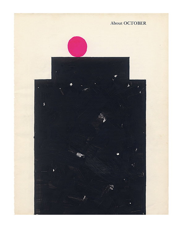
David Batchelor: The October Colouring-In Book
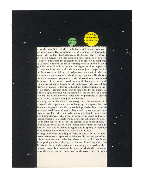
David Batchelor: The October Colouring-In Book
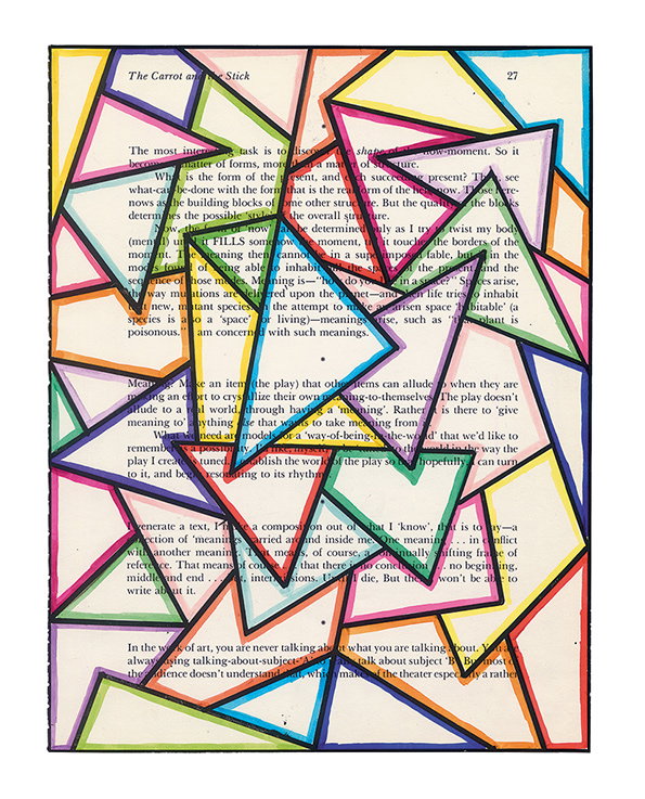
David Batchelor: The October Colouring-In Book
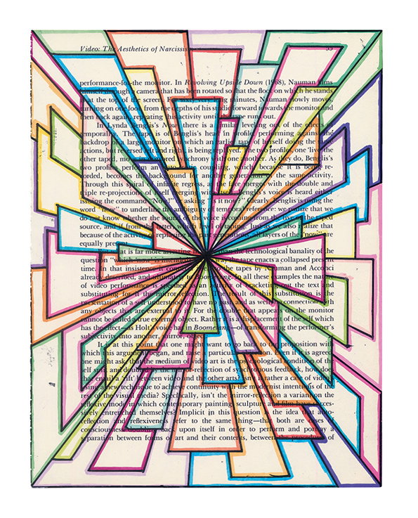
David Batchelor: The October Colouring-In Book
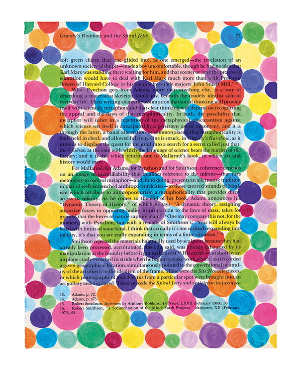
David Batchelor: The October Colouring-In Book
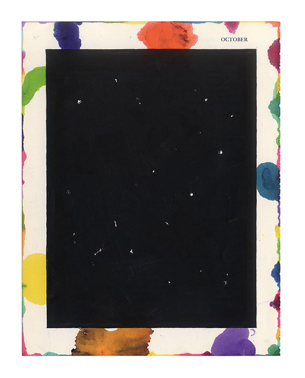
David Batchelor: The October Colouring-In Book
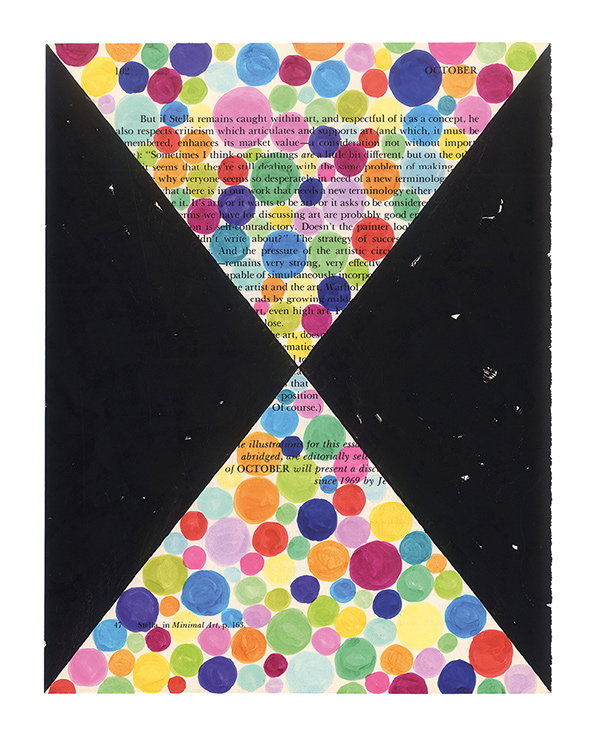
David Batchelor: The October Colouring-In Book
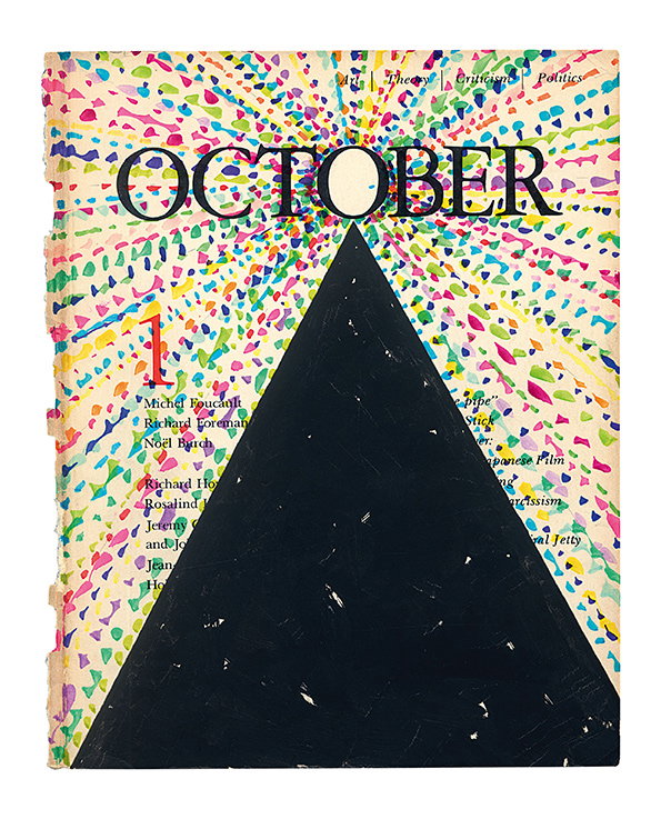
David Batchelor: The October Colouring-In Book
Share Article
Further Info
About the Author
—
Maisie joined It’s Nice That fresh out of university in the summer of 2013 as an intern before joining full time as an Assistant Editor. Maisie left It’s Nice That in July 2015.