Launch Recite Me assistive technology
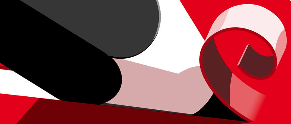
An abstract 3D render of curved, overlapping shapes in red, black, and white. The forms wind across the frame, creating a sense of depth and movement.

Feixen's lavish poster designs are some of the finest we've seen in a very long while

—
Date
10 December 2012

Swiss graphic designer Felix Pfäffli, also known as Feixen, knows exactly what he’s doing when it comes to making great posters. Working digitally in brightly coloured vectors he creates incredibly striking custom graphics for a variety of cultural clients. That’s not to say that’s all he’s good at though; having trained at the Lucerne School of Graphic Design he’s got the kind of skills that many people would give their right hand for, from experimental typography to immaculate publication design. So impressive are his talents in fact, that he was appointed to a teaching position only a year after his graduation in 2010.

We’re not ones to have favourites (sometimes we are actually) but Felix’s posters for Lucerne cultural centre Südpol and furniture designer Herman Miller are undoubtedly some of the finest pieces we’ve seen in a good while. Tasty business!
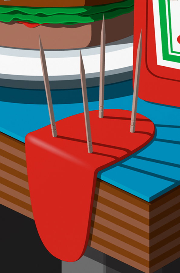
A 3D render of a red, viscous liquid pooling on a blue surface. Four thin, grey needles pierce the liquid, which drips over the edge of a striped brown platform.
Above

Feixen: Herman Miller

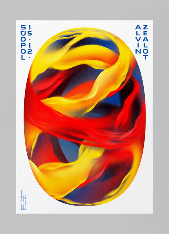
A 3D render of a swirling, oval shape filled with fluid ribbons of red, yellow and blue. Vertical text at the top reads “Zealot” and “Alvin”, while the left side reads “15.12.” and “Südpol”.
Above

Feixen: Alvin Zealot

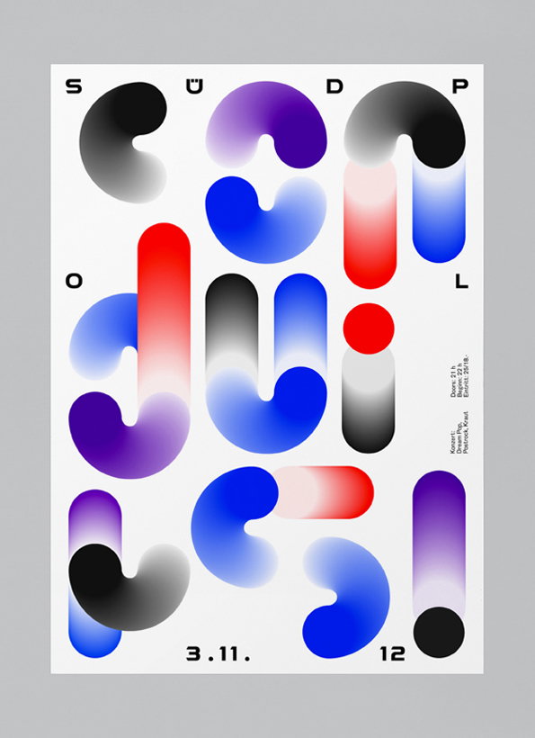
A typographic poster featuring abstract, rounded 3D shapes in gradients of blue, purple, red and grey. The shapes are arranged to form the word “Südpol” across the page. Small text at the bottom reads “3.11.” and “12”, with further event details listed vertically on the right.
Above

Feixen: Conduits

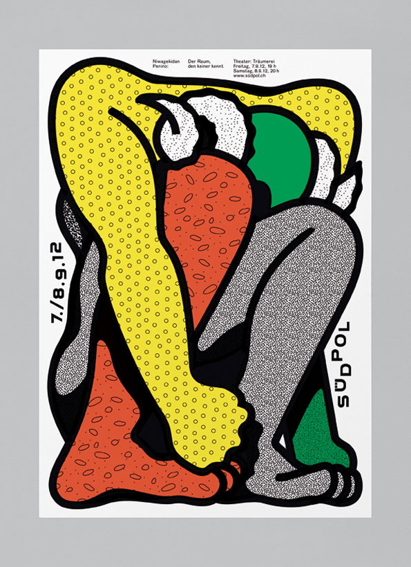
An illustration of a curled-up figure composed of bold, colourful shapes and dotted patterns. The figure is rendered in yellow, red, green and grey with thick black outlines. Text on the left reads “7./8.9.12” and a wordmark on the right reads “Südpol”.
Above

Feixen: Der Raum

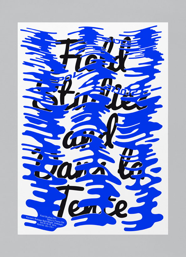
A typographic poster featuring bold, black cursive text partially obscured by distorted, bright blue shapes. The visible words read “Field Studies and Dans la Tence”. Smaller text at the bottom provides event details, including the date “27.10.23”.
Above

Feixen: Field Studies Dans La Tente

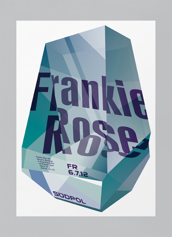
A graphic poster featuring a 3D crystalline shape in shades of blue and teal. Bold typography across the centre reads “Frankie Rose”, with smaller event details and the date “6.7.12” below. The word “Südpol” appears at the bottom of the shape.
Above

Feixen: Frankie Rose

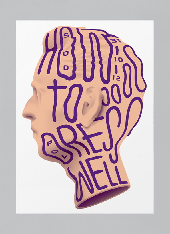
A 3D render of a head in profile, with purple typography flowing across the skin like liquid. The text reads “How to stress well”.
Above

Feixen: How To Dress Well

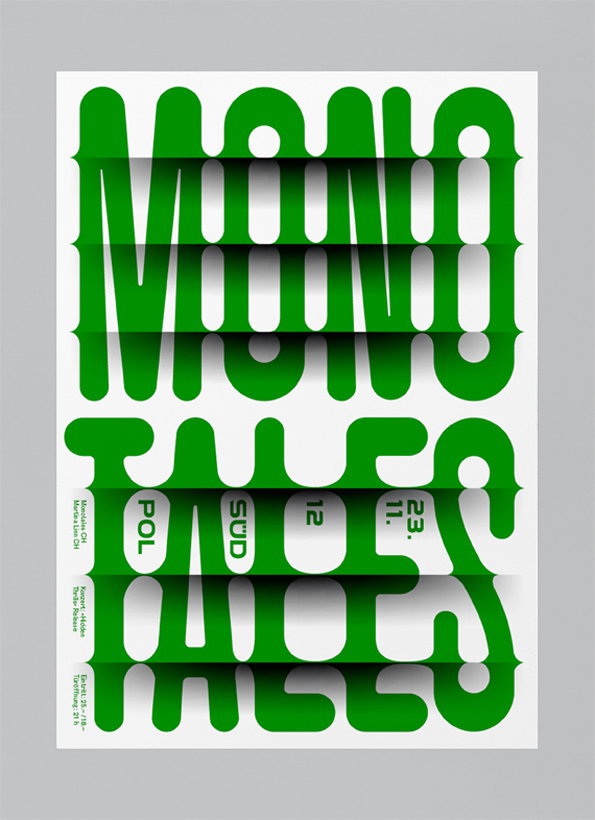
A green and white typographic poster featuring the words “MONO TALES” in a bold, rounded font. The letters are sliced horizontally with deep shadows, creating a 3D effect like folded paper. Small white blocks of text are tucked into the gaps, including the date “23. 12.”.
Above

Feixen: Monotales

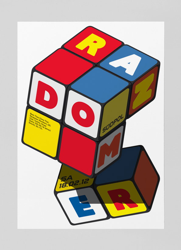
A graphic poster featuring a series of colourful 3D blocks stacked in a precarious tower. The blocks display letters that spell “Randomer” in a bold, sans-serif font. Smaller text on a yellow block lists event details, including the date “18.02.12” and the location “Südpol”.
Above

Feixen: Randomer

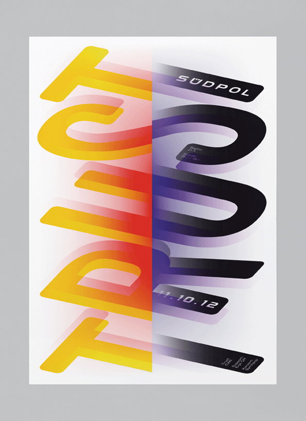
A typographic poster featuring the word “TRUCK” in large, distorted 3D lettering. The left side is a bright yellow and orange gradient, while the right side shifts into deep purple and black. Small text includes the word “SÜDPOL” at the top and the date “11.10.12” near the bottom.
Above

Feixen: Trust

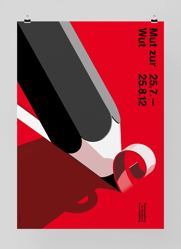
A graphic poster in red, black and white featuring a stylised, oversized pencil point. The pencil is angled downwards, creating a sharp shadow over a dark red surface. Vertical text on the right reads “Mut zur Wut” and “25.7. – 25.8.12”.
Above

Feixen: Mut Zur Wut

Share Article

Further Info

About the Author

James Cartwright

—

James started out as an intern in 2011 and came back in summer of 2012 to work online and latterly as Print Editor, before leaving in May 2015.

It's Nice That Newsletters

Fancy a bit of It's Nice That in your inbox? Sign up to our newsletters and we'll keep you in the loop with everything good going on in the creative world.