




Our Here profiles continue with frieze art director Sonya Dyakova
We’re obviously not saying that frieze magazine was poorly designed before, but have you seen it since Sonya got her clever hands and eyes on it? That ever-anticipated publication is like the Dyson Airblade of magazines – practical, timely and an absolute inspiration to all other designers. We actually interviewed Russian-born Sonya back in April about the complete re-design she did for Frieze magazine (“To put it crudely, I wanted for the magazine to be ‘hot’ in the grown-up way”) and her tactile attitudes to design and print. What we got from speaking to her was a feeling of absolute dedication and tradition to her work process.
When asked about her feelings towards the decline of printed publications and the transference of design from print to screen she simply replied: “Great design is important regardless of the times. Does this sound naive? I really mean it.”
Upon hearing this firm statement from such a quietly influential woman, we knew she would be perfect to speak at Here 2012. Sonya is a perfect blend of traditional graphic design knowledge with an entirely contemporary attitude to her practice, perhaps the reason why she has worked for Phaidon Press on a number of publications, each stamped with her tactile and, at times, conceptual trademark.
We are incredibly excited to and honoured to have Sonya Dyakova speaking at Here 2012, and we can’t wait to hear her share with us some of the invaluable tricks of her trade and some of the highlights of her thus-far incredibly fruitful and fascinating career, including how she found out rejection can be a blessing in disguise.
Here takes place on Friday September 21 at London’s Royal Geographical Society. For more information and tickets click here
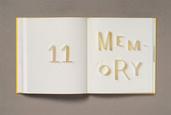
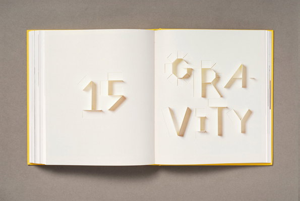
Sonya Dyakova: Paper Alphabet
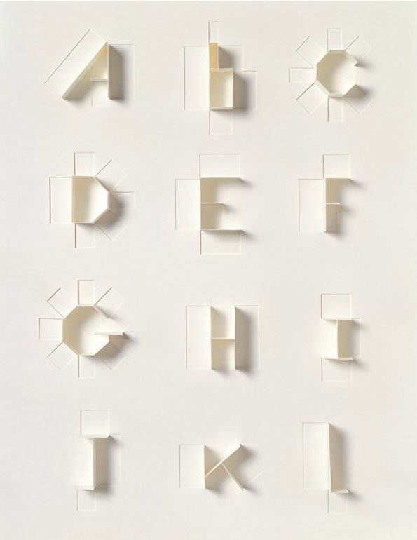
Sonya Dyakova: Paper Alphabet
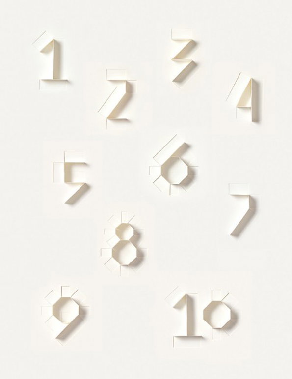
Sonya Dyakova: Paper Alphabet
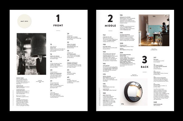
Sonya Dyakova: Frieze magazine
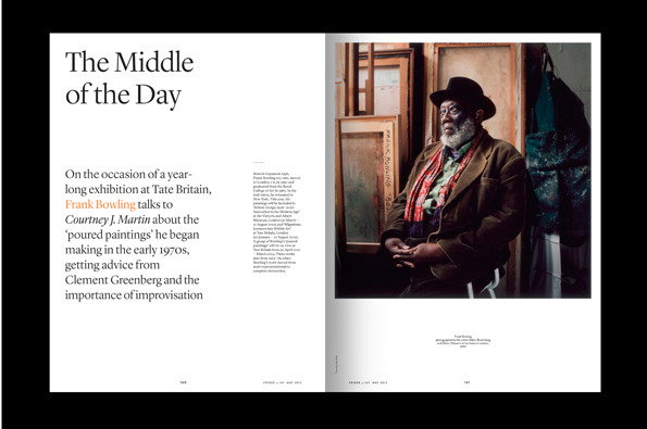
Sonya Dyakova: Frieze magazine
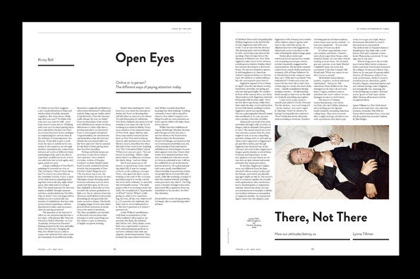
Sonya Dyakova: Frieze magazine
Share Article
Further Info
About the Author
—
Liv joined It’s Nice That as an intern in 2011 and worked across online, print and events, and was latterly Features Editor before leaving in May 2015.

