




Introducing... The meticulous portfolio of Danish designer Andreas Engelbreckt
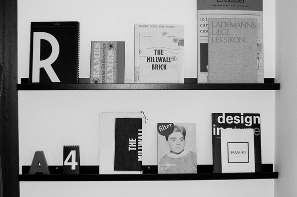
Andreas Engelbreckt is a young Danish designer currently completing a Masters in visual communication at the Royal Danish Academy of Fine Arts. We were first drawn to his work having seen his Panneau typeface – a font that evokes the decorative letterforms of 1940s French typography – but quickly discovered an impressive body of work focussing on classic type design and branding projects. We got in touch with Andreas to find out a little bit more about his practise and have a good old snoop around his desk space.
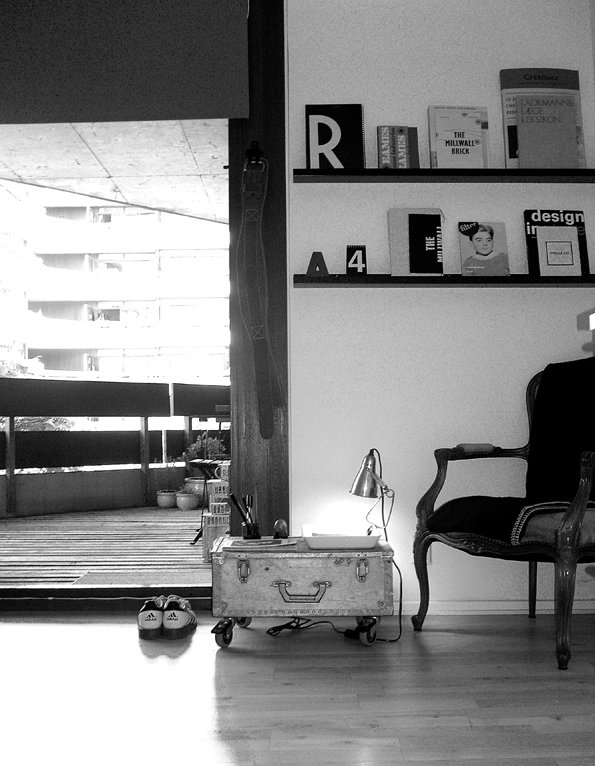
Andreas Engelbreckt: Studio
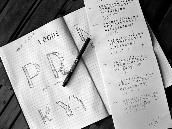
Andreas Engelbreckt: Process
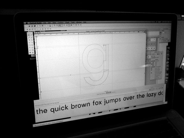
Andreas Engelbreckt: Process
Where do you work?
Most projects start with me sitting in the corner of my apartment with a notebook and my laptop. I guess you could call it my studio – it’s basically a chair, a lamp, two shelves with books and magazines, and a big box full of paper, art supplies and even more books. It’s not much, but it works out well. I can spread out inspirational material on my floor, and look at it from up high on my little throne. Later on, when I start producing the actual work, I work wherever there’s a surface – at school, a friends apartment, a cafe and sometimes just on my own floor or dining table. It really depends a lot on what kind of printing facilities i need, unfortunately I don’t have a plotter at home – yet.
How does your working day start?
If I’m working at home, I always leave my apartment for a little while before I start working. I’ve found that I work better if I trick my mind it into thinking it has left home and arrived at work. Otherwise I get stuck in a limbo where I’m not really sure whether or not my working day has begun.
I have to admit, I envy people who are good at getting started. I used to be very bad at starting the day, I would sometimes spend the first half of the day procrastinating, especially in the early stages of a project. Now I start working right away, then after half an hour I break for a little while, to make coffee, answer mails and check random internet stuff and things like that. Then, since I’ve already started working, it’s easier to get going again. Well begun is halfway done I guess.
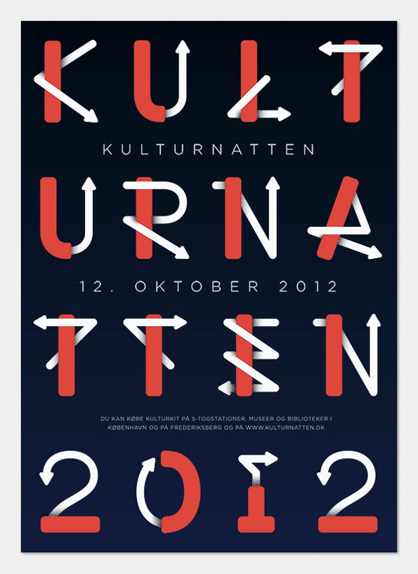
Andreas Engelbreckt: Kulturnatten
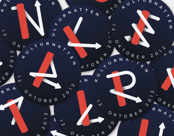
Andreas Engelbreckt: Kulturnatten
How do you work and how has that changed?
I always start with words, I write endless lists and notes, as if I think I can solve the problem by writing about it. Of course, I never can. Then I collect inspirational and informative material – books, quotes, definitions, images and things like that, constantly organising everything I find and taking more notes. I’ve also found documentaries to be very helpful (there’s a documentary on almost everything) and I think that allows for a submersion in the subject that I find very stimulating.
I always try to visit places or do things that are somehow related to the subject or client of the project; museums, stores, parks, factories, sports events and things like that. It’s often here the really good ideas pop up, rarely when I sit hours on end in front of the laptop trying to force it. I always try to have a notebook near my bed, I get a lot of ideas right before I go to sleep, mostly they turn out to be completely moronic when I go over them with fresh eyes, but every once in a while, an idea survives the night and turns out to be gold.
When I started out a few years ago, I sketched a lot by hand, but I didn’t really care for it. Everyone around me would go nuts with pens and brushes and liquid ink, filling out page after page. I never really found that it worked for me, maybe because I am not at all good at drawing. At a point it almost made me feel self conscious – it seemed you had to work like that if you wanted to be a great designer.
Now I’ve realised that it works better for me to sketch on the computer. I can work fairly fast, and the level of accuracy compared to my dodgy hand drawings makes it much easier for me to see what works and make decisions. Now when I draw by hand it’s mostly just to test out concepts. So I’ve become the kind of designer who has one notebook and one art liner – luckily I’ve found out that I’m not alone. I still think it is important to work big when I’m producing though, its hard to do a good poster if you don’t work at full scale, or a good magazine if you can’t see all the spreads at the same time. I’ve only recently realised the importance of this.
Where would we find you when you’re not at work?
I spend a lot of my spare time at a little local strength and conditioning club close to where I live. Here I either coach or work towards my own goals. This is one of the very few places where I’m truly able to put the creative work aside for a little while. As most creatives will tell you, work and life is, for better or worse, pretty tightly intertwined, so I think it’s important to have a place or an activity that can pull your mind completely away from work once in a while. When I’m not there I spend time with friends, doing everything and nothing, tinkering with bicycles, going for walks, watching movies or something completely different. There’s almost always good food and beer involved.
Would you intern for yourself?
I don’t think it would be all that bad. If I had an intern I would probably be so concerned about his/her experience that I would give him/her all the fun projects and be stuck making coffee and answering mails myself. Starting September I’m doing an internship at a studio called DesignUnit, let’s hope they feel the same way!
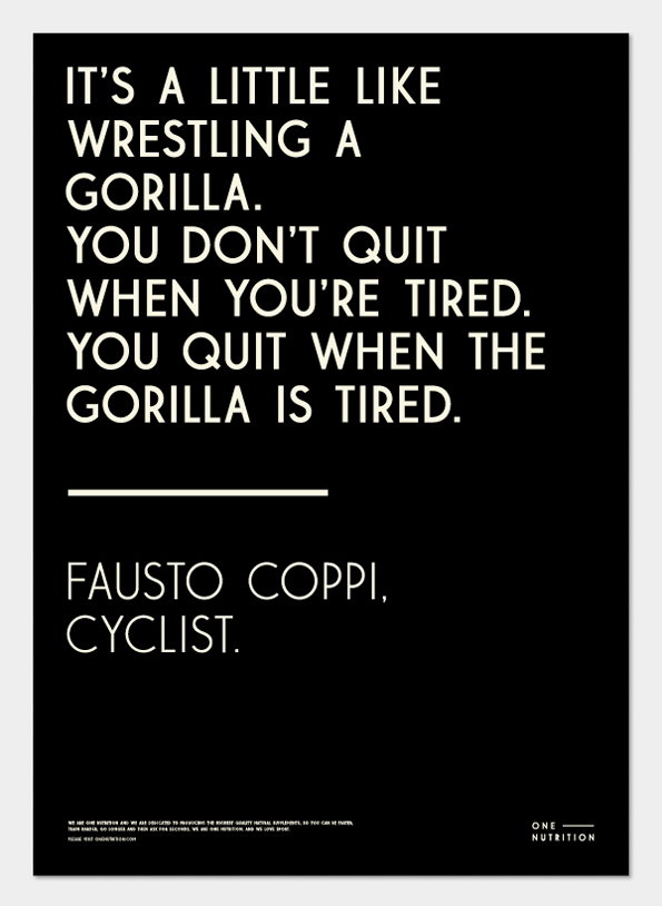
Andreas Engelbreckt: One Nutrition
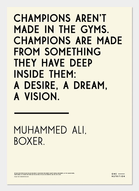
Andreas Engelbreckt: One Nutrition
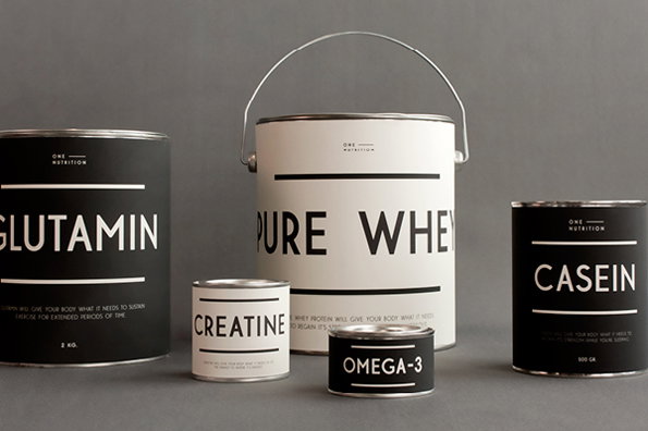
Andreas Engelbreckt: One Nutrition
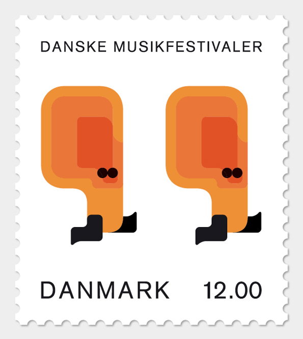
Andreas Engelbreckt: Danske Musikfestivaler
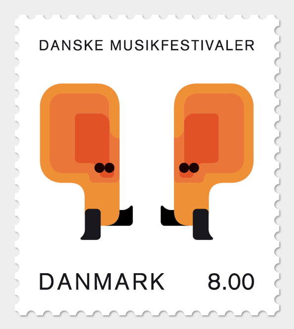
Andreas Engelbreckt: Danske Musikfestivaler
Share Article
Further Info
About the Author
—
James started out as an intern in 2011 and came back in summer of 2012 to work online and latterly as Print Editor, before leaving in May 2015.

