



Launch Recite Me assistive technology
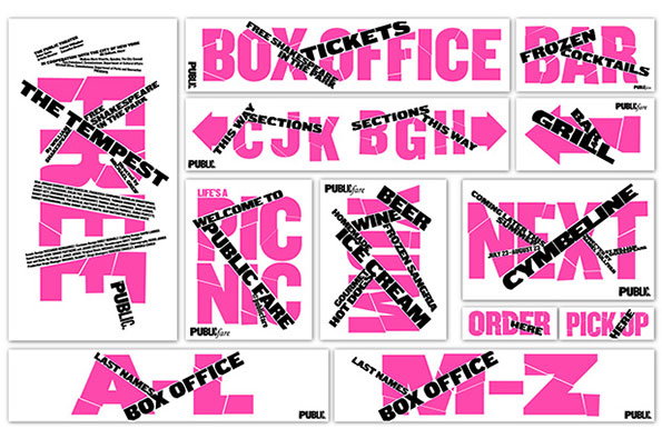
A series of pink and white graphic posters and signs for a Shakespeare in the Park event. The designs feature bold, fragmented typography with overlapping black banners reading “The Tempest”, “Box Office” and “Next Cymbeline”.

Paula Scher's confrontational Shakespeare in the park identity

—
Date
5 June 2015

Paula Scher and her team at Pentagram have created the campaign for a Shakespeare performance programme in Central Park, using bright colours and a provocative typographic style we wouldn’t perhaps usually associate with the Bard. The performances marry Shakespeare’s The Tempest with fairy-tale romance Cymbeline – two pieces about magic, storytelling and strange forces.

The project saw Paula dismantle the existing identity for the Public Theater, which facilitates the park performances, and acts as a preview for the look of the graphics for the organisation’s 2015-16 season. The imagery is based around the word “free,” and uses slices of type that slash through one another and through existing photographs.

“The tempest of type creates a mini-identity that both dramatically updates and functions within the familiar Public Theater brand,” says Pentagram. “With countless expressions in print and digital media, as well as environmental installations like snipped posters on the street, the identity is ‘always on’ and meets audiences wherever they are. An institutional identity must look as good in an ad in a Google search as it does in signage on a front of a building.”

Paula worked with Pentagram designer Jeff Close and the Public’s art director Kirstin Huber and her team on the project.
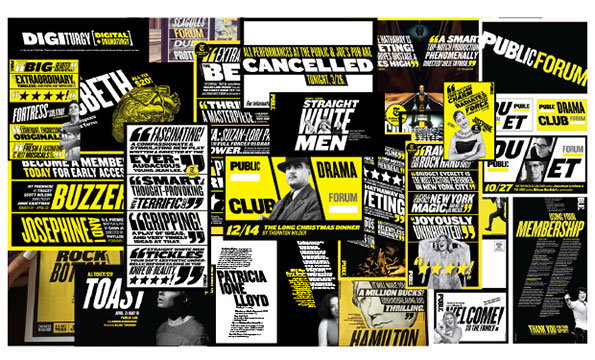
A collage of black, white and yellow promotional materials for the Public theatre. The layout features a mix of bold typography, photography and headlines, including the word “CANCELLED” in a large white box.
Above

Paula Scher: Public Theater programme identity
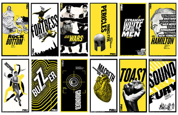
A grid of twelve graphic posters in a high-contrast yellow, black and white colour palette. Each poster features bold typography and imagery for different theatrical productions, including “Hamilton”, “Macbeth” and “Rock Bottom”.
Above

Paula Scher: Public Theater programme identity
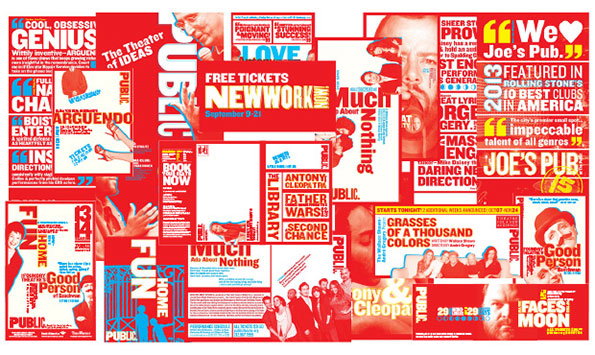
A collage of red and white promotional posters and flyers for the Public Theater. The layouts feature bold typography and portraits of performers, including a large poster that reads “Free Tickets New York”.
Above

Paula Scher: Public Theater programme identity
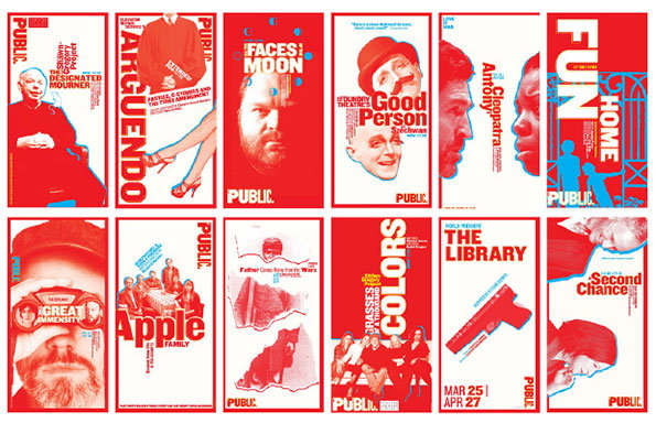
A series of twelve graphic posters in a bold red, white and blue colour palette. Each poster features a mix of photography and typography, with titles including “The Designated Mourner”, “Apple Family” and “The Library”.
Above

Paula Scher: Public Theater programme identity
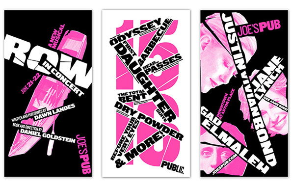
Three posters with a high-contrast black, white and pink colour palette. The first features a pink knife and the text “Row in Concert”, the second shows a large pink “18” with various event details, and the third displays portraits of people alongside names including “Justin Vivian Bond” and “Jane Lynch”.
Above

Paula Scher: Public Theater programme identity
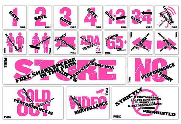
A series of bright pink and white signs for “Free Shakespeare in the Park”. The signs include gate numbers, directions to restrooms, and a large “Store” sign listing gifts, souvenirs and ponchos. Other notices announce that a performance is “Sold Out” or that there is “No Performance Today”.
Above

Paula Scher: Public Theater programme identity
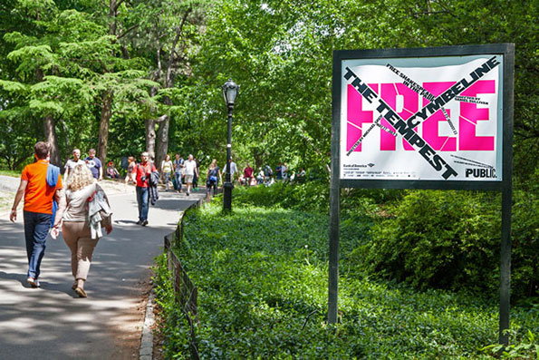
People walk along a paved path through a lush green park. To the right, a large sign features bold pink and white typography that reads “FREE” and “THE TEMPEST”.
Above

Paula Scher: Public Theater programme identity
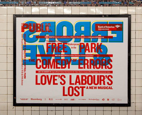
A bold typographic poster for “Shakespeare in the Park” is displayed in a black frame against a white tiled wall. Red text on a white background announces “The Comedy of Errors” and “Love’s Labour’s Lost”, layered over large, blue distorted lettering.
Above

Paula Scher: Public Theater programme identity
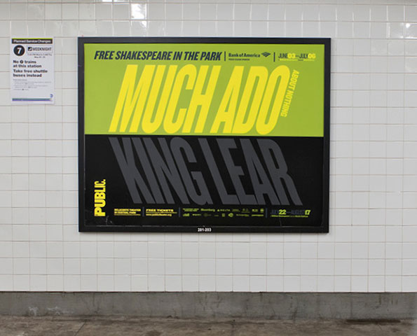
A poster for “Free Shakespeare in the Park” is displayed on a white tiled wall. The top half is yellow with the title “Much Ado About Nothing”, while the bottom half is black with the title “King Lear”.
Above

Paula Scher: Public Theater programme identity

Share Article

Further Info

About the Author

Emily Gosling

—

Emily joined It’s Nice That as Online Editor in the summer of 2014 after four years at Design Week. She is particularly interested in graphic design, branding and music. After working It's Nice That as both Online Editor and Deputy Editor, Emily left the company in 2016.


It's Nice That Newsletters

Fancy a bit of It's Nice That in your inbox? Sign up to our newsletters and we'll keep you in the loop with everything good going on in the creative world.
