Launch Recite Me assistive technology
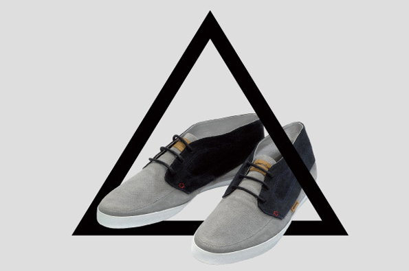
A pair of grey and black suede shoes are positioned inside a large black outline of a triangle. The shoes are set against a plain light grey background.

Parisian studio Untitled impress with some quietly confident graphic work

—
Date
14 June 2012

Coming up with a name for anything can be a real trial, and something that seems confidently gamechanging one day can sound trite, ugly and ridiculous the next. Kudos then to Hadrien Lopez and Philippe Ortion whose Parisian design studio is called simply Untitled, following in the footsteps of many an indecisive/enigmatic artist.

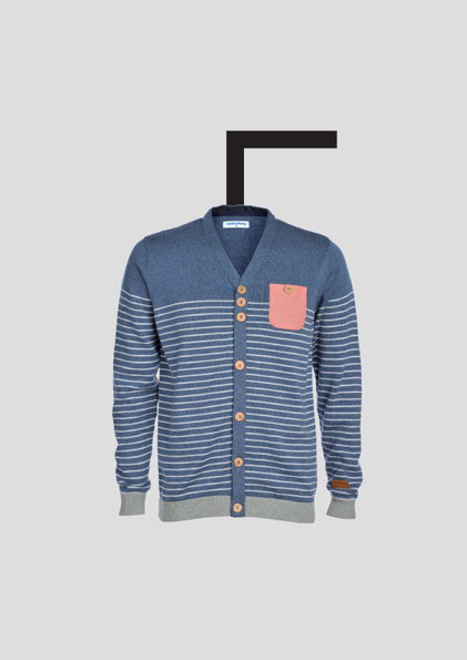
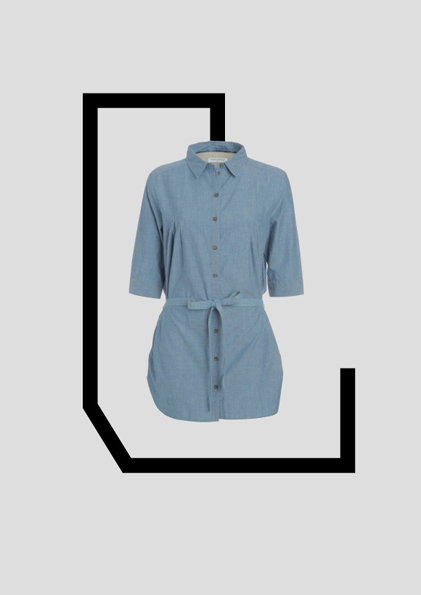
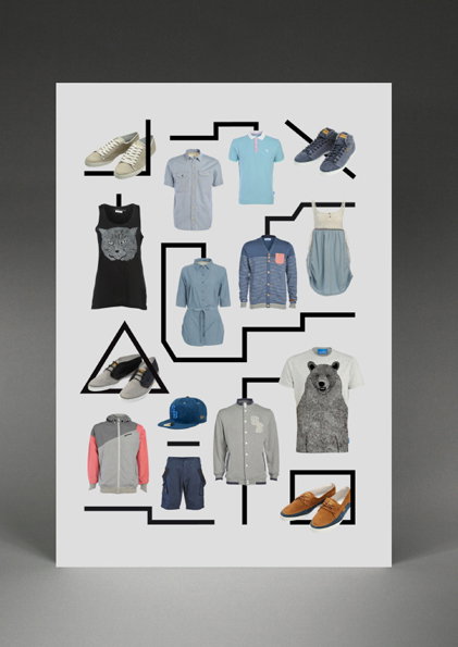
But though they seem a little enigmatic (my natural reaction to our tres cool cross-Channel cousins) there’s certainly nothing indecisive about their quietly effective branding, graphics and typography. Able to turn their hands to diverse briefs without sacrificing the consistent high quality, Untitled may not be flashy but they are seriously good. Pick of the new updates for me is this invitation for the Rtex spring collection – a series of tricky visual puzzles with a clean, simple aesthetic – but it’s also interesting to see some of the fun they’ve been having with new fonts.

Untitled they may be, uninteresting they certainly are not.
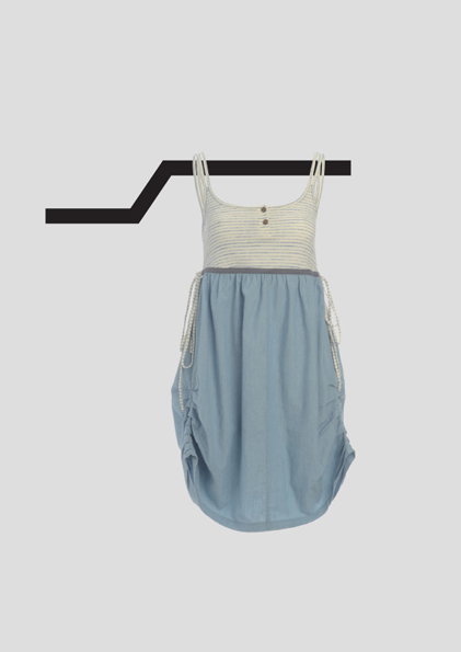
A light blue dress with a striped bodice hangs from a black metal rail. The garment is set against a plain grey background.
Above

Untitled: Rtex Printemps 2012

A blue striped cardigan with a small pink chest pocket and brown buttons. It is displayed against a plain grey background with a black L-shaped graphic floating above the collar.
Above

Untitled: Rtex Printemps 2012

A light blue, short-sleeved shirt dress with a belted waist. It is framed by a thick, black geometric line on a plain grey background.
Above

Untitled: Rtex Printemps 2012

A collage of clothing and footwear arranged around a series of black geometric lines. The items include T-shirts with animal prints, button-down shirts, a jacket, shorts and various pairs of shoes.
Above

Untitled: Rtex Printemps 2012

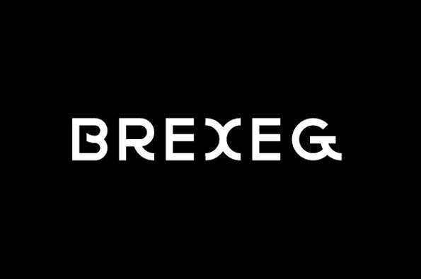
The word “Brexeg” appears in a bold, white sans-serif typeface against a solid black background.
Above

Untitled: Le Mercoeur

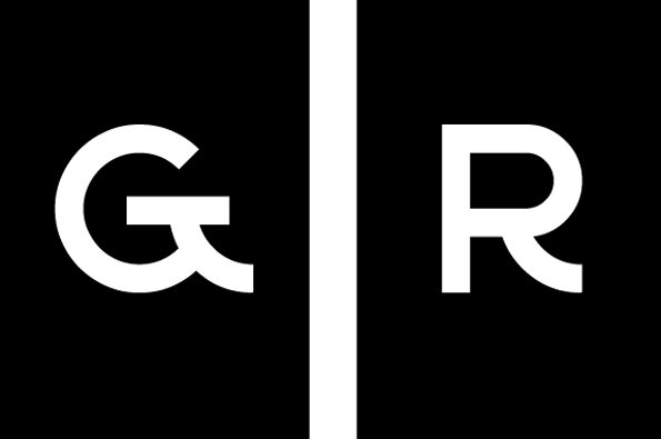
A minimalist logo featuring the white letters “G” and “R” on a black background. A vertical white line separates the two characters.
Above

Untitled: Le Mercoeur

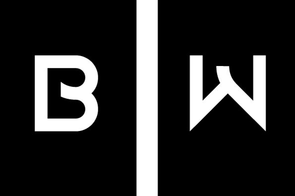
A black and white logo featuring the letters “B” and “W” separated by a vertical white line. The letters are rendered in a bold, geometric sans-serif typeface.
Above

Untitled: Le Mercoeur

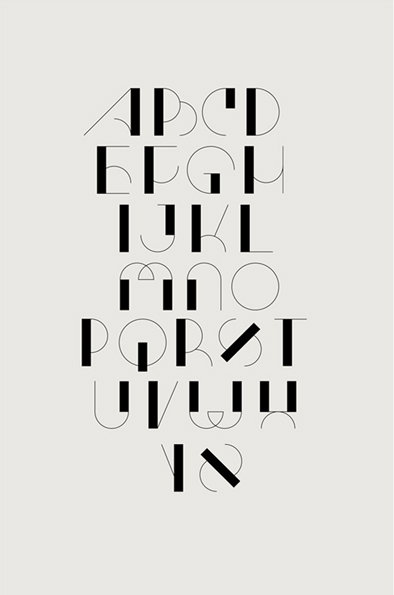
An illustration of a minimalist alphabet in black on a pale grey background. The letters are constructed from a mix of thick blocks and thin, sweeping lines.
Above

Untitled: Eunam

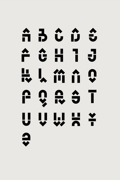
A typographic alphabet in black on a pale grey background. Each letter is constructed from bold, geometric shapes and incorporates small upward or downward pointing arrows.
Above

Untitled: Segu

Share Article

About the Author

Rob Alderson

—

Rob Alderson is a freelance writer, editor and strategist. He was previously editor-in-chief of It’s Nice That and WePresent, and editor of Design Week. He publishes the newsletter Undo, which tries to make sense of how AI is changing design work, the design process and the design industry.


It's Nice That Newsletters

Fancy a bit of It's Nice That in your inbox? Sign up to our newsletters and we'll keep you in the loop with everything good going on in the creative world.