Launch Recite Me assistive technology

Can Graphic Design Save Your Life? explores “widespread and subliminal” impact of design on health
—
Date
5 September 2017
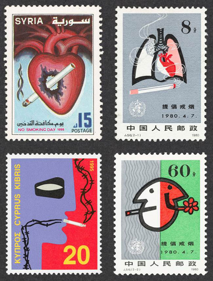
Four postage stamps with anti-smoking themes. One from Syria shows a cigarette piercing a heart, while another from Cyprus depicts a cigarette behind barbed wire. Two stamps from China feature stylised lungs and a face split in two, with one side smoking.

Wellcome Collection has opened a major new exhibition exploring the relationship between graphic design and health. The show was the idea of GraphicDesign& and is curated by founders graphic designer Lucienne Roberts and educator Rebecca Wright, programme director of the Graphic Communication Design course at Central Saint Martins, who together founded publisher Graphic Design&. It features 200 objects spanning packaging, posters, signage, brand identities, flags, and more, highlighting “the widespread and often subliminal nature of graphic design in shaping our environment, our health and our sense of self”. The book that accompanies the show is published by GraphicDesign& and unusually includes contributor answers to the question posed by the title. Lucienne’s studio, LucienneRoberts+ worked on the 2F design of the exhibition with 3D by Universal Design Studio

One aspect the show aims to consider is the “persuasive” strategies used in manipulating public perception around smoking. 80s ad campaigns by Silk Cut are shown alongside objects showing the transition to plain packaging, and anti-smoking imagery from around the world.

Another realm of imagery that’s explored is the range of creative approaches to educating people about the human body, with the exhibition including 16th Century anatomical pop-up books, the Tiny Bop learning app, and Planned Parenthood comic books advocating safe sex.

Other parts of the show explore the use of graphic design in hospitals, looking at fonts, posters, and signage, and colourful schemes for children’s wards that show how design can improve patient wellbeing. At the opening of the show are flags showing the Red Cross, Red Crescent and Red Crystal emblems, rarely exhibited together, stated as “some of the world’s most recognisable, powerful and highly protected symbols”.

The comprehensive showcase also tackles the use of graphics in the front-line response to epidemics, from Italian Renaissance plague notices to a hand-painted mural depicting Ebola symptoms in 2014; Abram Games’ anti-malaria poster and the 1980s campaign AIDS: Don’t Die of Ignorance.

A long list of designers featured include Margaret Calvert, Dick Bruna, Ken Garland, Alan Kitching, Pentagram, Studio Dumbar and PearsonLloyd.

Can Graphic Design Save Your Life? opens 7 September 2017 – 14 January 2018 at Wellcome Collection, London.
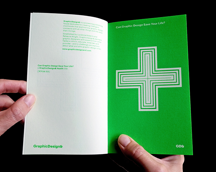
A person holds open a small green book. The cover features a white concentric cross and the title “Can Graphic Design Save Your Life?”.
Above

GraphicDesign&: Can Graphic Design Save Your Life? publication
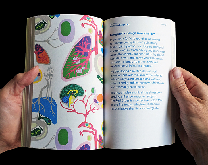
A person holds open a magazine to a spread. The left page features a colourful illustration of organic, anatomical shapes, while the right page contains a text column titled “Can graphic design save your life?”.
Above

GraphicDesign&: Can Graphic Design Save Your Life? publication
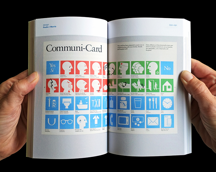
A person holds open a book to a two-page spread featuring the “Communi-Card”. The pages show a grid of simple blue, red and green icons paired with text to help patients communicate.
Above

GraphicDesign&: Can Graphic Design Save Your Life? publication
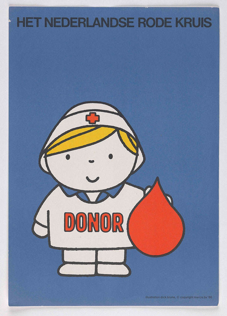
An illustration of a Miffy figure dressed as a nurse, wearing a white uniform and a cap with a red cross. They hold a large red blood drop, and the word “DONOR” is written in red across their chest. At the top, text reads “HET NEDERLANDSE RODE KRUIS”.
Above

Dick Bruna: poster for Het Nederlandse Rode Kruis (1986); copyright Mercis
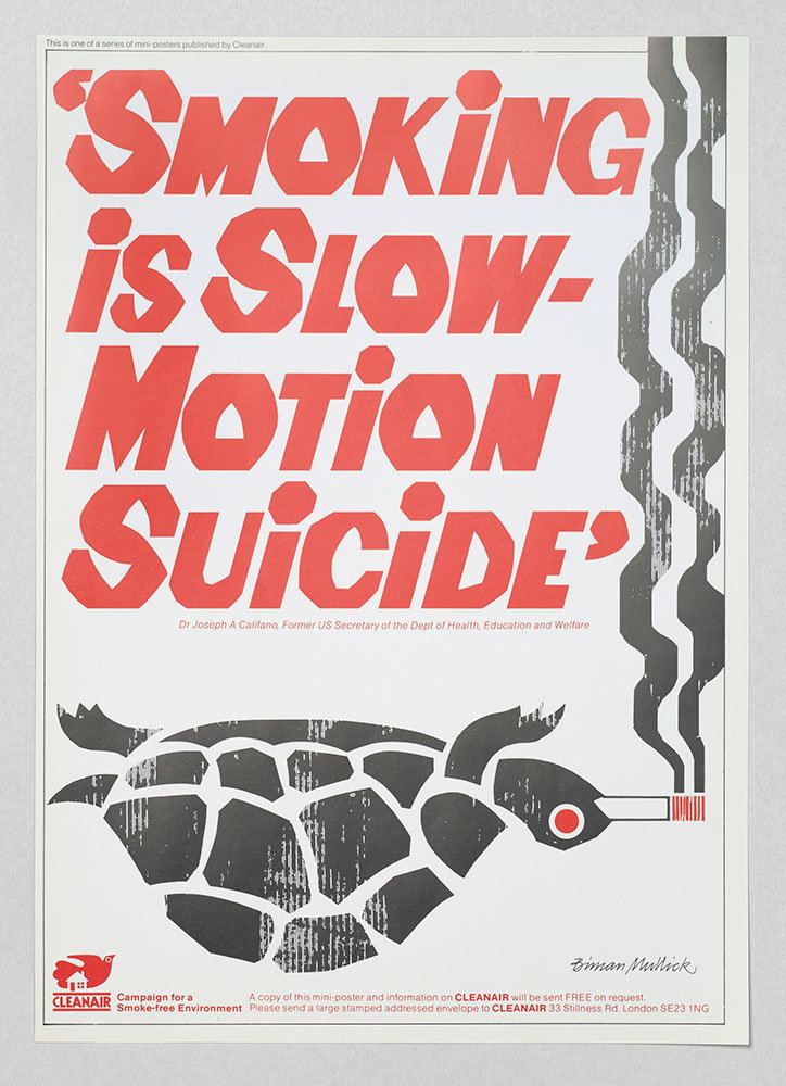
A bold typographic poster in red and grey reads “SMOKING IS SLOW-MOTION SUICIDE”. Below the text, a stylised grey tortoise is depicted with a lit cigarette in its mouth.
Above

Biman Mullick / Cleanair: Smoking is Slow Motion Suicide
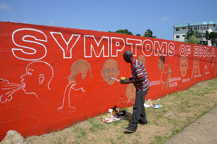
A person in a striped shirt stands beside a bright red wall painted with the words “SYMPTOMS OF EBOLA”. The mural features white and coloured illustrations of people experiencing various symptoms.
Above

Stephen Doe: Ebola mural in Liberia, 2014
Photo: Dominique Faget, AFP, Getty Images
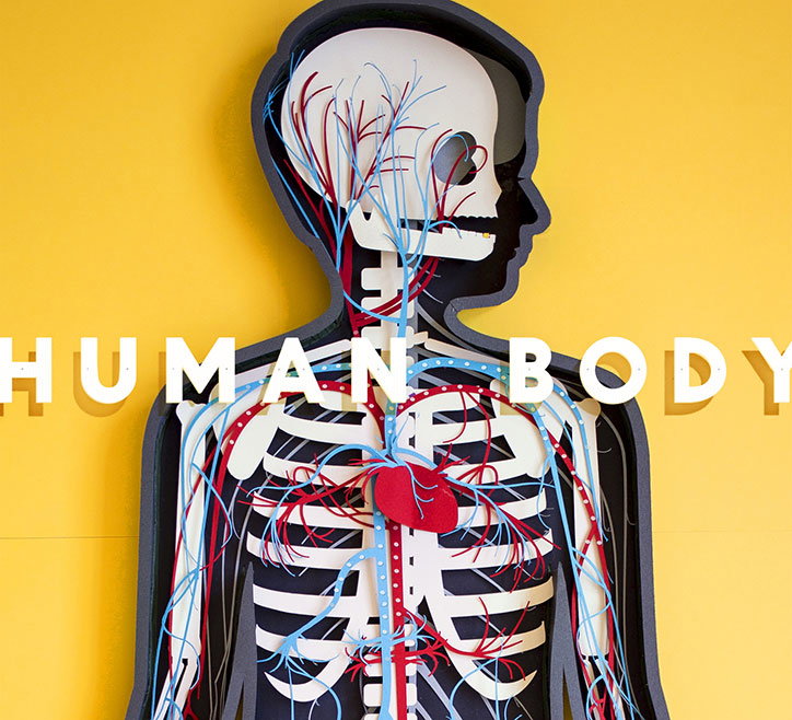
A 3D anatomical model of a human skeleton and circulatory system set against a bright yellow background. The words “HUMAN BODY” are laid over the centre of the figure in bold white capitals.
Above

The Human Body app 2013; artwork by Kelli Anderson for Tinybop
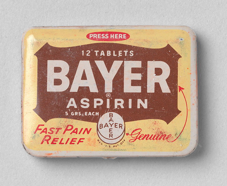
A small, rectangular metal tin for “Bayer Aspirin”. The yellow lid features a brown central label with white text that reads “12 Tablets” and “5 grs. each”. Red text around the edges reads “Press here”, “Fast pain relief” and “Genuine”.
Above

Bayer Aspirin ‘Genuine’ Fast Pain Relief Tin. The Bayer Company, Glenbrook Laboratories, Div. of Sterling Drug Inc., New York, USA
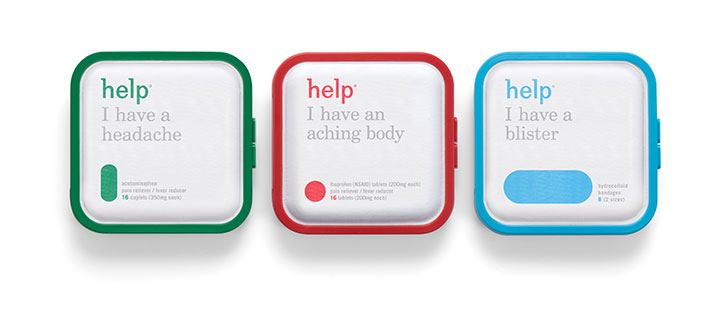
Three small, square medical kits in green, red and blue. Each features the brand “help” and a phrase describing a symptom, such as “I have a headache”.
Above

Pearlfisher: Help Remedies

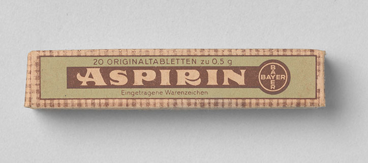
A vintage rectangular box of Aspirin against a plain grey background. The packaging features the word “Aspirin” in bold lettering and a circular Bayer logo.
Above

Bayer: Aspirin Faltschachtel, 1939

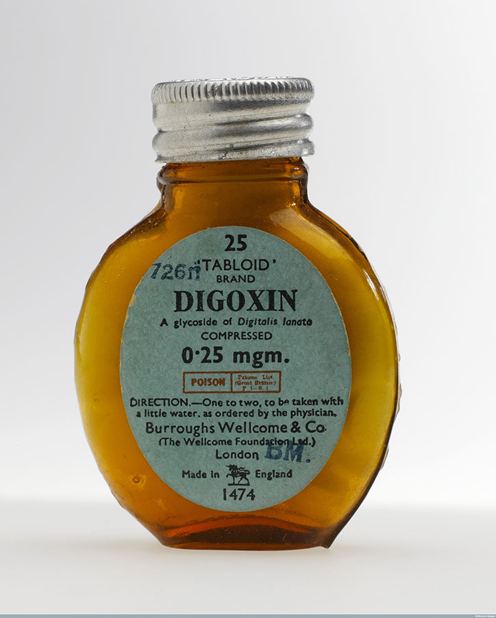
A small, amber glass bottle with a silver metal screw cap. A pale blue label reads “DIGOXIN” in bold black type, with the brand “TABLOID” and the dosage “0.25 mgm.” above and below.
Above

Science Museum London, Wellcome Images: Bottle of Digoxin tablets
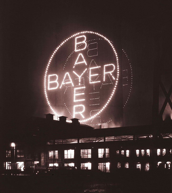
A large, circular neon sign reading “Bayer” glows against a dark night sky. The sign is positioned above a low, industrial building with lit windows.
Above

Bayer Cross, around 1938

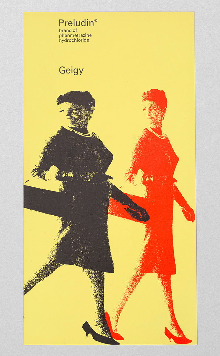
A yellow poster featuring two high-contrast figures of a person walking. One figure is black and the other is red, both wearing a dress and heels. Text at the top reads “Preludin® brand of phenmetrazine hydrochloride” above the word “Geigy”.
Above

Advertising pamphlet for Preludin, Geigy, c. 1962
Courtesy: Display, Graphic Design Collection (thisisdisplay.org)
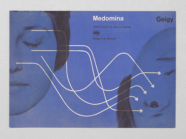
A blue-toned advertisement for the drug “Medomina” by Geigy. White lines flow from the face of a sleeping person on the left towards the face of a waking person on the right.
Above

Advertising pamphlet for Medomina, Geigy, c. 1960
Courtesy: Display, Graphic Design Collection (thisisdisplay.org)
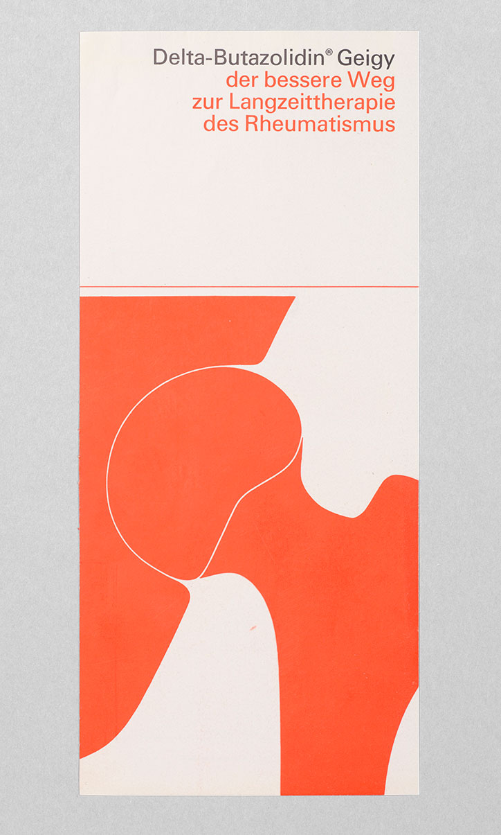
A pharmaceutical advertisement featuring a bold, orange abstract shape suggesting a joint or bone structure. Text at the top reads “Delta-Butazolidin® Geigy der bessere Weg zur Langzeittherapie des Rheumatismus”.
Above

Advertisement for Delta-Butazolidin Geigy, c. 1964
Courtesy: Display, Graphic Design Collection (thisisdisplay.org)
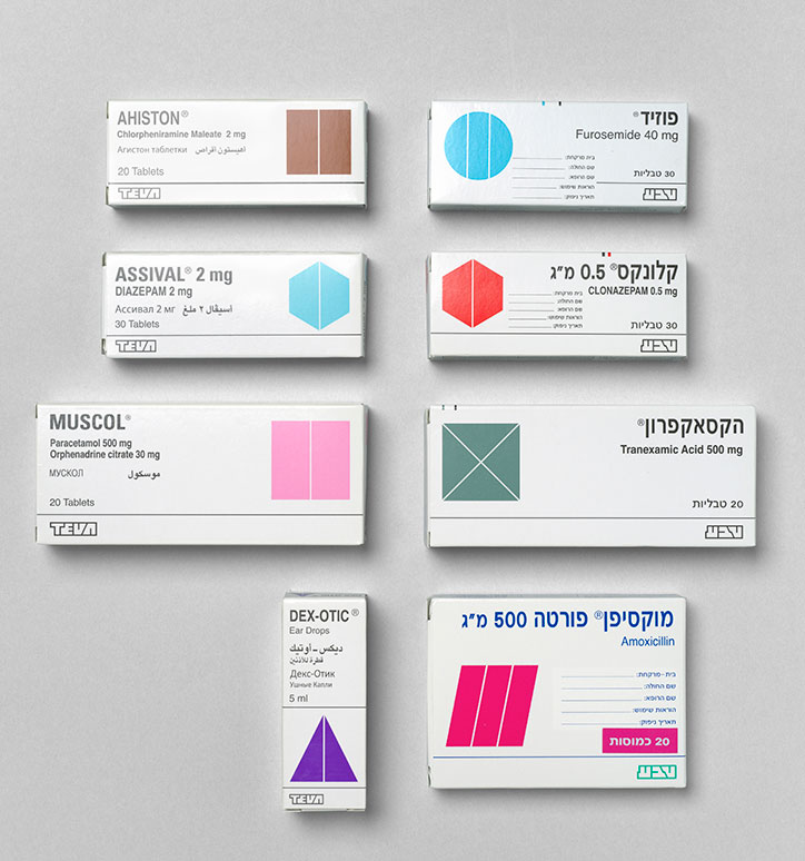
A collection of seven pharmaceutical boxes from Teva, arranged in a grid against a grey background. Each white box features a bold, colourful geometric shape and the name of a medication, such as “Ahiston” and “Muscol”.
Above

Eight different designs of dual language TEVA packaging (Hebrew-English), 1986, Dan Reisinger

A graphic illustration of four pink shapes on a pale pink background. Two large circles sit above two large squares, each containing a smaller, darker pink shape of the same form in its centre.
Above

Cancerfonden, breast cancer awareness campaign, 2016, Sweden
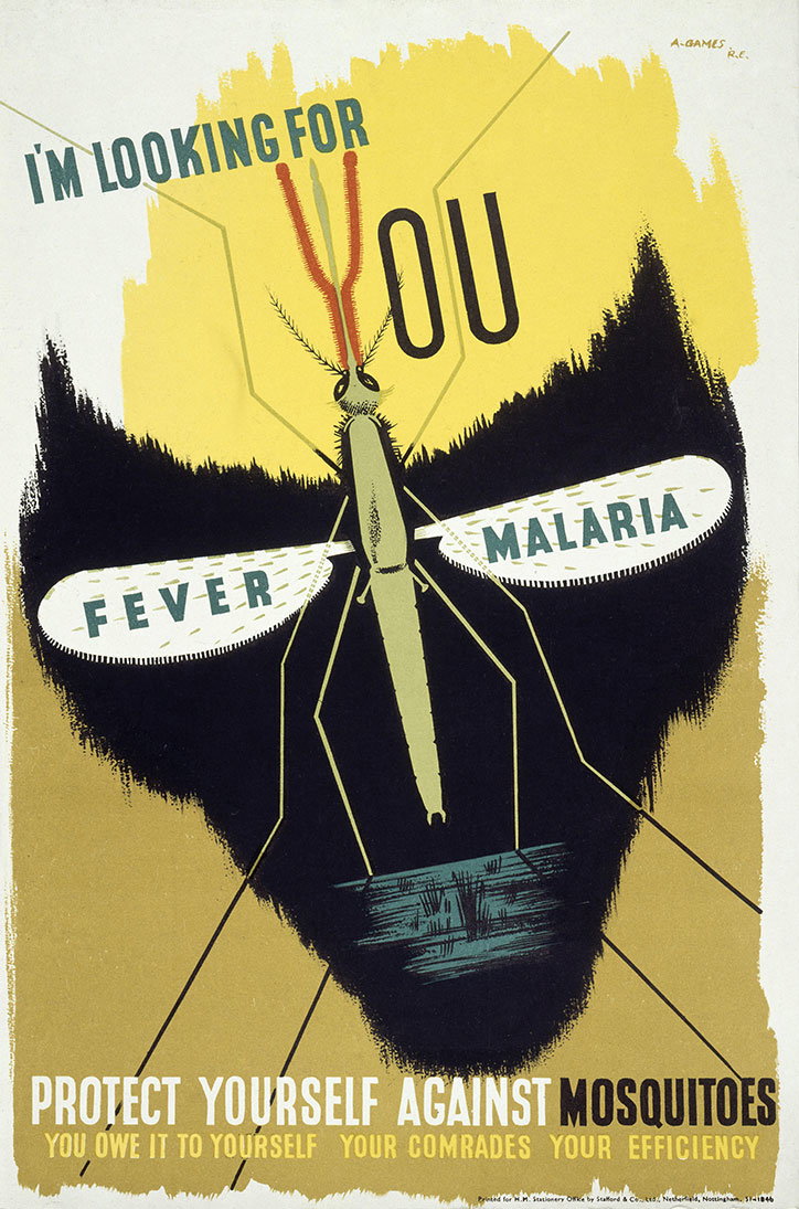
An illustration of a large mosquito centred against a yellow and black background. Text on the wings reads “FEVER” and “MALARIA”, while a headline above reads “I’M LOOKING FOR YOU”. The bottom of the poster reads “PROTECT YOURSELF AGAINST MOSQUITOES” and “YOU OWE IT TO YOURSELF YOUR COMRADES YOUR EFFICIENCY”.
Above

Anti Malaria Poster by Abram Games, 1941 © Estate of Abram Games
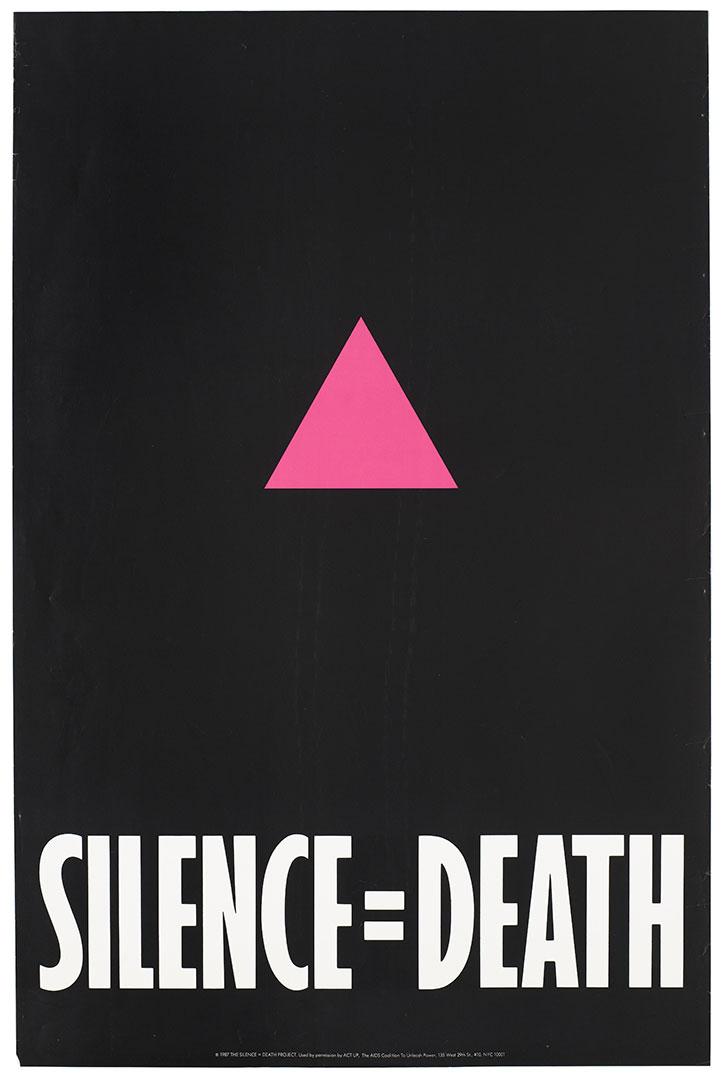
A graphic poster with a black background featuring a pink triangle in the centre. Bold white text at the bottom reads “SILENCE=DEATH”.
Above

Advertisement for The Silence = Death Project, 1987

Share Article

About the Author

Jenny Brewer

—

Jenny oversees editorial output across It’s Nice That. Get in touch with writing pitches for features or opinion pieces, big creative story tips, or questions about all things editorial. jb@itsnicethat.com

To submit your work to be featured on the site, please see our Submissions Guide.
It's Nice That Newsletters

Fancy a bit of It's Nice That in your inbox? Sign up to our newsletters and we'll keep you in the loop with everything good going on in the creative world.