Launch Recite Me assistive technology

O Street creates adaptable brand refresh for Last.fm inspired by sound waves
—
Date
15 February 2017
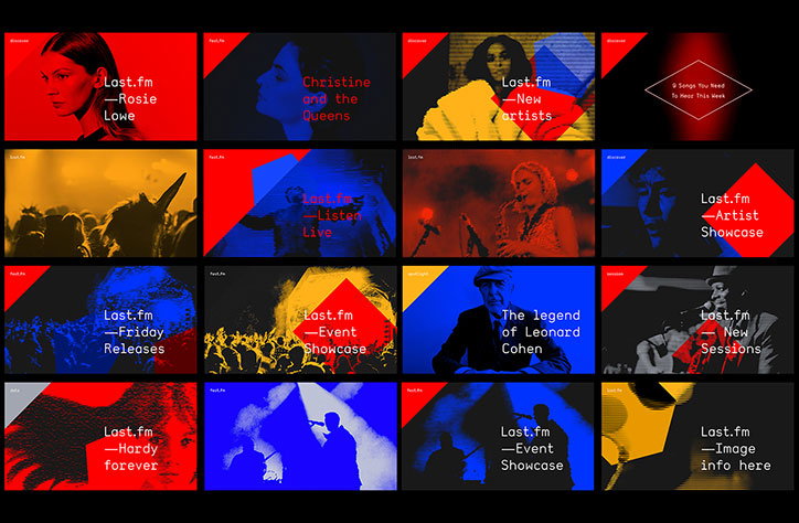
A grid of 16 graphic tiles for Last.fm, using a bold palette of red, blue, yellow and black. Each tile features a high-contrast image of a musician or crowd, paired with text such as “Rosie Lowe”, “New artists” and “The legend of Leonard Cohen”.

Graphic design studio O Street has completed a brand refresh for online music platform Last.fm, using a visual system inspired by sound waves. The studio previously developed a bespoke typeface for the brand, and has now created a graphic template for its eclectic bank of imagery.

As the platform features a broad range of artists, the imagery on the site is hugely varied. O Street was therefore asked to develop an image treatment that tied it all together, without losing the individuality of the musicians’ artworks.

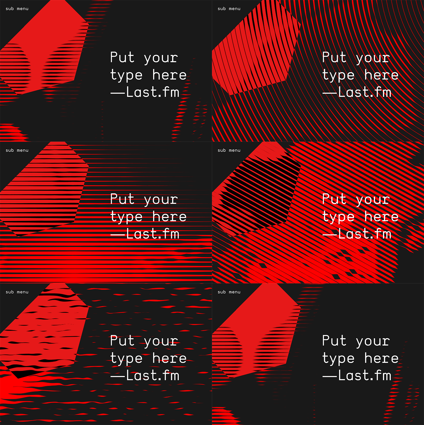
The result is a template system for a pattern of stylised lines, based on the graphic representation of sound waves, which can be applied to any image. The template is adaptable, to be customised on a sliding scale by the brand. “They can keep it quiet and muted, or boost the volume all the way to 11,” says O Street.

“Last.fm is all about data and music,” the studio says. “Using this aspect as a starting point enabled us to create a distinct aesthetic that really brings the images into the digital data sphere.”
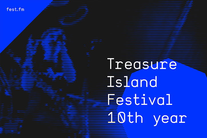
A blue and black graphic with a distorted, glitchy image of a person. Bold white text reads “Treasure Island Festival 10th year”, with “fest.fm” in the top left corner.
Above

O Street: Last.fm

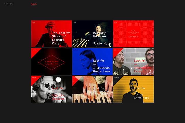
A grid of nine graphic tiles for Last.fm, using a bold red, blue, and yellow colour palette. Each tile features a portrait of a musician paired with clean, white typography.
Above

O Street: Last.fm

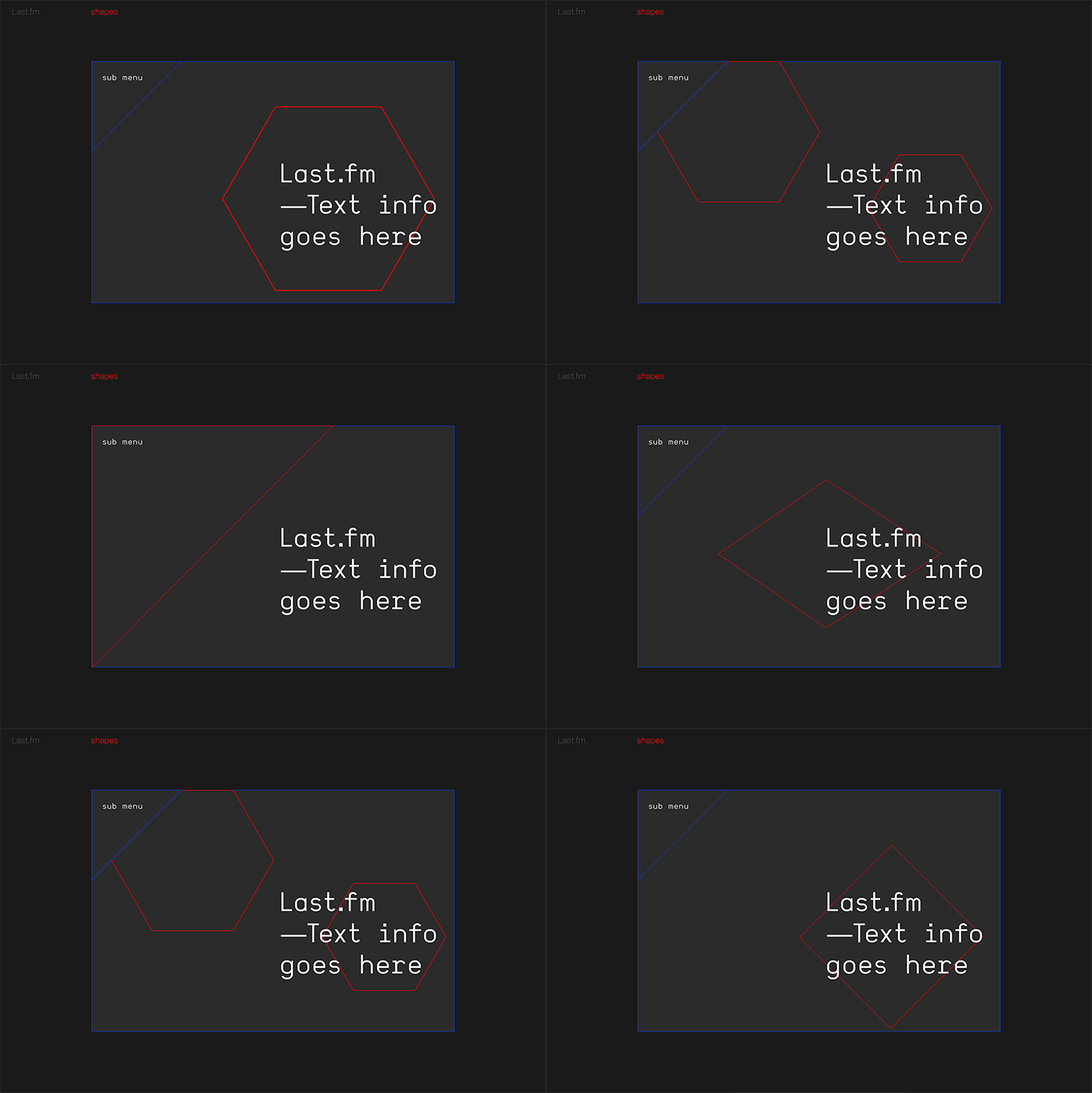
A digital interface on a dark grey background. A red hexagon contains the text “Last.fm —Text info goes here”, with “sub menu” written in the top left corner.
Above

O Street: Last.fm

An animation in which red and black geometric shapes and lines shift and warp across a dark background. White text reads “Put your type here” and “—Last.fm”, with “sub menu” in the top left corner.
Above

O Street: Last.fm

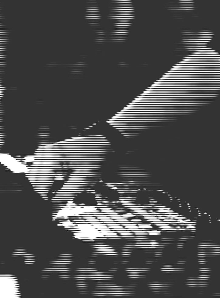
A high-contrast, black and white image of a person’s hand reaching over a mixing desk. The image is distorted by a heavy horizontal line effect, creating a digital, glitchy appearance.
Above

O Street: Last.fm

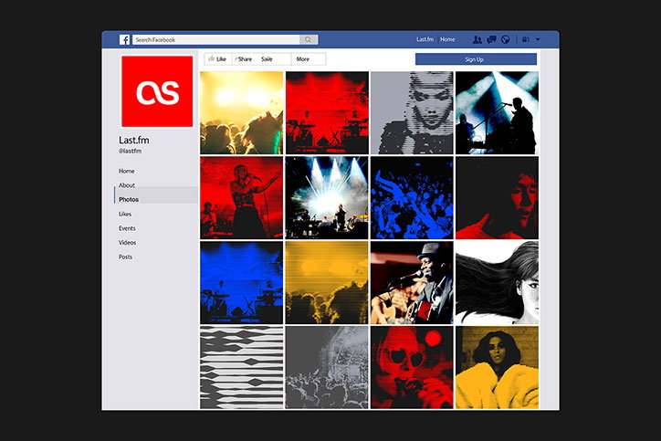
A screenshot of a Last.fm Facebook page. A grid of high-contrast, stylised concert photographs in red, blue, yellow and grey fills the main feed.
Above

O Street: Last.fm

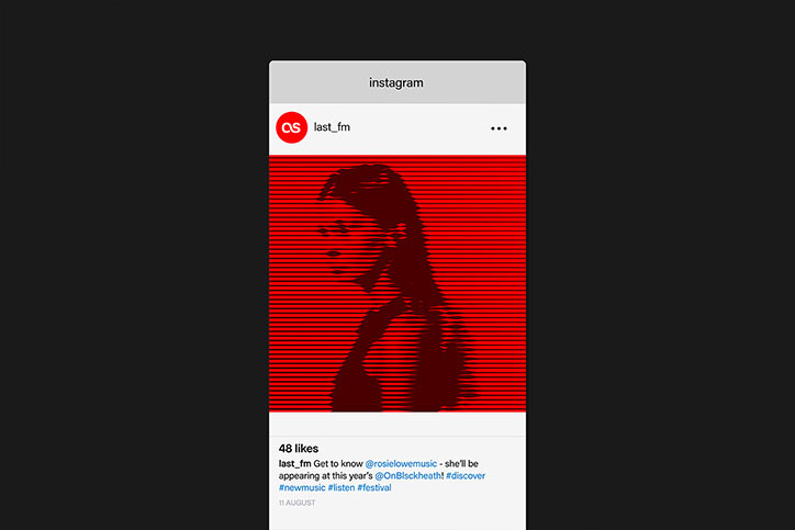
An Instagram post from the account “last_fm” features a distorted, red-toned image of a person. The figure is rendered in a glitchy, linear style against a bright red background. Below the image, the caption reads “Get to know @rosielowemusic - she’ll be appearing at this year’s @OnBlckheath!”.
Above

O Street: Last.fm

Share Article

Further Info

About the Author

Jenny Brewer

—

Jenny oversees editorial output across It’s Nice That. Get in touch with writing pitches for features or opinion pieces, big creative story tips, or questions about all things editorial. jb@itsnicethat.com

To submit your work to be featured on the site, please see our Submissions Guide.

It's Nice That Newsletters

Fancy a bit of It's Nice That in your inbox? Sign up to our newsletters and we'll keep you in the loop with everything good going on in the creative world.