When it was first published in 1996, A Smile in the Mind quickly became a key tome for a generation of designers. Edited by Beryl McAlhone and David Stuart, it made the case for wit and humour in design practice, showing and discussing some of the best projects that had been made at the time.
The book has now been released in an updated, second edition with editors Greg Quinton and Nick Asbury. There are sections on different types of wit, such as ambiguity, substitution and double takes; as well as closer looks at particular designers who employ it in their work, including Saul Bass, Michael Beirut, Sarah Illenberger and Christoph Niemann.
In their preface Greg and Nick describe their impetus for re-publishing the book: “The story of wit in the last 20 years is in fact one of scaling up. As designers have enjoyed access to new technologies and greater freedom to move across disciplinary boundaries, so the realm of wit has become larger, not smaller.”
On the advent of its release, here we publish an extract from A Smile in the Mind, where Seymour Chwast speaks about how he gets ideas, and the role of wit in his work.
“Wit is the way I solve problems. It is a way of thinking that allows me to come up with graphic ideas. Although the wit is there, the work is not necessarily funny. Design is play, and designers use a whole gamut of techniques that could be considered playful. Some are funny: some have serious intent.
I discovered how powerful and serious wit can be when I was in the Czech Republic judging a poster biennale during the Yugoslav Wars of the early 1990s. Two Sarajevo designers were showing about thirty posters, hand drawn, all based on puns and American clichés like Coca-Cola and Andy Warhol’s soup cans. They were presenting the war as totally absurd while living through it at the same time. Their intention was to make people aware of what was happening, but their technique was light and funny.
In my work there is always some sort of graphic play, in that there is an idea which is surprising. Wit usually involves the juxtaposition of elements that do not belong together. I frequently take two points that have to be addressed and combine them in one image. The result may be crazy or surreal, but it makes sense because the subject has both those sides to it. The way I go about it is to fool around with the two elements until the combination makes the most sense. It has to work as an idea as well as being graphically valid. If I find I have to try too hard, or stretch too much, I forget it and try something else.”
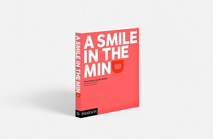
A Smile in the Mind: B. McAlhone & D. Stuart, G. Quinton & N. Asbury, published by Phaidon
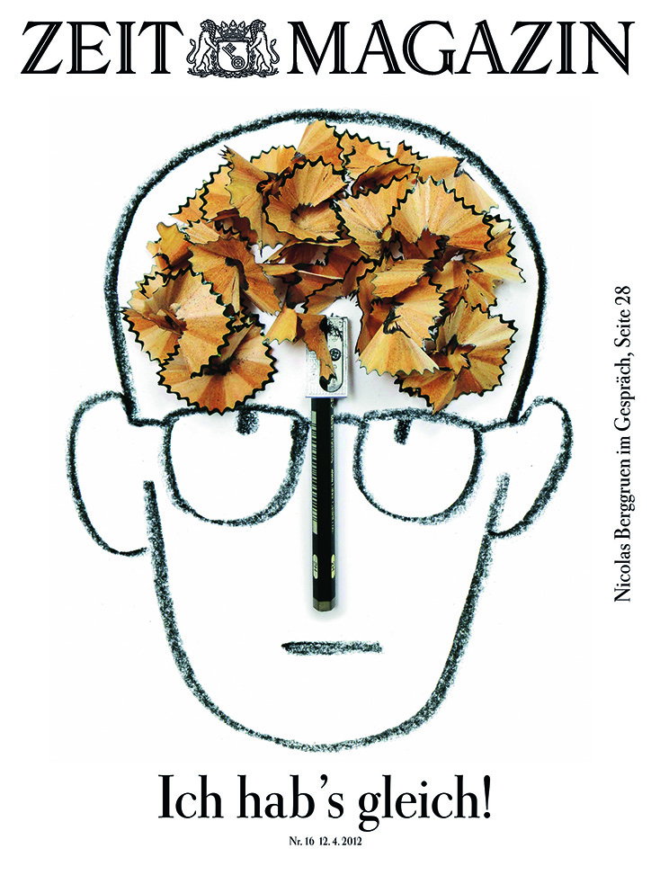
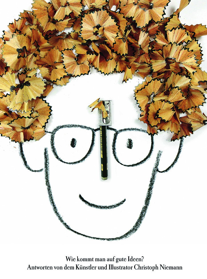
‘I almost have it!’ Two-part cover describing the process of creativity. Christoph Niemann, Germany, 2012. (page 31)
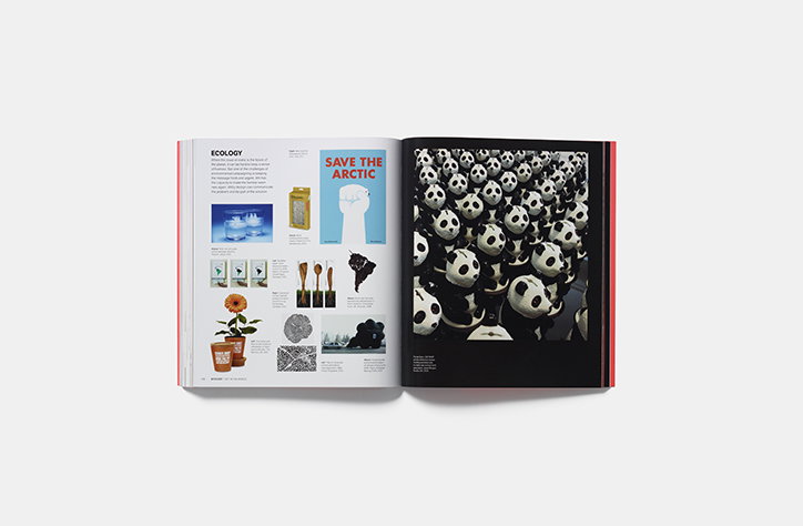
A Smile in the Mind: B. McAlhone & D. Stuart, G. Quinton & N. Asbury, published by Phaidon
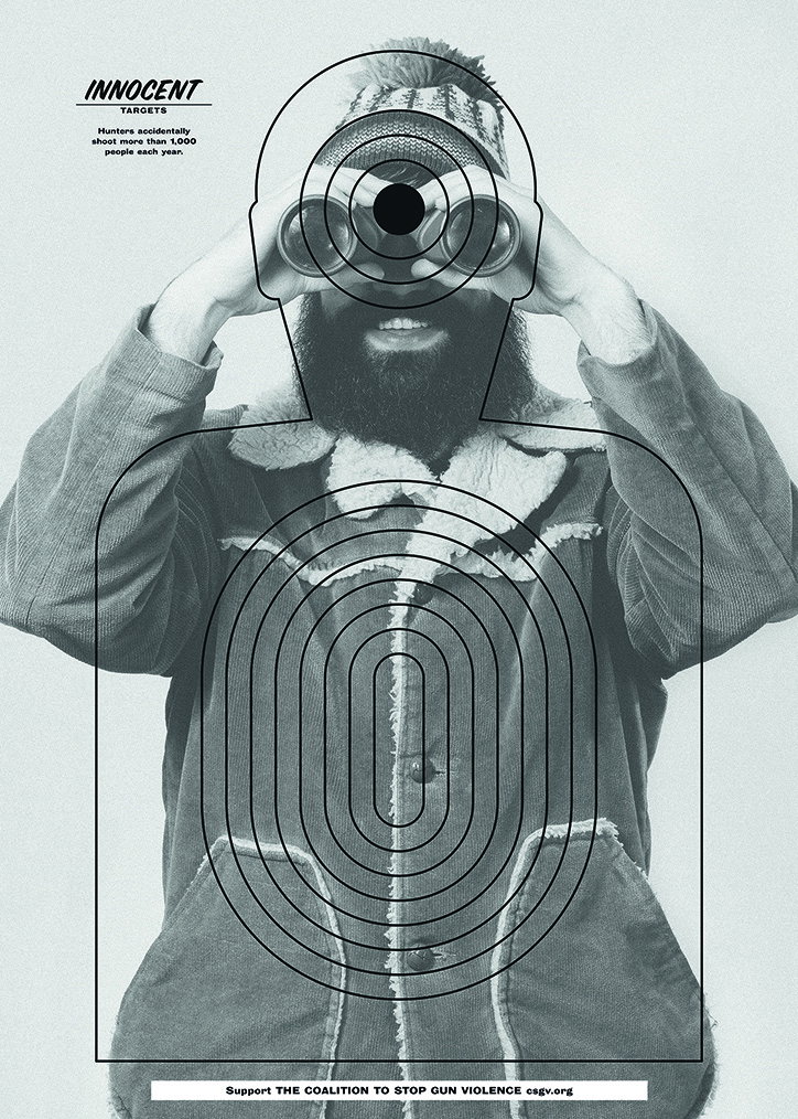
Innocent Targets: a series of posters highlighting the everyday victims of gun violence. Anthony Burrill, UK, 2014. Art director Ewoudt Boonstra; copywriter Zack MacDonald; photographer Robbie Augspurger; designer Anthony Burrill (page 33)
Ballet classes: tear off for details. Grupo Gallegos, USA, 2006. Creative directors Favio Ucedo/Juan Oubiña; art directors Curro Chozas/Paula Oliosi (page 50)
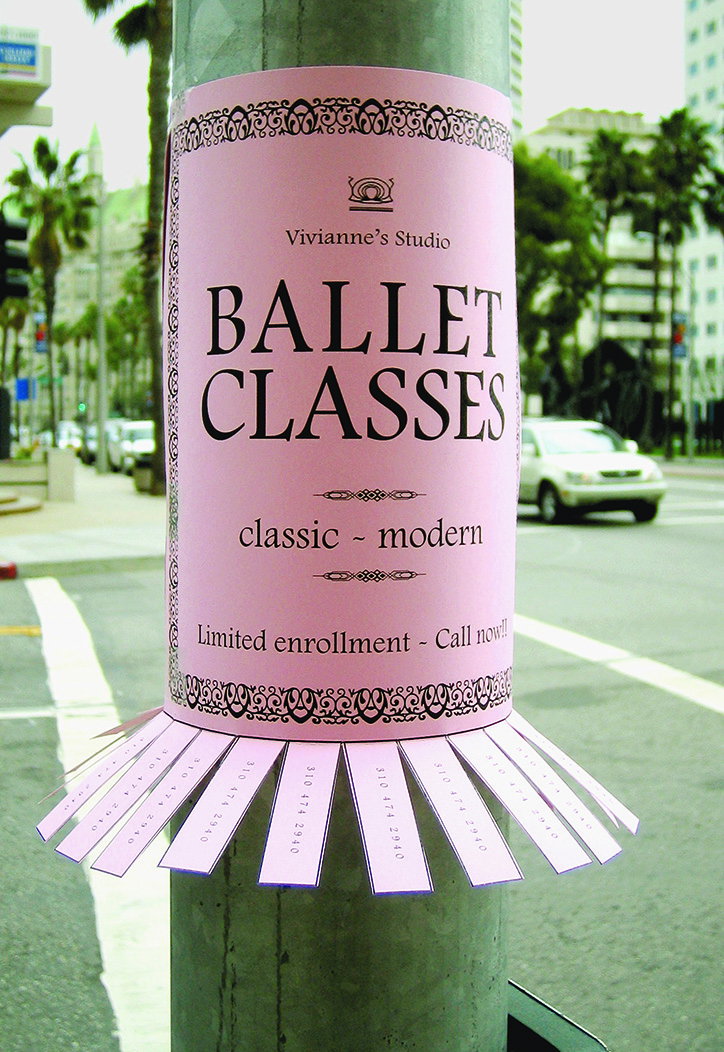
Ballet classes: tear off for details. Grupo Gallegos, USA, 2006. Creative directors Favio Ucedo/Juan Oubiña; art directors Curro Chozas/Paula Oliosi (page 50)
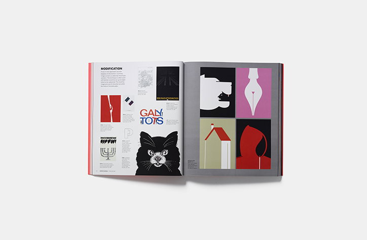
A Smile in the Mind: B. McAlhone & D. Stuart, G. Quinton & N. Asbury, published by Phaidon
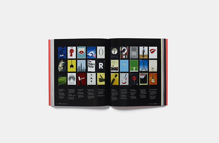
A Smile in the Mind: B. McAlhone & D. Stuart, G. Quinton & N. Asbury, published by Phaidon
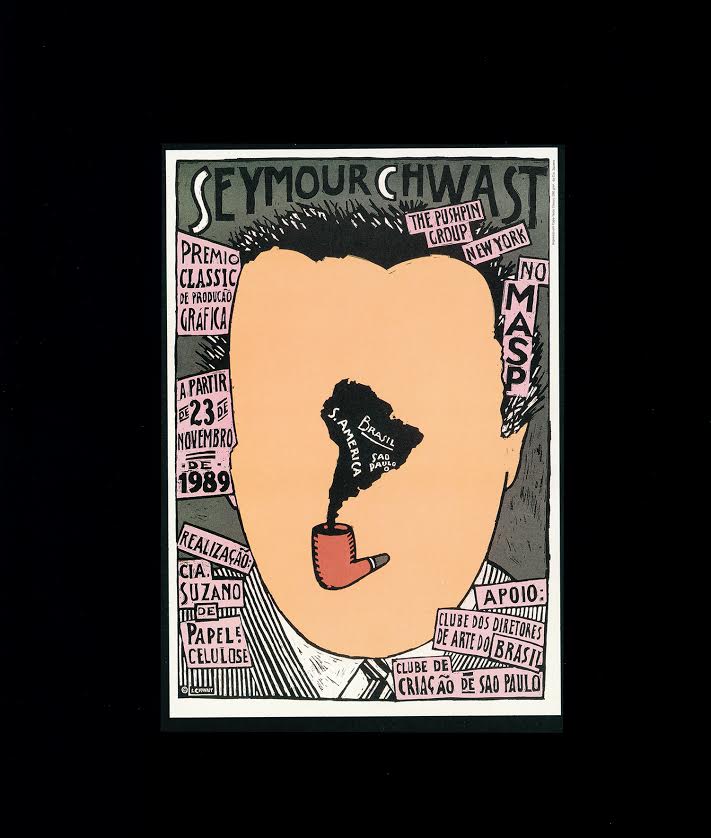
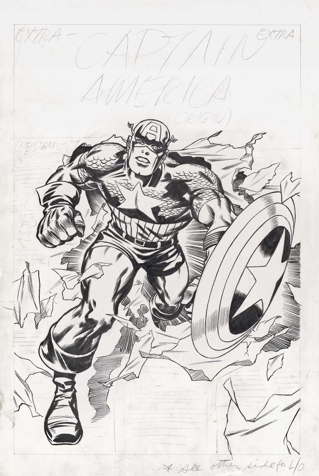
The Pushpin Group, USA, 1989.
Share Article
Further Info
About the Author
—
Billie studied illustration at Camberwell College of Art before completing an MA in Visual Communication at the Royal College of Art. She joined It’s Nice That as a Freelance Editorial Assistant back in January 2015 and continues to work with us on a freelance basis.