Launch Recite Me assistive technology
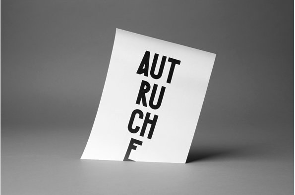
A white card stands tilted against a plain grey background. Bold black typography reads “AUTRUCHE”, with the letters stacked vertically.

Paris studio Akatre absolutely nail how to show off their typography talents

—
Date
3 August 2012

Being busy is apparently the new black, and fuelled by social media we are all at pains to point out how terribly full our lives are. As we breathlessly rush from social engagement to business meeting (stopping only to Tweet and tell the world) it seems that western society is afflicted by a desperate need to convince one another that our lives play out at breakneck speed.

Of course there’s another way to show how busy you’ve been and it’s a lot more straightforward. Do loads of stuff, update to your portfolio and repeat. That’s certainly how Paris studio Akatre seem to playing things and founders Valentin Abad, Julien Dhivert and Sébastien Riveron are doing it and doing it and doing it well. It’s worth spending some time on their site but we were particularly impressed by their typography work – not only do they produce interesting, great-looking fonts but they also document them in a wonderfully effective way. So nice one lads (although you’re probably too busy to read this)…
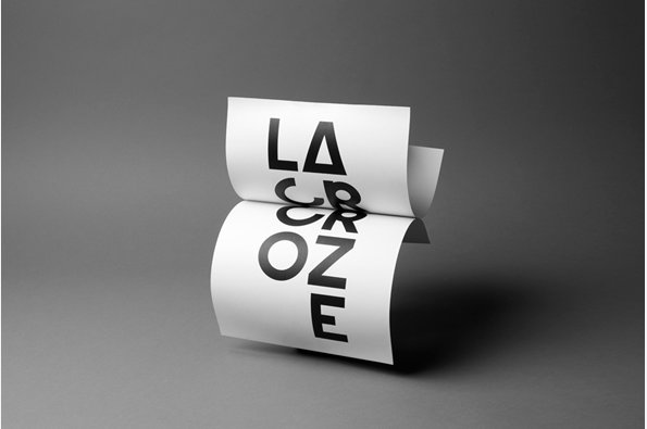
A piece of white paper curls into an S-shape against a grey background. Bold black typography across the folds reads “LACROZE”.
Above

Akatre: La Croze

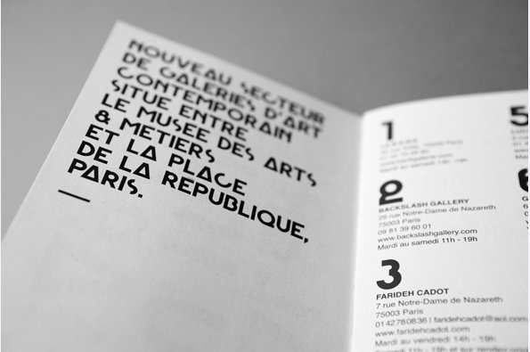
A close-up of an open booklet with bold, black typography on white paper. The left page reads “NOUVEAU SECTEUR DE GALERIES D’ART CONTEMPORAIN SITUE ENTRE LE MUSEE DES ARTS & METIERS ET LA PLACE DE LA REPUBLIQUE, PARIS.”
Above

Akatre: La Croze

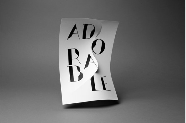
A piece of white paper is twisted into a spiral shape against a grey background. Bold black typography reads “ADORABLE”, with the letters curving and breaking across the folds.
Above

Akatre: Adorable

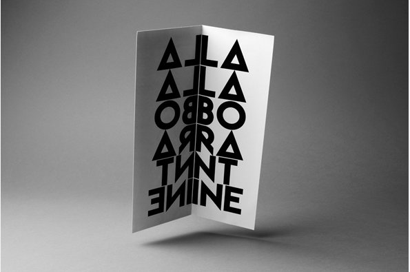
A folded white card stands upright against a grey background. Bold black typography is printed across the fold, creating a mirrored effect that reads “ONLINE” at the bottom.
Above

Akatre: la Laborantine

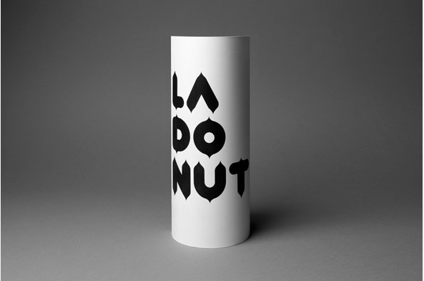
A white cylindrical container features bold, black typographic branding. The stylised text reads “LA DO NUT” stacked vertically.
Above

Akatre: La Donut

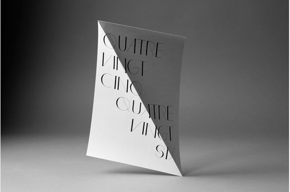
A white card stands upright against a grey background, folded diagonally to create a sharp crease. Black typographic text reads “QUATRE VINGT CINQ” on the left and “QUATRE VINGT SIX” on the right.
Above

Akatre: Typo

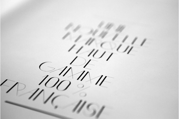
A close-up of black typography on white paper, shot at a shallow angle. The text reads “HAUT DE GAMME 100% FRANÇAISE”, with other words blurred in the background.
Above

Akatre: Typo

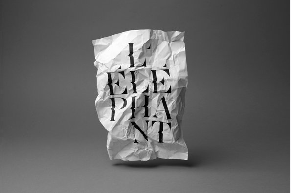
A piece of crumpled white paper floats against a grey background. Bold black serif text across the paper reads “ELEPHANT”, though the letters are distorted by the folds.
Above

Akatre: Le Elephant

Share Article

Further Info

About the Author

Rob Alderson

—

Rob Alderson is a freelance writer, editor and strategist. He was previously editor-in-chief of It’s Nice That and WePresent, and editor of Design Week. He publishes the newsletter Undo, which tries to make sense of how AI is changing design work, the design process and the design industry.


It's Nice That Newsletters

Fancy a bit of It's Nice That in your inbox? Sign up to our newsletters and we'll keep you in the loop with everything good going on in the creative world.