



Launch Recite Me assistive technology
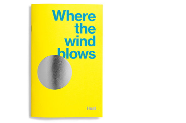
A bright yellow book cover features the title “Where the wind blows” in blue typography. A large, textured silver circle sits below the text, with the word “Heat” in small white type at the bottom.

The world's busiest man? Alex Fuller's super-busy creating awesome graphic design

—
Date
16 October 2012

By day Alex Fuller can be found plying his trade at the Leo Burnett Dept. of Design creating elegant solutions to commercial design problems and producing a variety of in-house material. By afternoon/evening he’s one of seven partners at The Post Family studio. By night he can be found creating illustrations for yet another outfit; Illustrtation Corporation. At other times (in those few spare hours before dawn perhaps) he’s the co-founder of 5×7 publishing and rumour has it he still finds time to play guitar, ride bikes and eat steak.

How this man even finds time to breathe is beyond us but whatever his secret, he’s got an undeniable talent for creating visual communication in all sorts of shapes and sizes. Here for your delectation is just one of many stunning projects available to peruse on his site – a self-initiated promotional project for Leo Burnett that explores the theme of heat. It’s an absolute sizzler of a publication, but we still recommend you check out Alex’s site to learn more of this talented man.
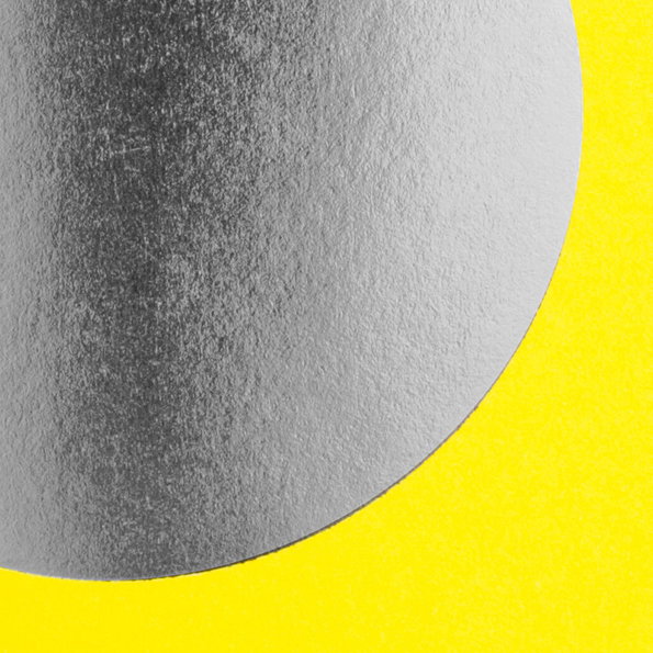
A close-up of a textured silver circle set against a bright yellow background. The metallic surface has a grainy, matte finish.
Above

Alex Fuller: Where The Wind Blows, Heat
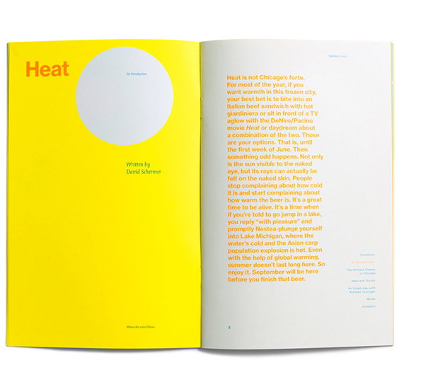
An open book with a bright yellow left page and a white right page. The yellow page features the word “Heat” in bold orange type and a large white circular cutout.
Above

Alex Fuller: Where The Wind Blows, Heat
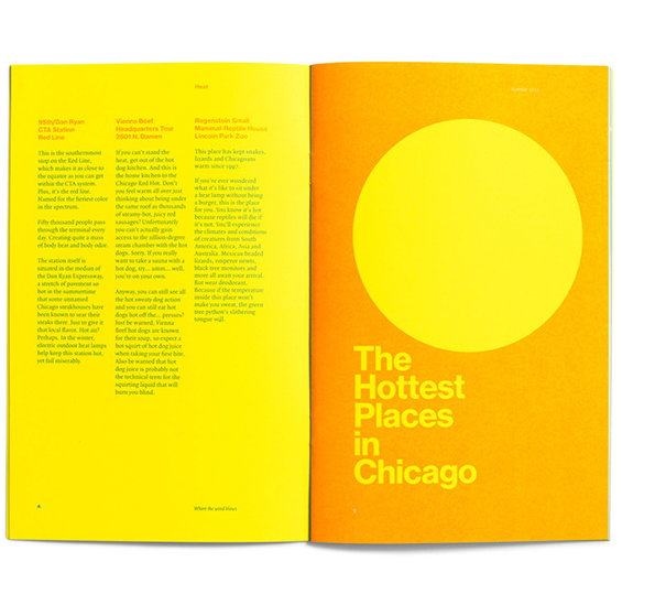
An open book with bright yellow pages. The right page features a large yellow circle and the title “The Hottest Places in Chicago”.
Above

Alex Fuller: Where The Wind Blows, Heat
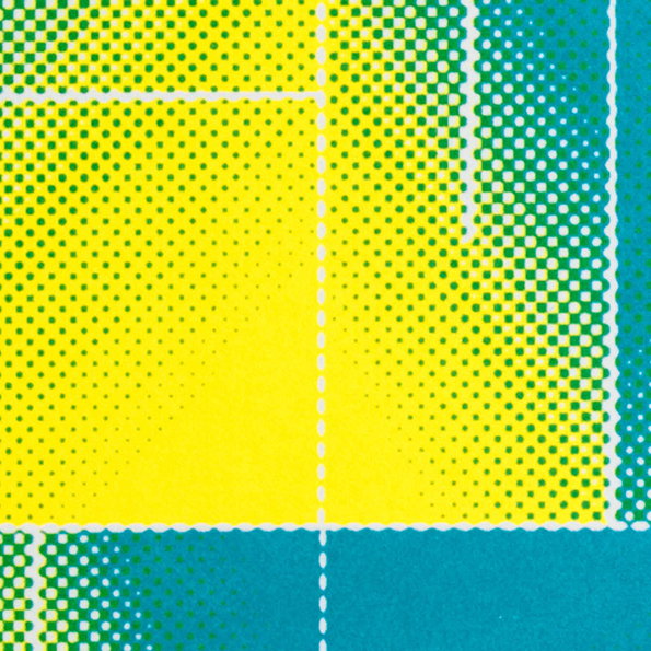
An abstract print featuring a grid of halftone dots in yellow, green and blue. White dashed lines divide the composition into irregular rectangular sections.
Above

Alex Fuller: Where The Wind Blows, Heat
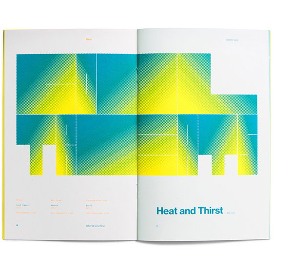
An open magazine spread featuring a bold, abstract graphic in blue and yellow. The image uses a halftone dot pattern to create gradients across geometric shapes. Below the graphic, the title “Heat and Thirst” is printed in a blue sans-serif typeface.
Above

Alex Fuller: Where The Wind Blows, Heat
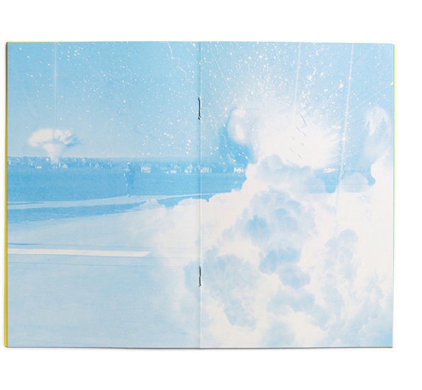
An open book shows a wide photograph of a bright blue landscape. A large, white plume of smoke or steam erupts in the foreground, with a small figure standing in the distance.
Above

Alex Fuller: Where The Wind Blows, Heat
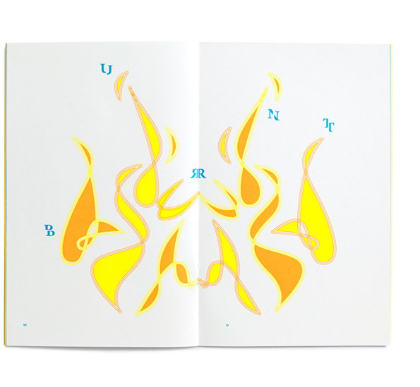
An illustration across two open book pages shows abstract, swirling yellow and orange shapes resembling flames. Blue letters are scattered around the forms, spelling “BURNT” in a stylised font.
Above

Alex Fuller: Where The Wind Blows, Heat
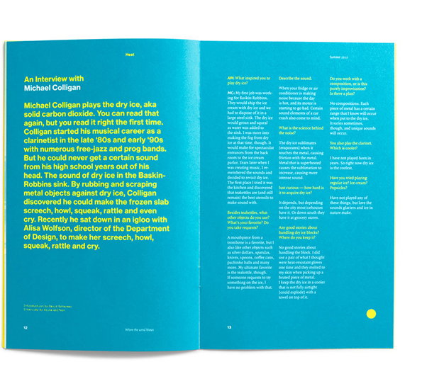
An open magazine spread featuring an interview with Michael Colligan. The left page contains a bold headline “An Interview with Michael Colligan” and an introductory paragraph, while the right page is laid out in three columns of Q&A text.
Above

Alex Fuller: Where The Wind Blows, Heat
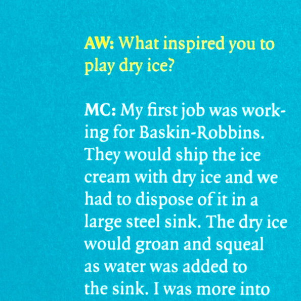
A bright blue background features a text excerpt from an interview. A question from “AW” asks what inspired the subject to “play dry ice”, followed by a response from “MC” about their first job at Baskin-Robbins.
Above

Alex Fuller: Where The Wind Blows, Heat
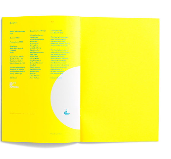
An open book with bright yellow pages. The left page contains columns of small blue text under the heading “Colophon”, with a large white circle at the bottom.
Above

Alex Fuller: Where The Wind Blows, Heat
A minimalist graphic divided by a curved line into a bright yellow section and a white section. A small blue line drawing of a sailboat sits in the white area, with the text “Where the wind blows” in the yellow.
Above

Alex Fuller: Where The Wind Blows, Heat

Share Article

Further Info

About the Author

James Cartwright

—

James started out as an intern in 2011 and came back in summer of 2012 to work online and latterly as Print Editor, before leaving in May 2015.


It's Nice That Newsletters

Fancy a bit of It's Nice That in your inbox? Sign up to our newsletters and we'll keep you in the loop with everything good going on in the creative world.