




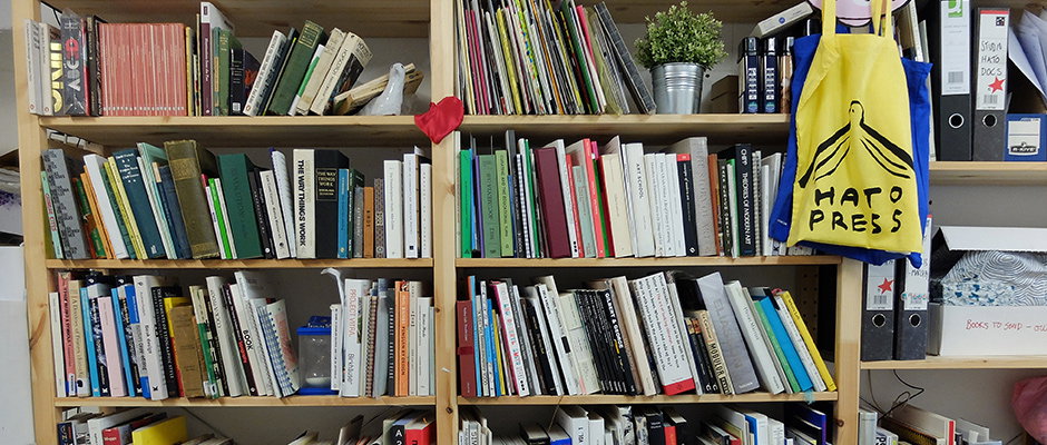
The Bookshelf of London-Based printers/publishers/creatives Hato Press
Yay! Hato Press! We love them. A lot. Neighbours of ours, Hato have spent the last five years collaborating with some of the coolest young creatives and oldest institutions to create impeccably beautiful printed matter and design solutions. A number of the publications these guys have produced are some of the most beautiful I’ve ever had the pleasure of holding/smelling, and it seems that every single thing they do or work on is covered in a glimmering magic dust that is exclusive to only them. Before you go and wet your pants over their multi-disciplinary work on their very nice websites (here and here) check out the books that have inspired them over the years below. Enjoy!
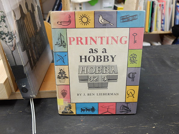
J. Ben Lieberman: Printing as a Hobby
J. Ben Lieberman: Printing as a Hobby
We saw this book at St Bride’s Library whilst researching a project. The library is an amazing space, we once had the opportunity to go into the archives and browse through all the books and found some amazing items including original sketches by Eric Gill as well as this book. At the time we found it we had only just set up Hato Press so the book seemed to fit in well with our new found hobby.
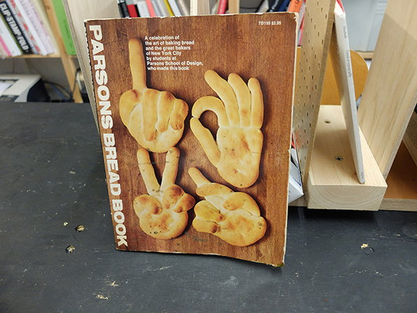
Parsons School of Design: Parsons Bread book
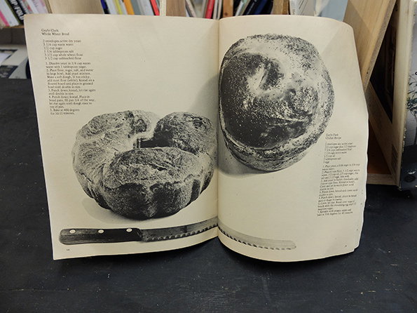
Parsons School of Design: Parsons Bread book
Parsons School of Design: Parsons Bread book
We found this while trawling through an old web archive, and bought it on eBay for 50p, its amazing how cheap some books can go for. It documents the New York baking scene in the 1970’s as well as a range of recipes of breads for a range of occasions, from Mother’s Breads to Party Breads to plain White Bread. Simply put it’s for people who love bread. The book is also available to view here.
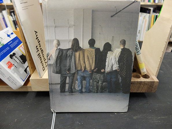
Jan Family: Plans for other days
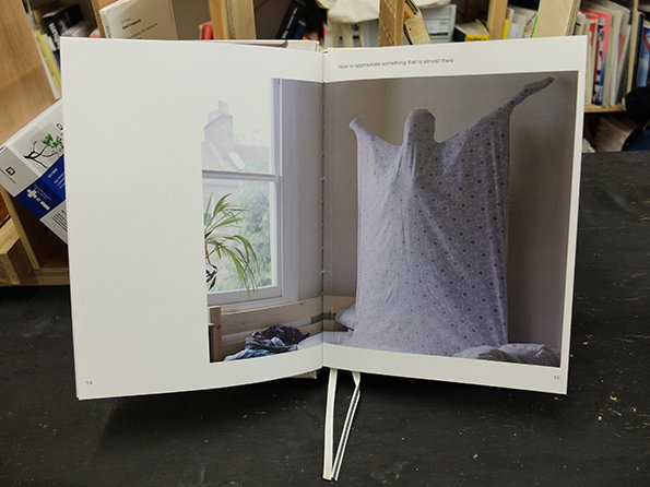
Jan Family: Plans for other days
Jan Family: Plans for other days
This book was given to us by Makin the Jan Ma from Jan Family, they were a group of designers and artists that used to lived together in a building on Kingsland Road. The book is a collection of everyday interventions undertaken by them and it makes us smile everytime we dip into it. To quote from the back cover because we honestly don’t think we can put it better: “This book suggests, it doesn’t dictate. It is a list of proposals on how to relate to our surroundings. A manual of moments…”
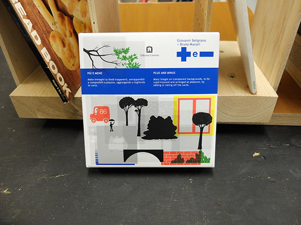
Bruno Munari: Plus and Minus
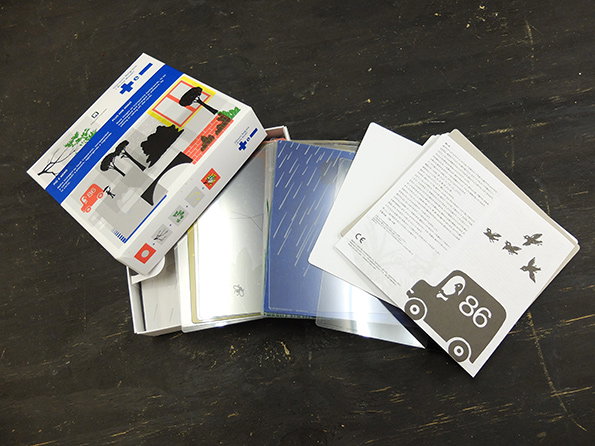
Bruno Munari: Plus and Minus
Bruno Munari: Plus and Minus
We were given this book by a friend of ours Momoko Mizutani. She runs a shop called Momosan which used to be on Kingsland Road next to the Jan building. This may be cheating as it’s not strictly a book, but Bruno Munari’s Plus and Minus is intended for children as a game to create their own scenes and narratives by superimposing beautifully illustrated transparent plates. Munari’s work is a constant inspiration for us, each time we look back at his works we find another masterpiece.
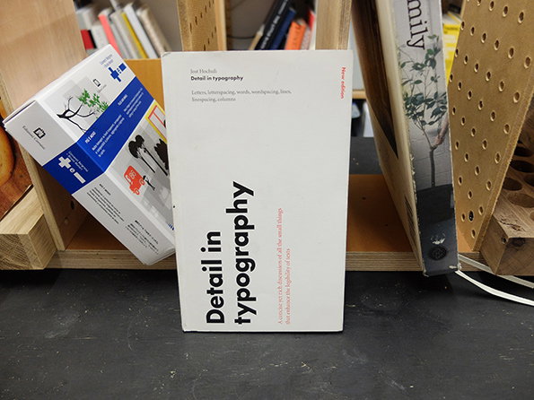
Jost Hochuli: Detail in Typography
Jost Hochuli: Detail in Typography
Our typography tutor lent us this book while we were still studying and we bought a copy soon after we graduated. We couldn’t recommend this book any higher to anyone who wants to learn more about typography. Of course there are a number of other very well-written publications on the subject, but we have found this to be concise, and extremely easy to read. It is a great reference book when you’re typesetting. Sadly it’s currently out of print but can be found from certain PDF websites.
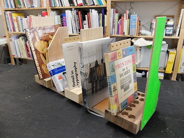
Hato Press: Books displayed on a stackable book system developed in collaboration with Michael Marriott Studio.
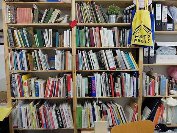
Hato Press: Bookshelf
Share Article
Further Info
About the Author
—
Liv joined It’s Nice That as an intern in 2011 and worked across online, print and events, and was latterly Features Editor before leaving in May 2015.


