Briefcase celebrates 20 years of Czech typeface design with new book Typo 9010
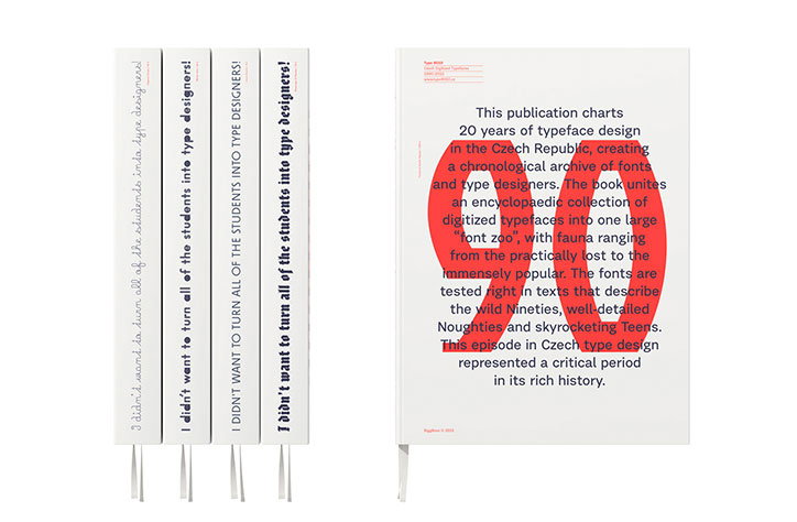
Capturing significant moments from the Czech Republic’s oldest type design studio, new book Typo 9010, brainchild of Tomáš Brousil of independent type foundry Briefcase, celebrates digitised Czech typefaces from 1990 to 2010 by uniting them as an encyclopaedic collection.
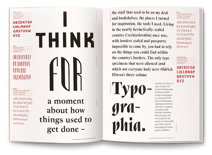
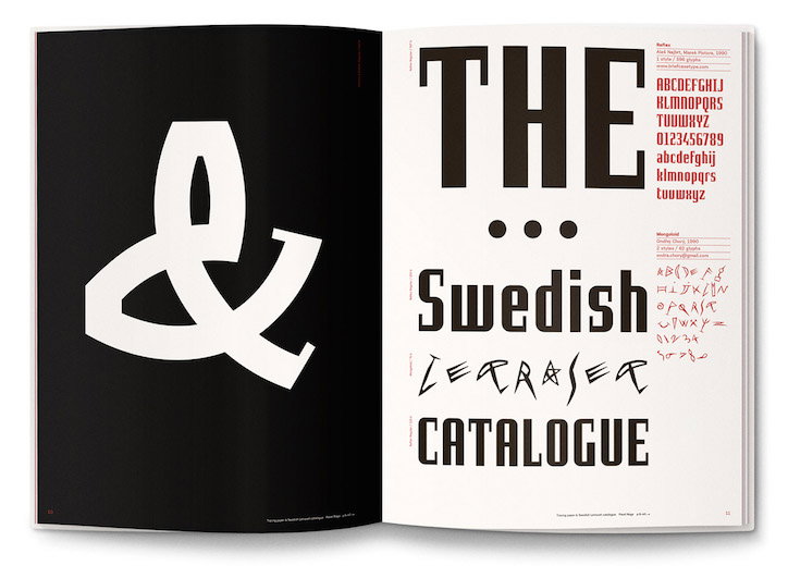
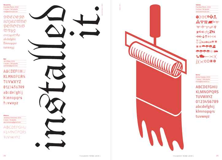
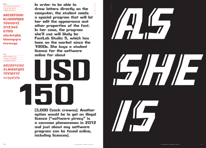
Typo 9010’s designers Zuzana Lednická and Radek Sidun present Czech type design and its digital beginnings by combining 399 digitised typefaces and short texts from typographers narrating the atmosphere of Prague’s Academy of Arts, Architecture and Design at the tipping point of the digitised type revolution.
Illustrated pages and consistently varied layouts reflect and complement the vast and varied collection of typefaces created by Czech type designers in the last 20 years. Typo 9010’s editor Petra Dočekalová and his team have researched and sourced a huge range of typefaces, having even discovered some on obsolete formats such as floppy disks, to curate this fascinating catalogue of typefaces from the obscure to the immensely popular.
Briefcase: Typo 9010
Briefcase: Typo 9010
Briefcase: Typo 9010
Briefcase: Typo 9010
Share Article
Further Info
About the Author
—
Milly Burroughs (@millyburroughs2.0) is a Berlin-based writer and editor specialising in art, design and architecture. Her work can be read in magazines such as AnOther, Dazed, TON, Lux, Elephant, Hypebeast and many more, as well as contributing to books on architecture and design from publishers Gestalten and DK. She is It’s Nice That’s Berlin correspondent.