Brighten the Corners live up to their name with this colour-saturated annual report
The words “annual report” conjure up images of grey men in grey suits compiling charts and graphs on grey paper ready to be distributed to grey clients in a decidedly grey world. Pretty darned grey – and I can’t be the only one that thinks this. There must be thousands of offices worldwide churning out these drab documents every year.
International lighting giants Zumtobel have clearly gotten wise to this phobia of tedious corporate documents and decided to buck the trend, commissioning Brighten the Corners and Anish Kapoor (no big deal) to produce a sensationally designed double-volume that utilises no less than ten overlaid neon inks. Take that grey!
In one volume, the meat of the report is discussed – the highs, the lows, the challenges overcome – and in the second we’re treated to an explosion of neon solar flares that leap from the page. We’re at a loss as to how this magnificent volume was printed, suffice to say whoever was responsible knows their Heidelberg inside out. Incredible work from everyone involved. Now let’s just hope more annual reports start to look this good.
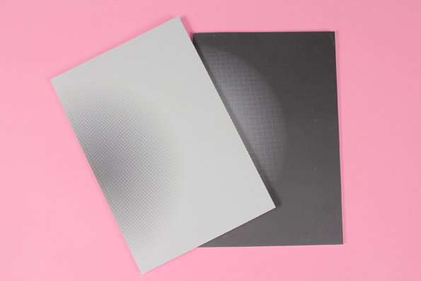
Brighten the Corners & Anish Kapoor: Zumtobel Group Annual Report
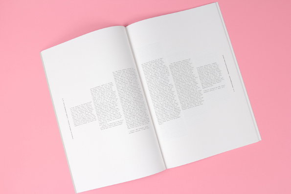
Brighten the Corners & Anish Kapoor: Zumtobel Group Annual Report
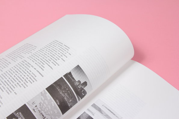
Brighten the Corners & Anish Kapoor: Zumtobel Group Annual Report
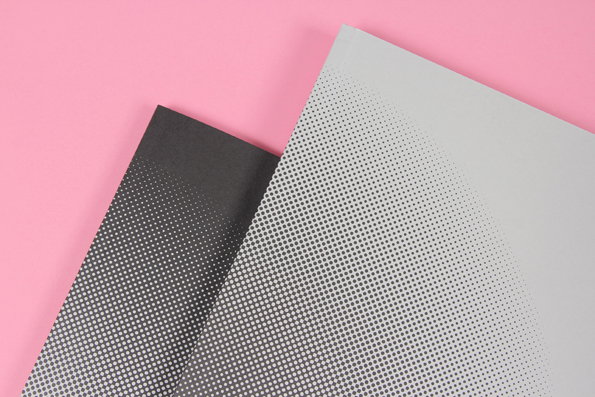
Brighten the Corners & Anish Kapoor: Zumtobel Group Annual Report

Brighten the Corners & Anish Kapoor: Zumtobel Group Annual Report
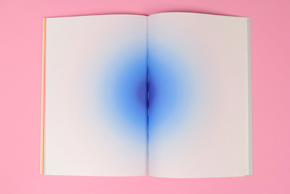
Brighten the Corners & Anish Kapoor: Zumtobel Group Annual Report
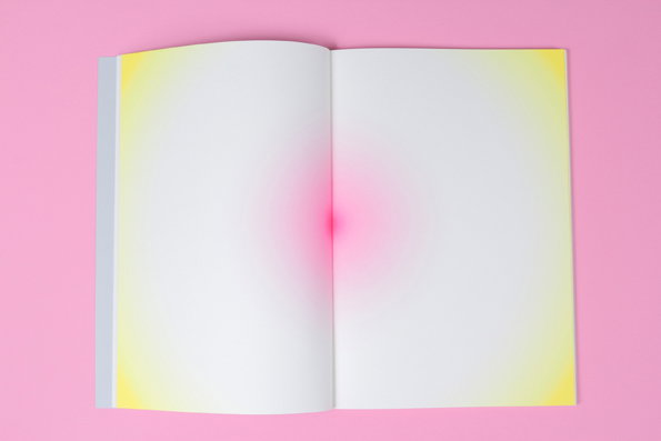
Brighten the Corners & Anish Kapoor: Zumtobel Group Annual Report

Brighten the Corners & Anish Kapoor: Zumtobel Group Annual Report

Brighten the Corners & Anish Kapoor: Zumtobel Group Annual Report

Brighten the Corners & Anish Kapoor: Zumtobel Group Annual Report
Share Article
Further Info
About the Author
—
James started out as an intern in 2011 and came back in summer of 2012 to work online and latterly as Print Editor, before leaving in May 2015.