Launch Recite Me assistive technology
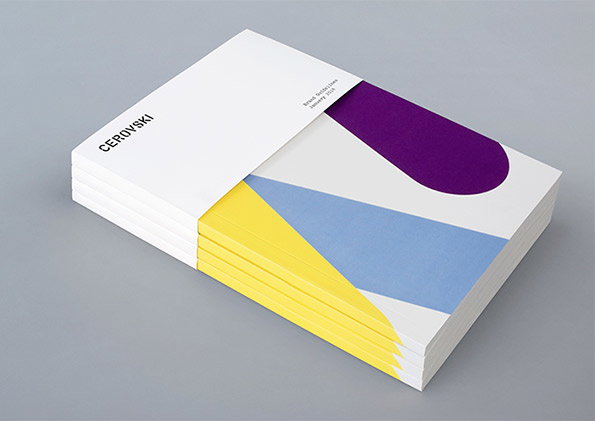
A stack of brand guideline booklets on a grey background. The top cover features the word “Cerovski” and abstract shapes in purple, blue and yellow.

Graphic Design: Bunch create great identity for Croatian print studio Cervoski

—
Date
10 February 2014

Last October we sang the praises of London/Zagreb-based studio Bunch, and by jove they’ve proved their graphic design talents yet again. They were commissioned to produce a brand identity for Cervoski, a Croatian print production studio which articulates its core skills as “nebulous finishing, microscopic editions, absurd materials and crazy deadlines.”

Needing the visual vernacular to work across everything from stationery to iPad apps, mugs to T-Shirts, Bunch set about developing an identity which could be both coherent and flexible. “The utility of the logotype and typeface provide a cohesive foundation for a wealth of material choices and print finishes,” they say. “These include metallic and white inks, dyed and unbleached boards and papers, die cuts, debossed clear foils, open stitching and over-print details.”

We think you’ll agree they’ve succeeded in some style too. Thanks a Bunch.
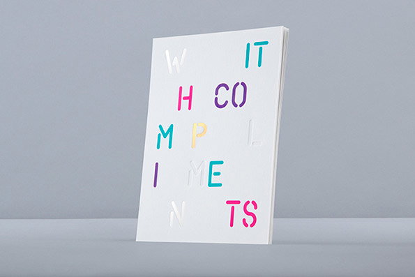
A white notebook stands against a grey background. The cover features the words “with compliments” in a scattered, multi-coloured typographic arrangement.
Above

Bunch: Cervoski identity

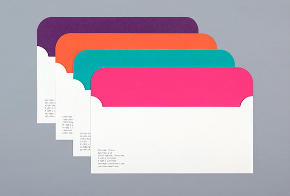
Four open envelopes in purple, orange, teal and pink are layered against a grey background. Each white envelope features a block of small, aligned text in the bottom left corner.
Above

Bunch: Cervoski identity

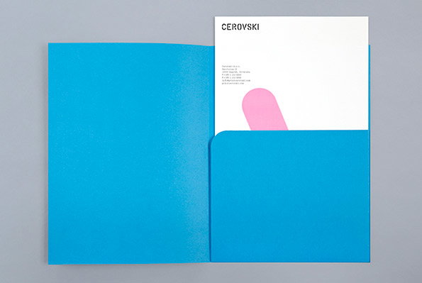
A bright blue folder lies open on a grey surface. Tucked inside is a white card featuring the word “Cerovski” and a pink abstract shape.
Above

Bunch: Cervoski identity

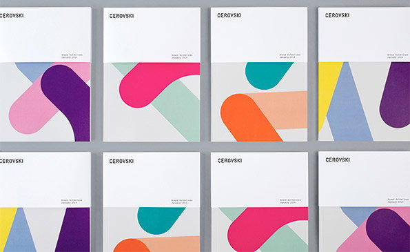
Eight white booklets are arranged in two rows of four. Each cover features the word “Cerovski” at the top and a different composition of bold, colourful abstract shapes.
Above

Bunch: Cervoski identity

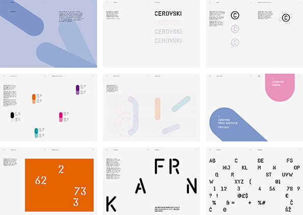
A grid of nine graphic design slides showcasing a visual identity. The layouts feature a mix of bold typography, abstract rounded shapes in pastel tones, and a character set.
Above

Bunch: Cervoski identity

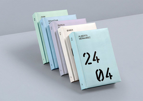
Five slim books in pale pastel colours lean against each other on a grey surface. The front book is light blue and reads “ALBERTO HERNANDEZ” above the handwritten numbers “24 04”.
Above

Bunch: Cervoski identity

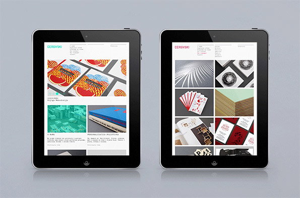
Two tablets display a minimalist portfolio website for “Cerzyski”. The screens show a grid of design projects, including bold graphic prints and a blue book.
Above

Bunch: Cervoski identity

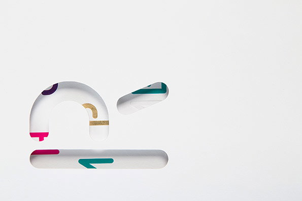
A 3D render of a white, rounded lowercase “n” shape set against a plain light grey background. The letter is hollowed out, revealing colourful abstract patterns in pink, teal and gold inside.
Above

Bunch: Cervoski identity

Share Article

About the Author

Rob Alderson

—

Rob Alderson is a freelance writer, editor and strategist. He was previously editor-in-chief of It’s Nice That and WePresent, and editor of Design Week. He publishes the newsletter Undo, which tries to make sense of how AI is changing design work, the design process and the design industry.

It's Nice That Newsletters

Fancy a bit of It's Nice That in your inbox? Sign up to our newsletters and we'll keep you in the loop with everything good going on in the creative world.