Launch Recite Me assistive technology
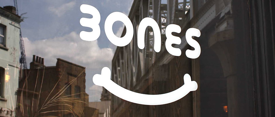
A white graphic of the word “BONES” is laid over a reflection of city buildings and a cloudy sky. A curved line with rounded ends sits beneath the text, forming a smile.

London's Burgess Studio produce great identity for Shoreditch restaurant

—
Date
17 October 2014

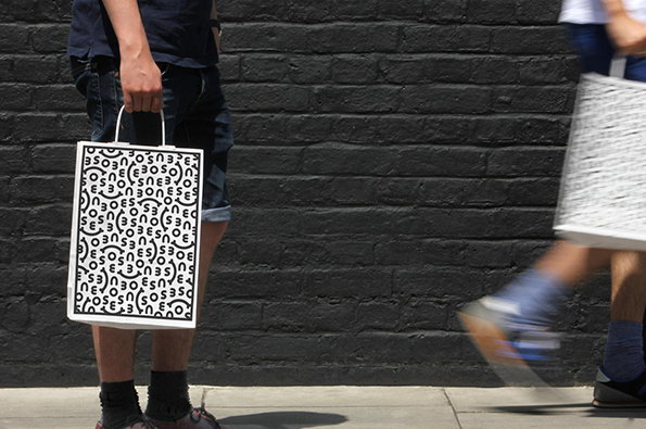
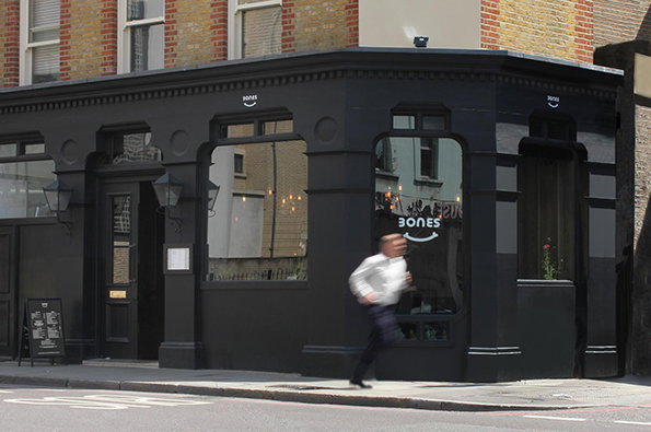
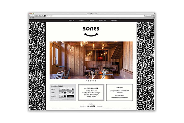
When it comes to a trendy commission, a restaurant in east London that serves everything on the bone is right up there. Credit is due then to Burgess Studio, whose identity for the eatery doesn’t take itself too seriously. Built around a nice typographic wordmark and the simple idea of making the all-important bone into a smile, the look and feel rolls out seamlessly across everything from bags to cups, menus to the website. It’s simple, it’s striking and it steers well clear of some kind of terrible hipster overload, all of which is to be very much commended.
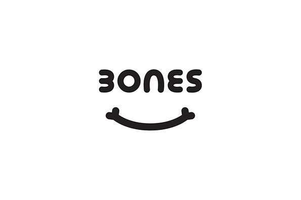
A black logo on a white background reads “BONES” in a rounded, bold typeface. Below the text is a curved line shaped like a smile, with bone-like ends.
Above

Burgess Studio: Bones identity

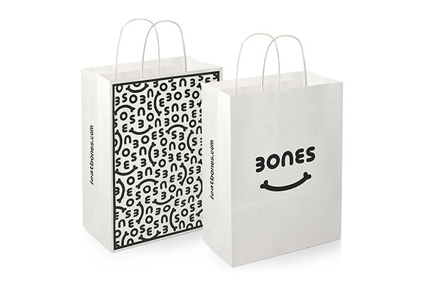
Two white paper shopping bags with white handles. One bag features a black logo that reads “Bones” above a curved smile, while the other is covered in a repeating pattern of the same logo.
Above

Burgess Studio: Bones identity

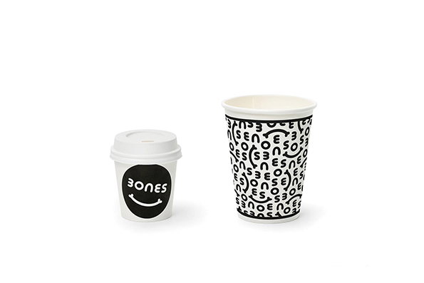
Two white coffee cups against a plain white background. The smaller cup has a lid and a black circular logo featuring the word “Bones” above a smile. The larger cup is covered in a repeating pattern of the same “Bones” smile logo.
Above

Burgess Studio: Bones identity

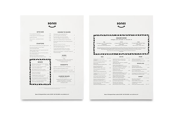
Two pages of a minimalist menu for a restaurant called “Bones”. The first page lists food categories including “Bite Size”, “Starters” and “Desserts”, while the second page features a “House Wine” section and a detailed wine list.
Above

Burgess Studio: Bones identity

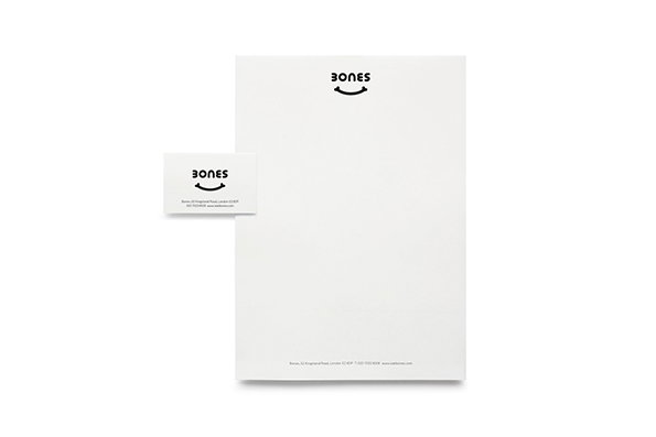
A business card and a sheet of letterhead are laid out against a white background. Both feature a black logo consisting of the word “Bones” above a curved line.
Above

Burgess Studio: Bones identity

A person stands against a dark brick wall, holding a white shopping bag. The bag is covered in a black typographic pattern that repeats the word “nonsense”.
Above

Burgess Studio: Bones identity

A matte black storefront with large windows and a dark door. A blurred figure of a person runs past the building, which features the word “Bones” and a smile logo on the glass.
Above

Burgess Studio: Bones identity

A website layout for a restaurant called “Bones”. A central photograph shows a moody, wood-panelled dining room with warm lighting and leather booths. Below the image are sections for booking a table, opening hours and contact details.
Above

Burgess Studio: Bones identity

Share Article

About the Author

Rob Alderson

—

Rob Alderson is a freelance writer, editor and strategist. He was previously editor-in-chief of It’s Nice That and WePresent, and editor of Design Week. He publishes the newsletter Undo, which tries to make sense of how AI is changing design work, the design process and the design industry.


It's Nice That Newsletters

Fancy a bit of It's Nice That in your inbox? Sign up to our newsletters and we'll keep you in the loop with everything good going on in the creative world.