Launch Recite Me assistive technology
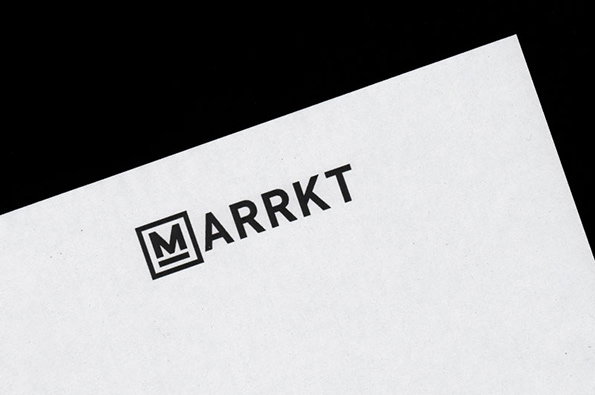
A black logo on a white textured paper background reads “MARRKT”. The first letter is enclosed in a square frame.

Graphic Design: Beautiful business cards and logomarks from Catalogue

—
Date
14 June 2013

Catalogue are a Leeds-based design studio founded in 2010. Over three short years they’ve worked on some stunning projects for a variety of international clients, boutique London enterprises and even (less sexy perhaps) Leeds City Council. They’re also responsible for Library Paper, a biannual catalogue of impeccable graphic design and writing. Like many of their contemporaries they’ve also worked on a lot of bread-and-butter type branding projects, creating logotypes and business cards for all manner of enterprises. It’s these we’re focussing on this time, but rest assured we’ll be back to write about Catalogue again when the time is right.
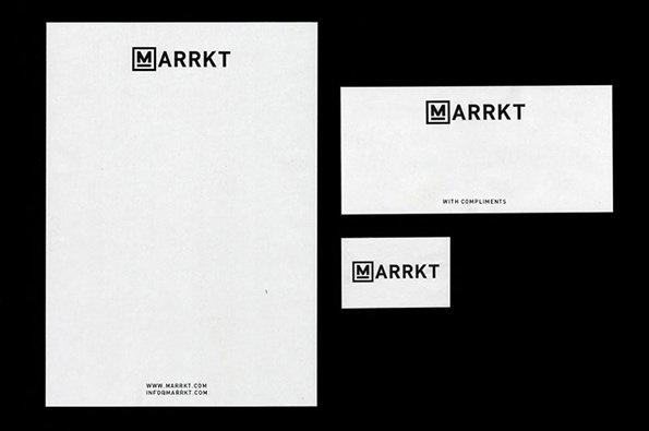
Stationery branding for Marrkt, featuring a letterhead, a compliments slip and a business card on a black background. Each white item displays the “Marrkt” logo in a bold, black sans-serif typeface.
Above

Catalogue Studio: Maarkt Identity

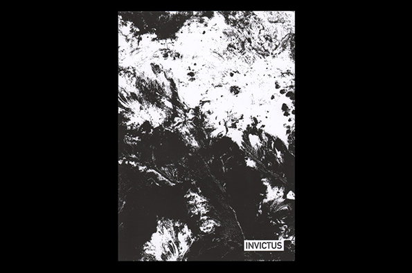
A high-contrast black and white image featuring an abstract, textured pattern of organic shapes. In the bottom right corner, a small white box contains the word “Invictus”.
Above

Catalogue Studio: Invictus Identity

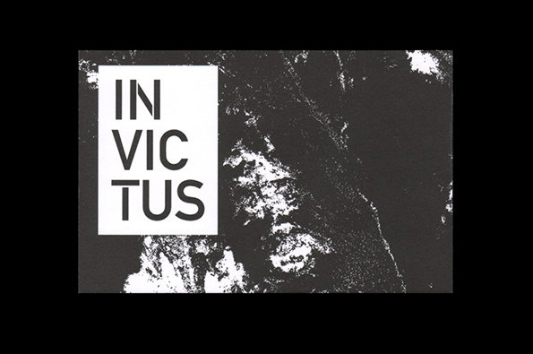
A black and white image featuring a grainy, abstract texture resembling a satellite view of land and sea. A white rectangular block on the left contains the word “INVICTUS” split across three lines.
Above

Catalogue Studio: Invictus Identity

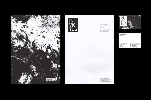
A black and white brand identity for “Invictus”, featuring a folder, letterhead and business cards. The design uses a bold, sans-serif typeface and high-contrast, abstract organic textures.
Above

Catalogue Studio: Invictus Identity

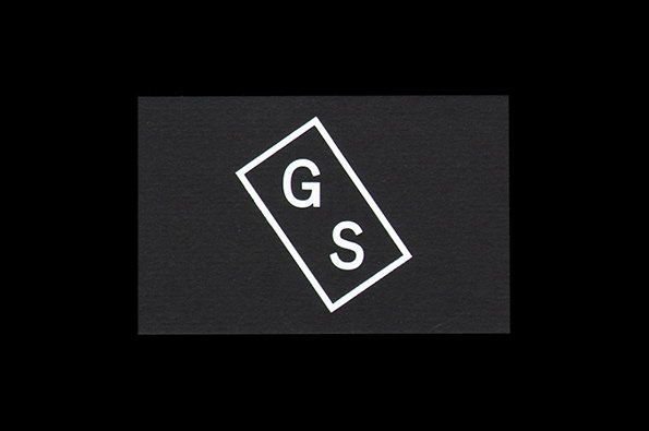
A white outlined rectangle tilted at an angle on a dark grey background. Inside the shape are the letters “G” and “S” in a white serif typeface.
Above

Catalogue Studio: Giles Smith Identity
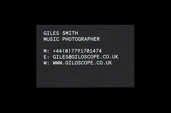
A black business card with white sans-serif text. It reads “Giles Smith Music Photographer” followed by a phone number, email and the website “www.giloscope.co.uk”.
Above

Catalogue Studio: Giles Smith Identity
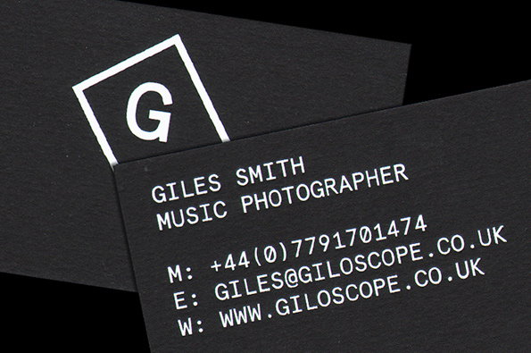
Two black business cards with white text. One shows a logo of a capital “G” inside a square, while the other reads “Giles Smith Music Photographer” followed by a phone number, email and website.
Above

Catalogue Studio: Giles Smith Identity
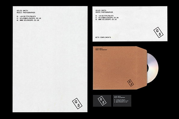
A stationery set for music photographer Giles Smith, featuring a letterhead, a “with compliments” card, and a brown kraft envelope. Each item is branded with a minimalist “GS” logo inside a diamond shape.
Above

Catalogue Studio: Giles Smith Identity

Share Article

About the Author

James Cartwright

—

James started out as an intern in 2011 and came back in summer of 2012 to work online and latterly as Print Editor, before leaving in May 2015.


It's Nice That Newsletters

Fancy a bit of It's Nice That in your inbox? Sign up to our newsletters and we'll keep you in the loop with everything good going on in the creative world.