A forward-minded retrospective: behind the design of the massive Cedric Price monograph
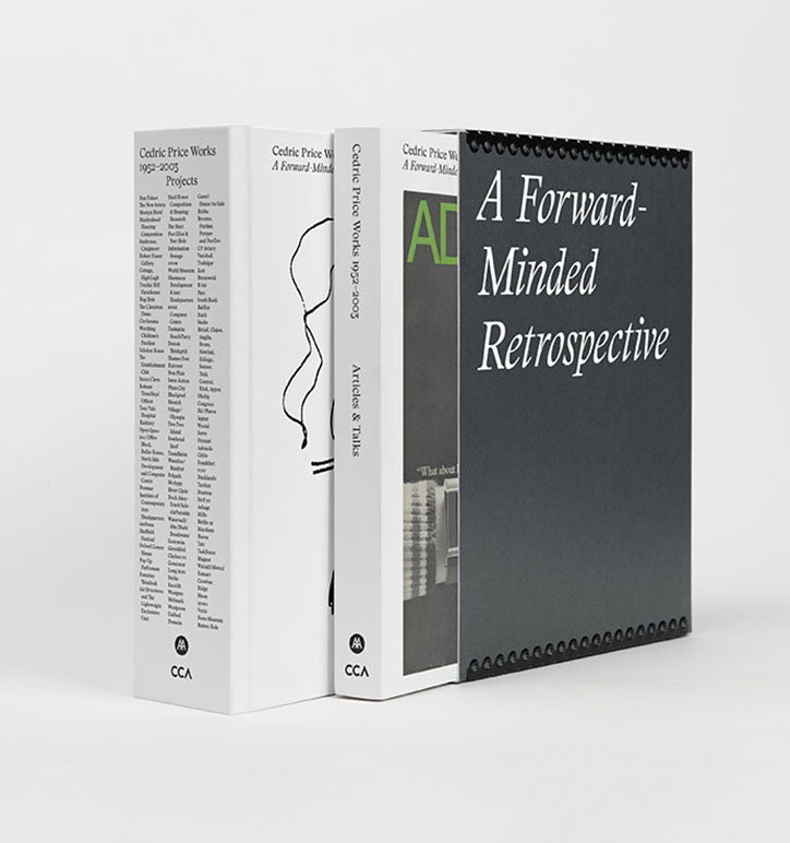
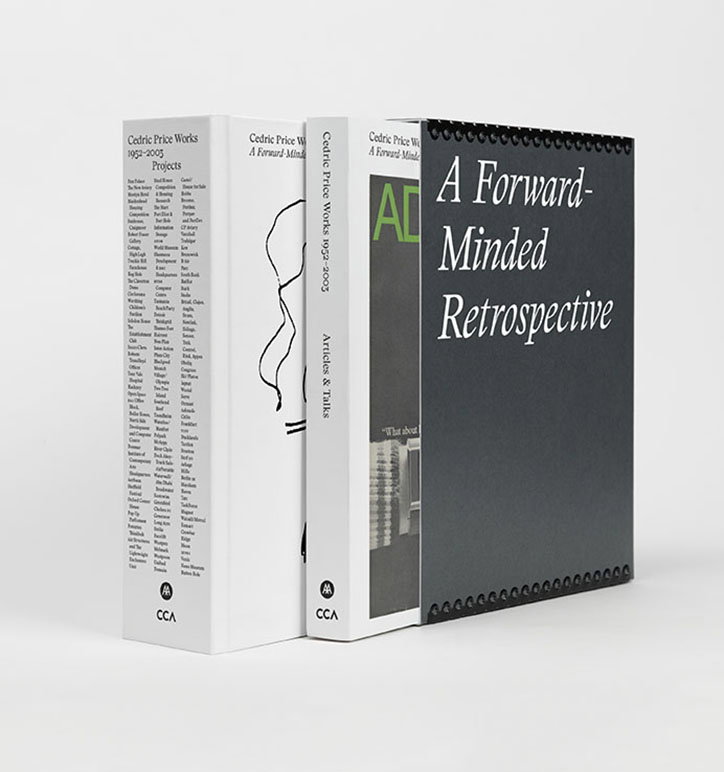
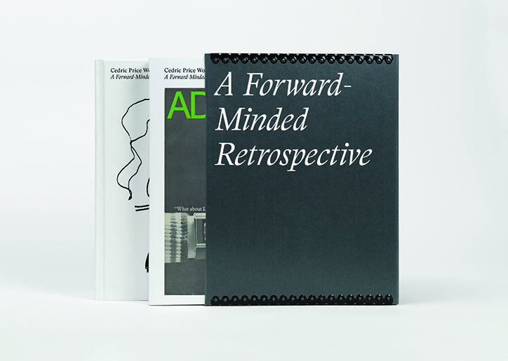
British architect Cedric Price had an illustrious career as an architect, thinker, teacher and philosopher. A new publication titled Cedric Price Works 1953 – 2003: A Forward-Minded Retrospective, is a monumental, two volume monograph that brings together all of his projects, articles and talks. Co-published by the Architectural Association, where Cedric studied and taught, and the Canadian Centre for Architecture, that owns the majority of his archive, the book comprises over 1,000 pages with over 900 drawings, photographs and images.
“The two volume format was a collective decision, made quite early on – as a complete works, it made sense to give respective focus to Price’s projects and written/spoken work, though there is still much cross-referencing between the two books,” says Wayne Daly, who designed the book with art director Zak Kyes. “Once this separation was established, both volumes suggested their own treatment – volume one, comprising all of his projects, took shape quite quickly; we looked to large format reference books (thesauruses, medical dictionaries), including the use of thumb indexes which divide the book into decades. In the end, this volume is at the maximum spine depth possible for machine binding, so we couldn’t have included other content regardless."
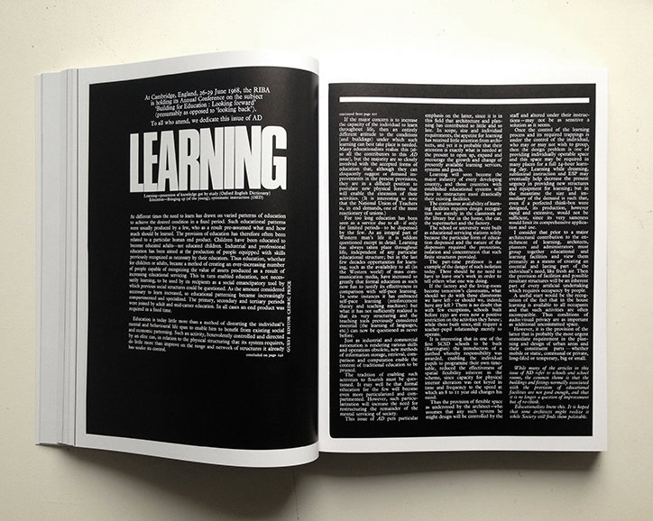
The second volume was originally intended to be a more modest pocket book, but as much of Cedric’s writing was done for magazines, the idea was rethought so the designers could reproduce pages in facsimile where possible. “For us, there was balance to be found in being sensitive and respectful towards the material, while still letting Price’s personality show through,” explains Wayne. We developed what we think is a robust, relatively low key grid, to privilege the many types of imagery, with enough room to inject moments of surprise.”
The book was commissioned in 2009 and the designers were commissioned in 2013. “We were particularly interested to understand the strategies and techniques employed in other architects’ complete works, and where Price might fit into – or stand apart from – this lineage,” explains Wayne. "Samantha Hardingham (editor of Cedric Price Works) and the Cedric Price Estate were interested in materiality from the outset and together we arrived at decisions which we hope impart a certain Pricean sensibility to the look and feel of the book, including a two and half metre-long fold out reproduction of Price’s 1965 City of the Future drawing, a hand-stamped bookmark produced using original rubber stamps from Price’s office, and a custom slipcase made by Lineco, a Massachusetts-based company that specialises in archival boxes.”
“The book mostly uses a relatively recent face called Stanley, from Swiss foundry Optimo and designed by Ludovic Balland. Its design references Stanley Morison’s Times New Roman, and so has its roots in a certain kind of Englishness,” says Wayne. “The fact that Times was designed for use in a newspaper aligned well with Price’s own interest in current affairs. Knowing that we would be working on the book over a number of years, we were especially conscious to work with a typeface that would last a long time, but yet which was also felt of the present, and for us Stanley sustains this balance.”
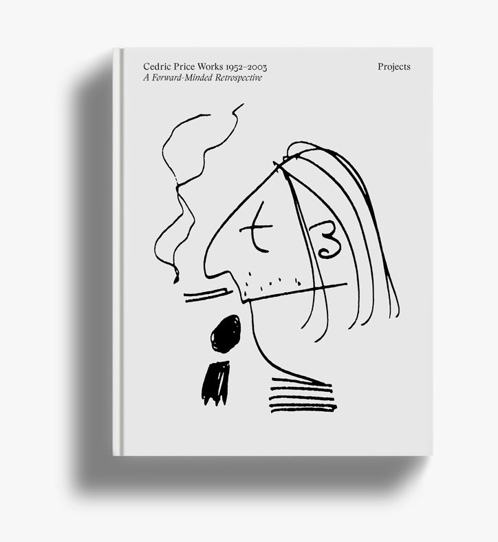
Wayne Daly and Zak Kyes: Cedric Price Works 1953 – 2003
Wayne Daly and Zak Kyes: Cedric Price Works 1953 – 2003
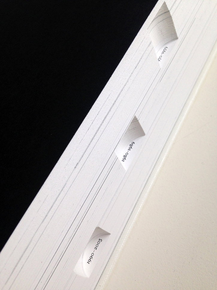
Wayne Daly and Zak Kyes: Cedric Price Works 1953 – 2003
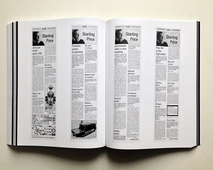
Wayne Daly and Zak Kyes: Cedric Price Works 1953 – 2003
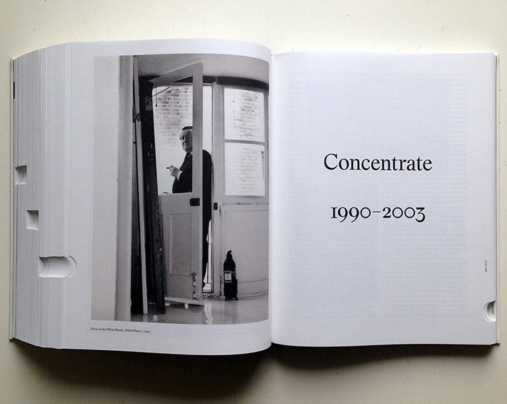
Wayne Daly and Zak Kyes: Cedric Price Works 1953 – 2003
Wayne Daly and Zak Kyes: Cedric Price Works 1953 – 2003
Wayne Daly and Zak Kyes: Cedric Price Works 1953 – 2003
Share Article
Further Info
About the Author
—
Owen joined It’s Nice That as Editor in November of 2015 leading and overseeing all editorial content across online, print and the events programme, before leaving in early 2018.