Launch Recite Me assistive technology
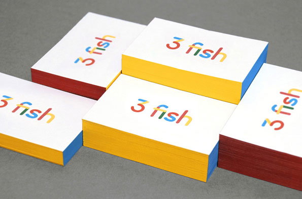
Five stacks of white cards are arranged on a grey surface. Each stack features the words “3 fish” in multi-coloured lettering, with the card edges in red, yellow and blue.

Daniel Buxton's 3 Fish In A Tree identity is beautifully clean, bright and simple

—
Date
22 November 2012

Let’s not beat about the bush here, sometimes a careful selection of bright colours is all you need to attract attention. As a race we’re drawn to shiny things more than we’d like to admit, cooing over bold colour schemes like magpies around a diamond. Combine that colour lust with some tight design and you’re on to a total winner. Which is perhaps why we’re so drawn to Daniel Buxton’s rebrand of 3 Fish In A Tree – it’s clean, simple, and features just the right amount of enticing hues to hold our attention for more than a few seconds. Which is all you really need from a piece of branding anyway. Nice job Daniel!
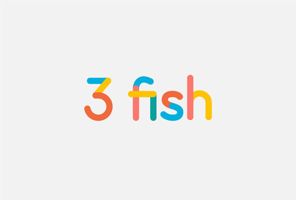
A colourful logo on a plain light grey background reads “3 fish”. The characters are formed from rounded, overlapping lines in blue, orange, pink and yellow.
Above

Daniel Buxton: 3 Fish In A Tree

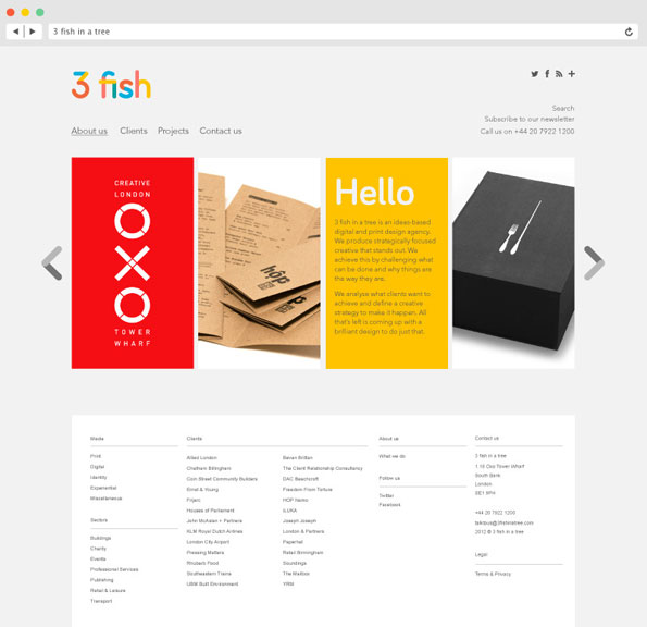
A screenshot of the website for the design agency 3 fish in a tree. A central carousel displays a red poster with “OXO” and “Tower Wharf”, brown kraft paper packaging, a yellow text block starting with “Hello”, and a black gift box.
Above

Daniel Buxton: 3 Fish In A Tree

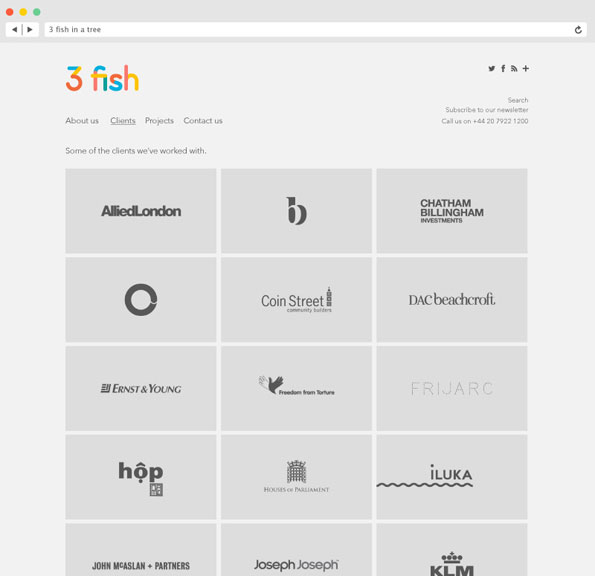
A screenshot of the “Clients” page for the studio 3 fish. A grid of grey squares displays various client logos, including “Allied London”, “Ernst & Young” and “Klm”.
Above

Daniel Buxton: 3 Fish In A Tree

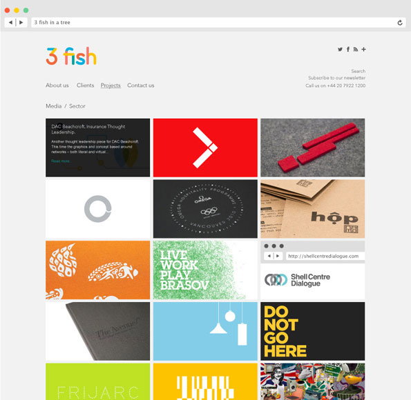
A screenshot of the 3 Fish agency website. A grid of colourful project thumbnails sits below a simple navigation menu and the “3 fish” logo.
Above

Daniel Buxton: 3 Fish In A Tree

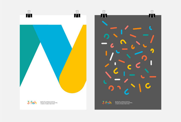
Two posters are clipped to a grey wall. The first features a large, abstract geometric shape in teal, blue and yellow, with the text “3 fish” at the bottom. The second has a dark grey background covered in small, colourful confetti-like shapes and the same “3 fish” branding.
Above

Daniel Buxton: 3 Fish In A Tree

Share Article

About the Author

James Cartwright

—

James started out as an intern in 2011 and came back in summer of 2012 to work online and latterly as Print Editor, before leaving in May 2015.


It's Nice That Newsletters

Fancy a bit of It's Nice That in your inbox? Sign up to our newsletters and we'll keep you in the loop with everything good going on in the creative world.