Launch Recite Me assistive technology
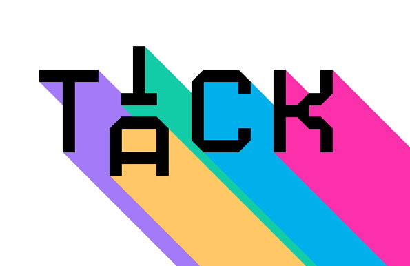
A graphic of the word “TACK” in bold, black block lettering against a white background. Each letter casts a long, diagonal shadow in a different bright colour: purple, yellow, blue and pink.

Seriously nice, bright applied graphic design from Paulista David Galasse

—
Date
16 May 2012

David Galasse looks like he does it all and does it really well. His bright, wonderfully applicable graphic design doesn’t follow the trend bent but instead does a fantastic job of creating truly personal identities, printed collateral, web/mobile/app design, animation etc.

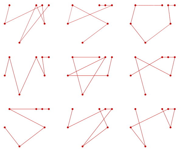
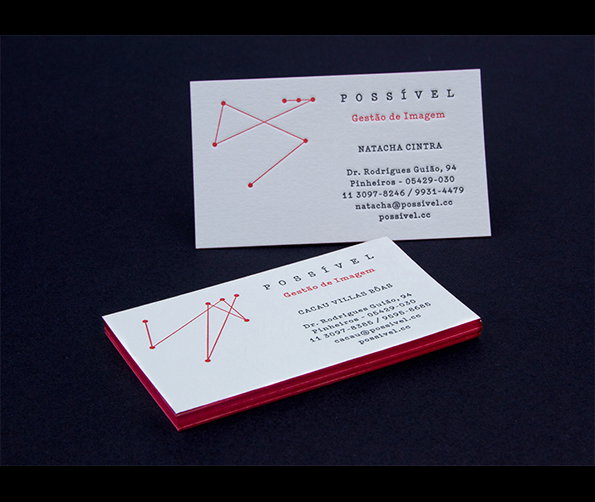
What David does best is translate personality and ideas really nicely into type that literally lets the concept speak for itself – as seen in a new face created for the Cine Favela Film Festival in his city base Sao Paulo, with typographic elements lifted straight off the walls of the city’s pixação scene, or the identity for Possível whose owner revealed a love for a certain Olivetti typewriter and David created constellation-like diagrams of the type-paths taken between keys. And though “variety” sounds somewhat clichéd, it couldn’t be a better middle name for David who has it by the bucket and it is anything but unoriginal.
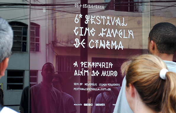
A poster for the “6º Festival Cine Favela de Cinema” is displayed on a glass window. The white, stylised text reads “A periferia além do muro” above a list of venues and a website.
Above

David Galasse: Cine Favela Film Festival
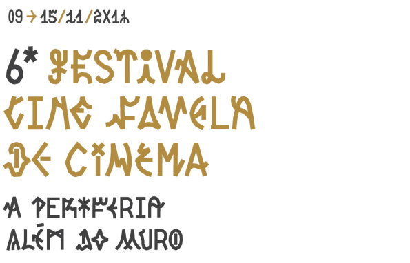
A typographic poster in gold and black on a white background. It reads “6* Festival Cine Favela de Cinema” and “A periferia além do muro”.
Above

David Galasse: Cine Favela Film Festival
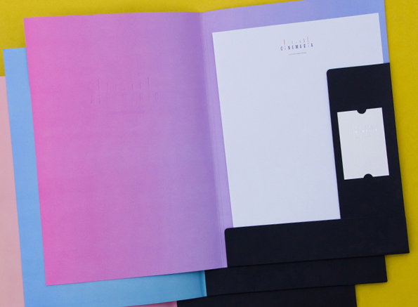
An open folder with a pink and purple gradient cover holds a white sheet of paper. The paper features a minimalist logo that reads “CINEMAGIA”.
Above

David Galasse: Cinemagia

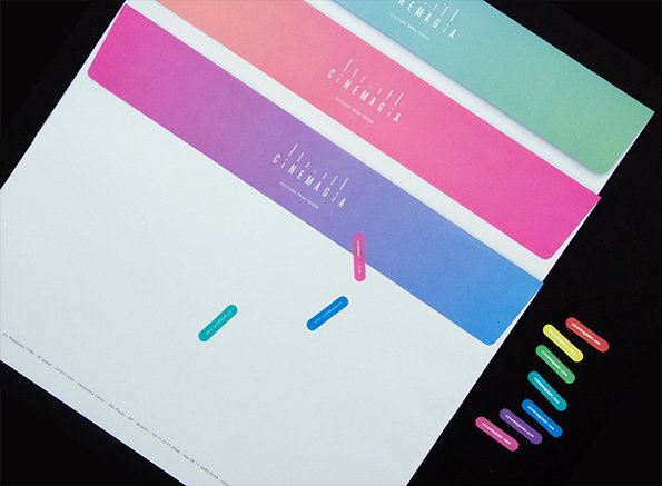
Three long, gradient-coloured strips in pink, purple and green feature the “Cinemagia” logo. Small, matching oval stickers are scattered beside them on a white sheet of paper.
Above

David Galasse: Cinemagia

A grid of nine red line drawings on a white background. Each drawing consists of five dots connected by straight lines to create different abstract geometric shapes.
Above

David Galasse: Possível

Two white business cards for “Possível Gestão de Imagem” are set against a dark background. Each card features a red geometric line drawing and contact details for a different person.
Above

David Galasse: Possível

Share Article

About the Author

Bryony Quinn

—

Bryony was It’s Nice That’s first ever intern and worked her way up to assistant online editor before moving on to pursue other interests in the summer of 2012.


It's Nice That Newsletters

Fancy a bit of It's Nice That in your inbox? Sign up to our newsletters and we'll keep you in the loop with everything good going on in the creative world.