Launch Recite Me assistive technology
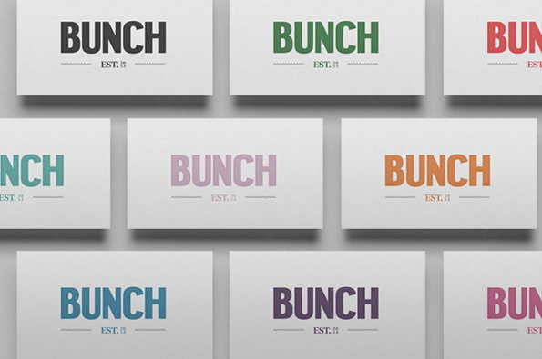
A grid of white business cards, each featuring the word “BUNCH” in a bold, sans-serif typeface. The logo appears in various colours, including black, green, red, purple and orange, with the text “EST. 20” printed in a smaller font below.

Graphic Design: DIA give fruit juices their own unique personalities for Bunch

—
Date
1 August 2013

We’ve heard of humanising objects before but giving names to a range of raw juices is a new one for us. New York branding agency DIA have just finished work on the identity of a range of organic drinks in advance of their launch in London this year. The four juices have each been given their own names – Rosie, Agnes, Wilson and Jack – allowing the company to create brand stories and personalities around each unique flavour. Sounds like a charming idea, but really it’s the visuals that have got us hooked; the custom type, the simple packaging and the illustrated patterns designed to represent fields of crops. For a company flogging squashed fruit it’s a pleasantly premium aesthetic they’re developing.
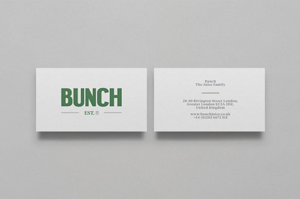
Two business cards for Bunch are laid side by side on a grey background. One shows the green logo “BUNCH” and “EST. 19”, while the other lists contact details and the phrase “The Juice Family”.
Above

DIA: Bunch branding

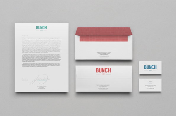
A corporate identity set featuring a letterhead, envelopes and business cards on a grey background. The branding uses a bold, sans-serif logotype that reads “Bunch”.
Above

DIA: Bunch branding

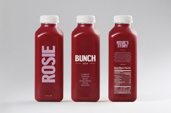
Three bottles of deep red juice with white caps stand against a plain grey background. The labels feature bold white typography, including the brand name “Bunch” and the product name “Rosie”.
Above

DIA: Bunch branding

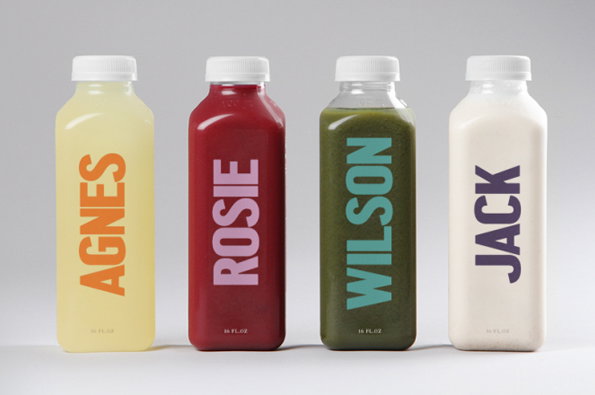
Four bottles of colourful juices stand in a row against a plain grey background. Each bottle features a name in bold, vertical typography: “AGNES”, “ROSIE”, “WILSON” and “JACK”.
Above

DIA: Bunch branding

A bold, dark grey logo reads “BUNCH” in a heavy sans-serif typeface. Below this, smaller text reads “EST. 2013”, flanked by two jagged, zigzag lines.
Above

DIA: Bunch branding

Share Article

Further Info

About the Author

James Cartwright

—

James started out as an intern in 2011 and came back in summer of 2012 to work online and latterly as Print Editor, before leaving in May 2015.

It's Nice That Newsletters

Fancy a bit of It's Nice That in your inbox? Sign up to our newsletters and we'll keep you in the loop with everything good going on in the creative world.