Launch Recite Me assistive technology
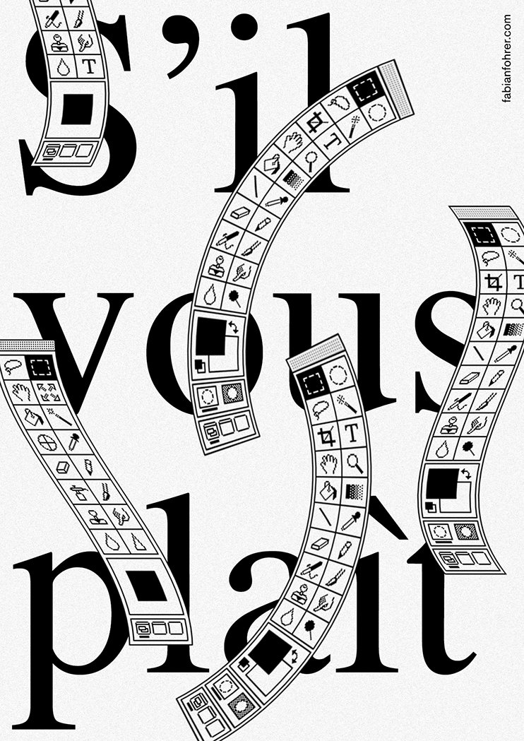
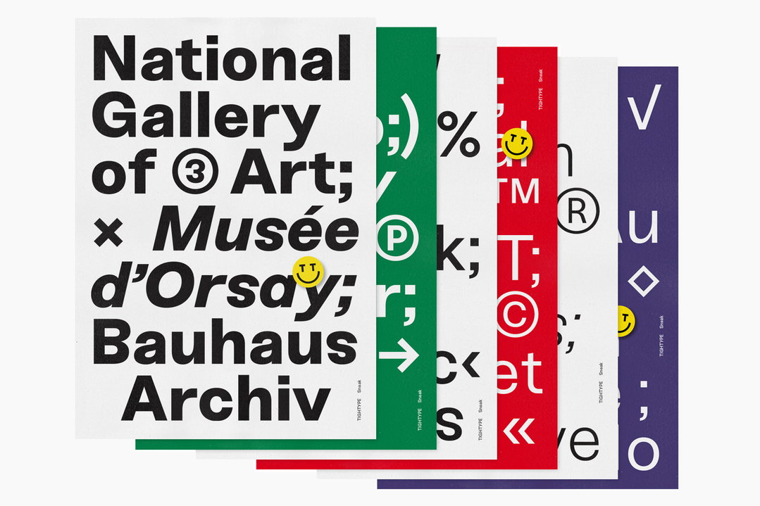
A series of graphic posters featuring bold, black typography and symbols on white, green, red and purple backgrounds. The front poster reads “National Gallery of Art; x Musée d’Orsay; Bauhaus Archiv”.

Fabian Fohrer’s work is “a typographic bridge between order and disorder”

—
Date
31 October 2016

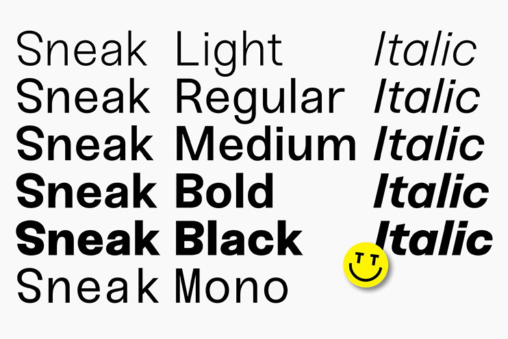
Graphic designer Fabian Fohrer is co-founder of type design collective Tightype, based in Constance, Germany. He has just finished working on his latest typeface called Sneak that is a crisp, sans serif typeface available in five weights that is notable for its reversed characters. Currently working at Bureau Mirko Borsche, Fabian describes his work as “a typographic bridge between order and disorder.”

Fabian’s website shows a fascination with pushing type to its workable limits, and is testing his abilities with a poster a day project that has seen him create about 60 new works since September. “My interest in graphic design started while I was still at school, doing smaller projects for friends and family,” says Fabian, who plans to finish his studies next year. “My university studies didn’t challenge me enough thought so I worked on several design projects and typefaces to gain experience in working independent and to become more confident.”

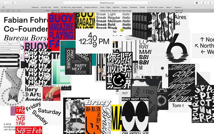
The designer’s personal website is packed with works that appear each time you click on the homepage, and Fabian is keen to experiment with a variety of styles to expand his understanding of the subject. “I prefer to start working by focusing on ideas and a concept and then concentrate on visualising afterwards to reach a more solid result,” he says of his working method.
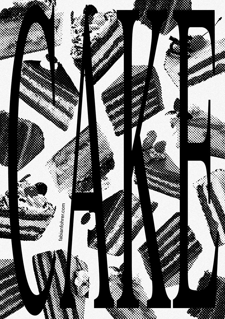
A black and white graphic illustration featuring the word “CAKE” in large, bold serif typography. The letters are layered over a scattered pattern of sliced cake pieces rendered in a halftone dot style.
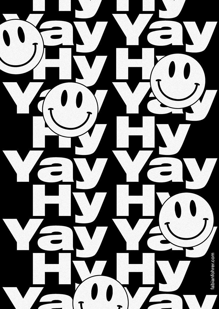
A black and white graphic pattern featuring the words “Yay” and “Hy” repeated in a bold, sans-serif typeface. Several simple smiley faces are scattered across the composition, overlapping the text.
A black and white typographic illustration reads “S’il vous plaît”. Curved toolbars from design software are layered over the letters, featuring various icons for brushes, pens and shapes.
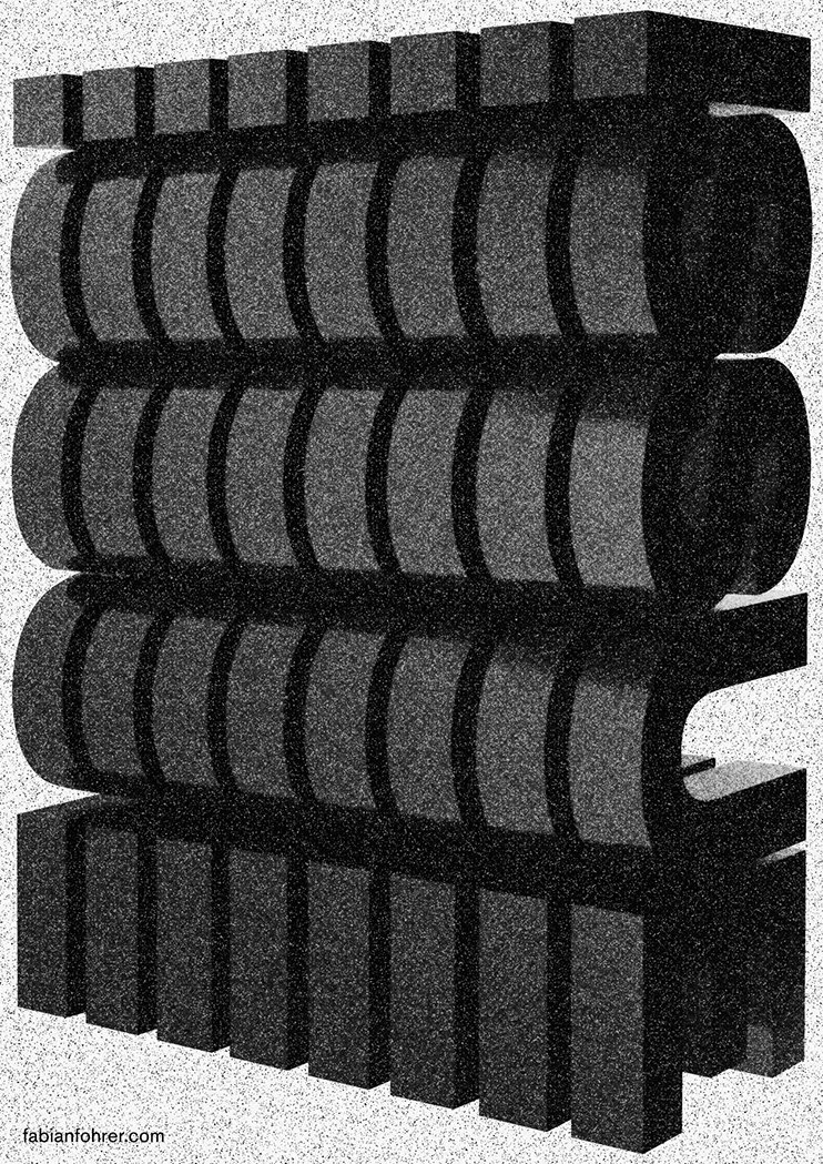
A 3D render of a grainy, dark grey architectural form composed of stacked horizontal layers. The structure features rounded, ribbed sections sandwiched between two flat, blocky tiers.
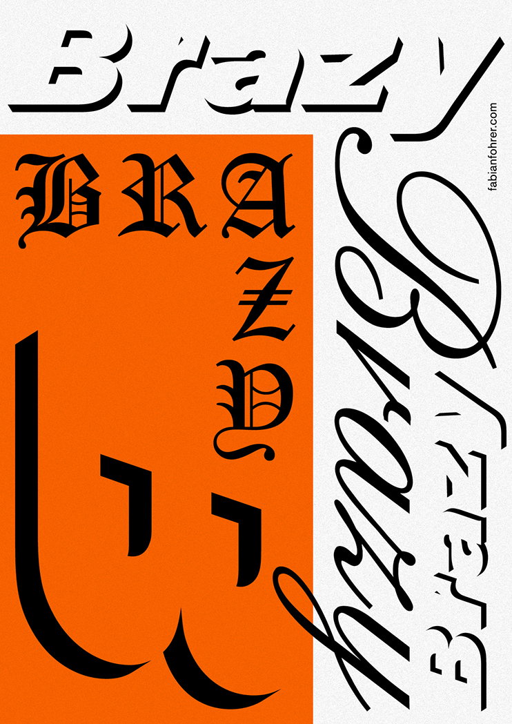
A typographic study of the word “Brazy” repeated in various styles. The word appears in a bold black gothic font on an orange background, alongside fluid script and sharp, angular lettering on a white background.
A black and white illustration of a series of nested, hand-drawn rectangular frames. In the centre, the letters “FN” are rendered in a bold, gestural style.
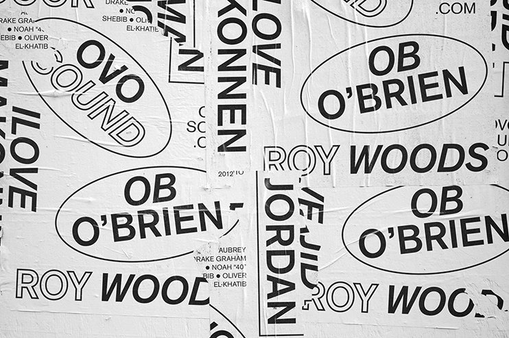
A black and white collage of overlapping posters and stickers. Bold typography features the names “Ob O’Brien” and “Roy Woods”, alongside the “Ovo Sound” logo.
A typography specimen for a typeface called “Sneak”. The image shows various weights including “Light”, “Regular”, “Medium”, “Bold”, “Black” and “Mono”, with corresponding italic versions. A small yellow smiley face sits at the bottom right.
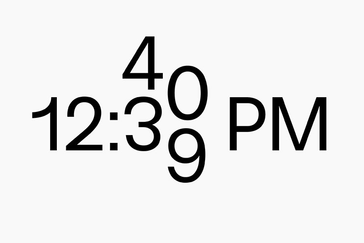
Black typographic text on a white background reads “12:3” followed by the letters “PM”. The numbers “4”, “0” and “9” are stacked vertically beside the three.
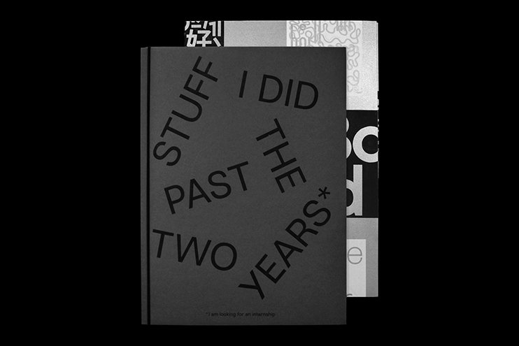
A grey book cover features bold, black typography arranged in a circular pattern. The text reads “STUFF I DID THE PAST TWO YEARS*”.
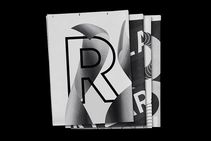
A stack of black and white printed pages against a black background. The top page features a large, bold letter “R” layered with flowing, gradient-shaded 3D forms.
A digital collage of graphic design work, featuring a dense arrangement of posters, typography and logos. Bold black, white, red and yellow elements overlap, including a red poster that reads “BUOY MAGAZINE PLAYING”.

Share Article

About the Author

Owen Pritchard

—

Owen joined It’s Nice That as Editor in November of 2015 leading and overseeing all editorial content across online, print and the events programme, before leaving in early 2018.


It's Nice That Newsletters

Fancy a bit of It's Nice That in your inbox? Sign up to our newsletters and we'll keep you in the loop with everything good going on in the creative world.