Launch Recite Me assistive technology
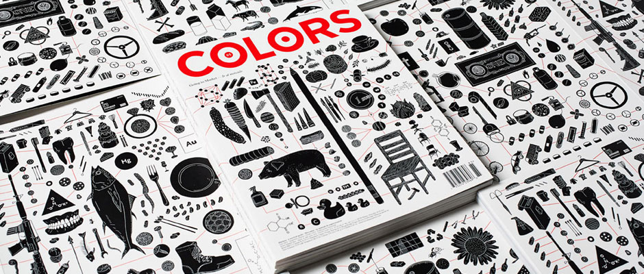
A stack of magazines featuring a black and white illustration of various objects. The cover of the top magazine displays the word “Colors” in bold red type.

Graphic Design: Former Colors associate art director Felipe Rocha is on the move

—
Date
18 September 2013

Brazilian designer Felipe Rocha was born in São Paulo, Brazil, where he drew pictures and designed things until 2012. Then he received a request to relocate to Treviso in Italy to offer his services to Benneton’s much-respected creative laboratory Fabrica, and, more importantly, to help art direct their magnificent publication Colors.

After a year of smashing out some beautiful editions of the magazine he’s moved back home to work for Flag, set up his own design studio, Arnold and generally make himself available for freelance commissions which, based on the strength of the work you see here, should be coming in thick and fast.

We’re always in awe of Fabrica for their ability to get great people to join them in order to make great things, and Felipe is certainly no exception.
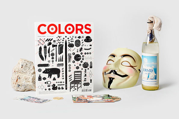
A copy of Colors magazine stands upright, featuring a white cover with the red title “COLORS” and a collection of black ink illustrations. Beside it sit a Guy Fawkes mask, a bottle of Ermis ouzo, and a large piece of pale rock.
Above

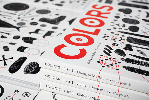
Colors# 85: Going to Market

A stack of books with white covers and red typography that reads “COLORS”. The covers feature a grid of black and white illustrations of food and household objects, with the title “Going to Market — Ir ao mercado” printed along the spine.
Above

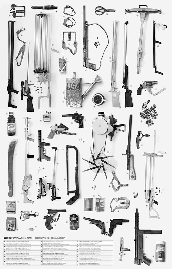
Colors# 85: Going to Market

A black and white collage of various survival tools and weapons arranged on a plain white background. The collection includes knives, firearms, a compass, and a mug featuring the word “USA”. A table at the bottom is titled “Colors Survival Essentials – Essenciais de Sobrevivência”.
Above

Colors# 85: Going to Market

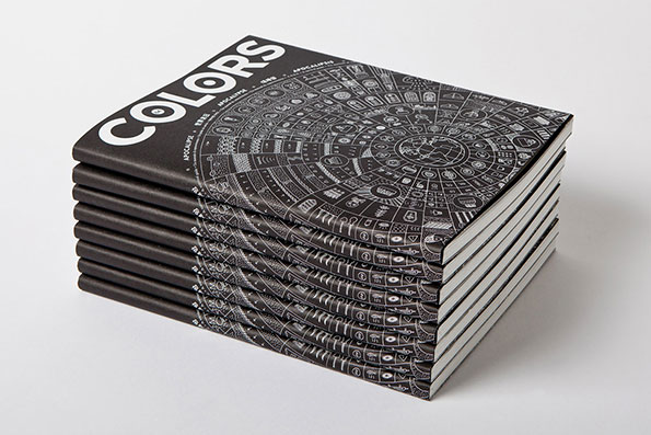
A stack of black magazines with the word “COLORS” printed in bold white type on the cover. The covers feature a detailed, circular white illustration resembling an ancient calendar or map.
Above

Colors #84: Apocalypse

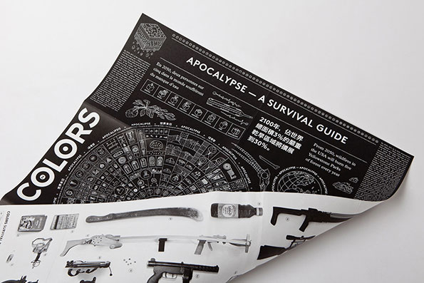
A black and white printed guide titled “Apocalypse – A Survival Guide”. The layout features a central circular diagram surrounded by text in English, French and Chinese. A folded section of the paper reveals a series of illustrated survival tools and weapons.
Above

Colors #84: Apocalypse

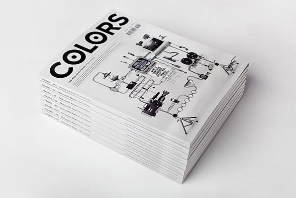
A stack of magazines with the title “Colors” printed in bold, black type across the top. The cover features a detailed technical illustration of a complex machine with various pipes and dials.
Above

Colors# 86: Making the News

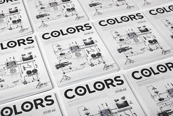
A grid of identical magazines titled “Colors” laid out on a white surface. Each cover features a complex, technical black and white illustration of a machine.
Above

Colors# 86: Making the News

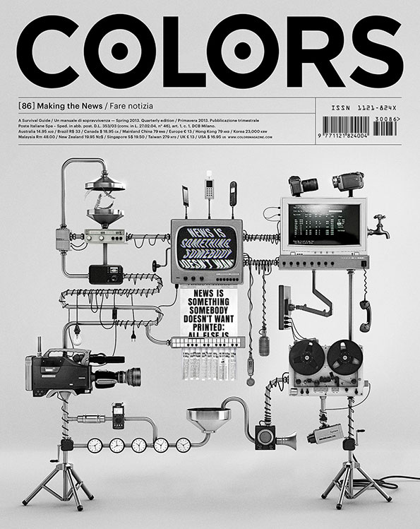
The cover of Colors magazine in black and white. A complex, surreal machine made of vintage cameras, reel-to-reel recorders and screens is connected by a network of pipes and wires. A central screen displays the text “NEWS IS SOMETHING SOMEBODY DOESN’T WANT PRINTED; ALL ELSE IS ADVERTISING”.
Above

Colors# 86: Making the News

Share Article

Further Info

About the Author

James Cartwright

—

James started out as an intern in 2011 and came back in summer of 2012 to work online and latterly as Print Editor, before leaving in May 2015.


It's Nice That Newsletters

Fancy a bit of It's Nice That in your inbox? Sign up to our newsletters and we'll keep you in the loop with everything good going on in the creative world.