Launch Recite Me assistive technology
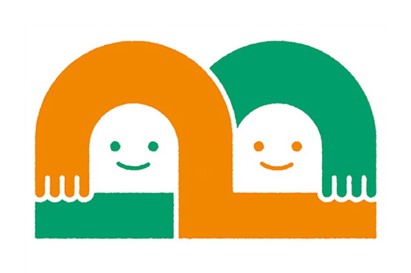
An illustration of two smiling, white figures peeking over a horizontal divide. One figure is framed by an orange arch, while the other is framed by a green arch.

Graphic Design: Oeuflab's lovely, personified identities for clinics and hospitals

—
Date
27 May 2014

Oeuflab is a small graphic design company based in Fukuoka who create amazingly lovely logos and identities for various clinics and hospitals around Japan. Apparently the name “Oeuflab” translates to something like “Egg Institute,” and the company’s ethos is to think not only about the surface (or the “eggshell”) of a brief, but also about the substance (or “yolk”) inside. Their branding is effective, clean and comforting, and we love the welcoming colours and creatures that emerge from the simple logos. We’ve never seen such friendly and accessible designs for a paediatric hospital, vet or skin care clinic: Oeuflab is definitively a good egg, and we can’t wait to see what ingenious designs they hatch next.
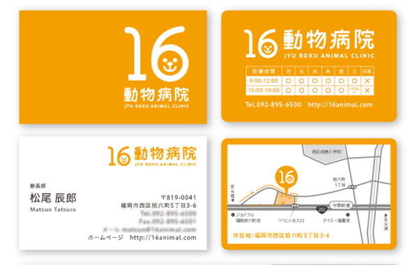
A set of business cards for “Jyu Roku Animal Clinic” in bright orange and white. The logo features the number “16” with a small dog face inside the zero.
Above

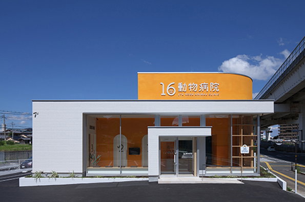
Oeuflab: Animal Hospital

A modern, single-storey building with a bright orange upper section and large glass windows. White text on the orange facade reads “16 動物病院” and “16 animal clinic”.
Above

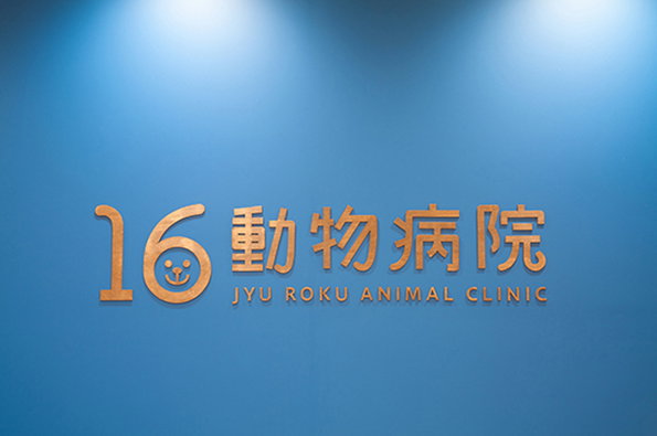
Oeuflab: Animal Hospital

Gold 3D lettering on a blue wall reads “16 動物病院” and “JYU ROKU ANIMAL CLINIC”. The zero in the number 16 is styled as a smiling animal face.
Above

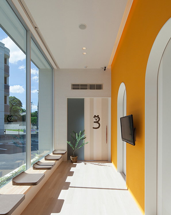
Oeuflab: Animal Hospital

A bright, narrow corridor with a vibrant orange wall and a large glass window. A row of curved wooden benches lines the window, facing a television mounted on the orange wall.
Above

Oeuflab: Animal Hospital

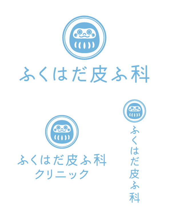
A light blue logo featuring a stylised, circular character with a smiling face. The character is paired with Japanese text that reads “ふくはだ皮膚科”.
Above

Oeuflab: Skin Clinic

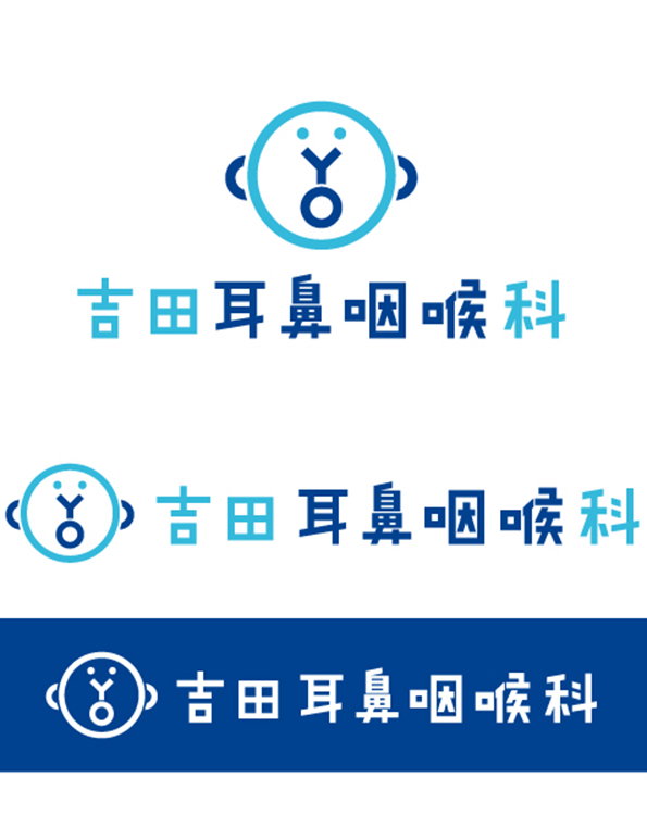
A logo for an otolaryngology clinic featuring a blue circular icon that resembles a face. Below the icon, Japanese text reads “吉田耳鼻咽喉科”. The logo is shown in three colour variations: blue on white, light blue on white, and white on a blue background.
Above

Oeuflab: Otolaryngology Clinic

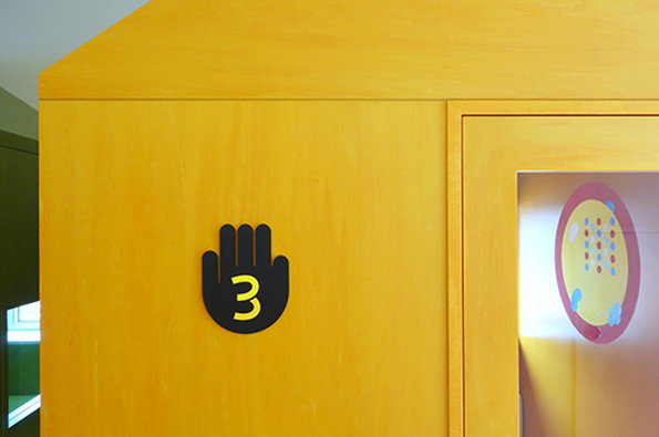
A yellow wooden wall features a black hand-shaped icon with a yellow number “3” in the centre. To the right, a window reveals a colourful circular graphic.
Above

Oeuflab: Paediatric hospital

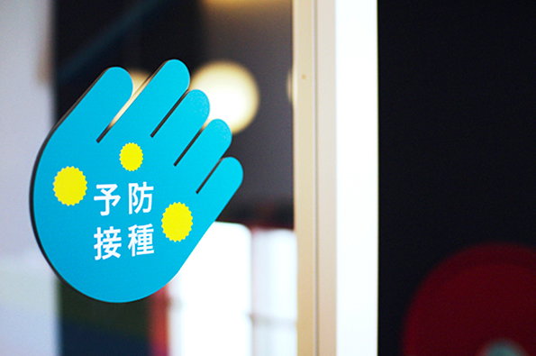
A blue hand-shaped sign with yellow circles is stuck to a glass door. Japanese text in the centre reads “予防接種”, meaning vaccination.
Above

Oeuflab: Paediatric hospital

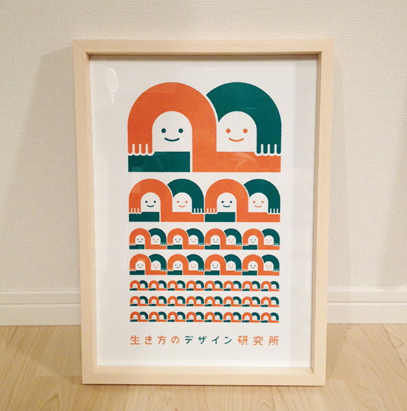
A framed illustration featuring rows of stylised, smiling figures in orange and green. The figures decrease in size from top to bottom, creating a repeating pattern. Japanese text is printed at the bottom of the page.
Above

Oeuflab: Design Institute of the Way of Life
Share Article

Further Info

About the Author

Madeleine Morley

—

It's Nice That Newsletters

Fancy a bit of It's Nice That in your inbox? Sign up to our newsletters and we'll keep you in the loop with everything good going on in the creative world.