Launch Recite Me assistive technology
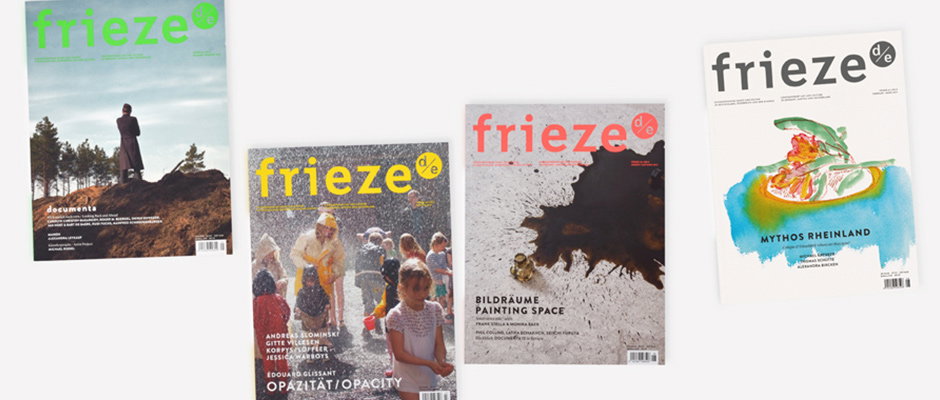
Four issues of Frieze magazine are laid out against a white background. Each cover features a different colour palette and image, with the word “frieze” prominently displayed at the top.

Graphic Design: Dutch duo Studio Laucke Siebein, masters of modern design

—
Date
22 January 2014

People go on about “flourishes” but it’s not until you’ve seen stars applied in between lines of perfectly chosen typography that you really understand what it means, but these guys have go them coming out of their ears. Few graphic design portfolios have given me as much palpable joy as this one from Studio Laucke Siebein. As well as designing frieze d/e, Dirk and Johanna have made charming posters, identities, books and small publications for the likes of Kunsthal Rotterdam and the Groninger museum. I wonder why museums keep on coming to them to design the identities for their shows? Ah yes, it’s because everything these two lay their hands on becomes fun, accessible and desirable.
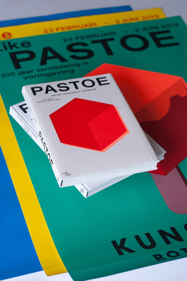
A stack of exhibition materials featuring a white booklet and a green poster. Both display the word “PASTOE” and a red 3D geometric shape.
Above

Studio Laucke Siebein: Pastoe

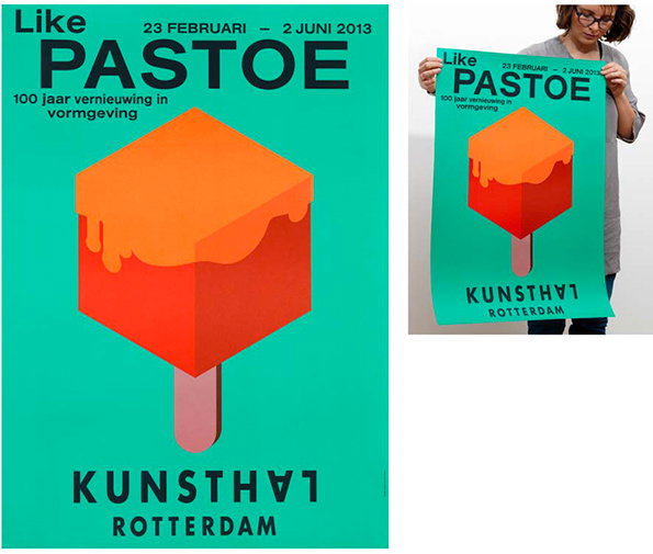
A graphic poster on a teal background features a 3D illustration of a red and orange ice lolly. Text at the top reads “Like PASTOE” and “23 februari – 2 juni 2013”, with “Kunsthal Rotterdam” at the bottom.
Above

Studio Laucke Siebein: Pastoe

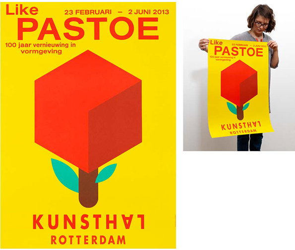
A yellow poster features a red 3D cube on a brown stem with two green leaves. Text at the top reads “Like PASTOE” and “23 februari – 2 juni 2013”, while the bottom reads “KUNSTHAL ROTTERDAM”. To the right, a person holds the poster up against a white wall.
Above

Studio Laucke Siebein: Pastoe

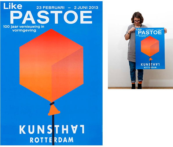
A blue poster features a large orange 3D cube floating like a balloon. Text at the top reads “Like PASTOE” and “23 februari – 2 juni 2013”, with “Kunsthal Rotterdam” at the bottom. To the right, a person holds the poster in front of a white wall.
Above

Studio Laucke Siebein: Pastoe

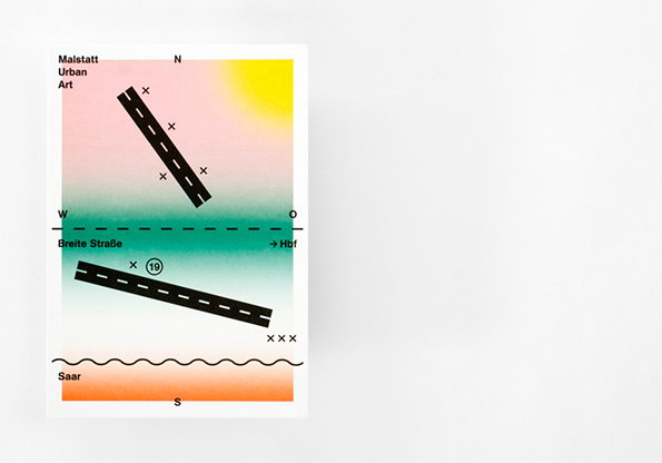
A minimalist map illustration with a soft gradient background of pink, yellow, green and orange. Black lines represent roads, with text including “Malstatt Urban Art”, “Breite Straße” and “Saar”.
Above

Studio Laucke Siebein: Malstatt Urban Art
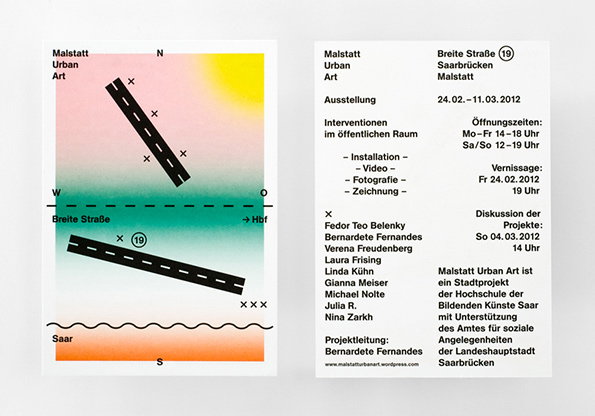
Two exhibition flyers for “Malstatt Urban Art”. One features a colourful abstract map with a road and the text “Breite Straße”, while the other lists event details, dates and a list of participating artists.
Above

Studio Laucke Siebein: Malstatt Urban Art
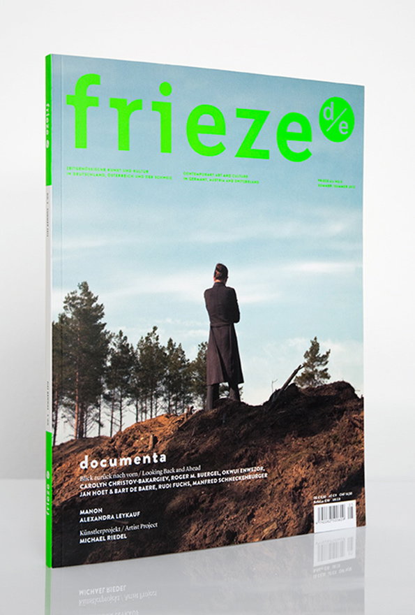
The cover of Frieze magazine features a person in a long black coat standing on a mound of dark earth. They look out over a landscape of pine trees under a pale blue sky. The magazine title “frieze” is printed in large, bright green letters at the top. Below, the word “documenta” appears in white, followed by a list of artists.
Above

Studio Laucke Siebein: frieze d/e magazine
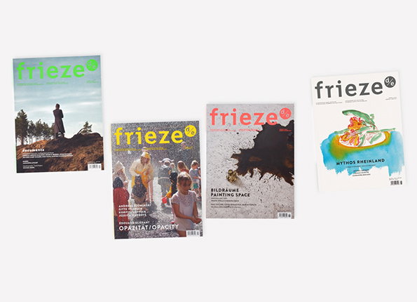
Four issues of Frieze magazine are laid out against a plain white background. Each cover features different artwork and typography, including one with the title “Mythos Rheinland”.
Above

Studio Laucke Siebein: frieze d/e magazine
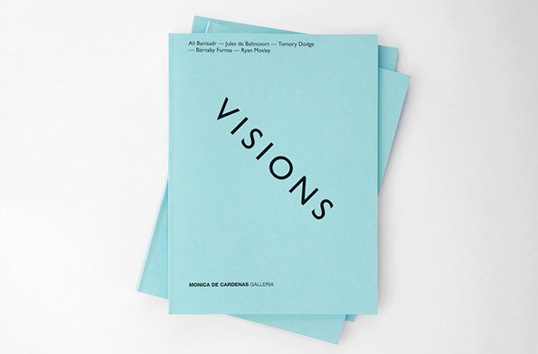
A stack of light blue booklets on a white background. The top cover features the word “VISIONS” in black, slanted typography and the text “MONICA DE CARDENAS GALLERIA” at the bottom.
Above

Studio Laucke Siebein: Visions

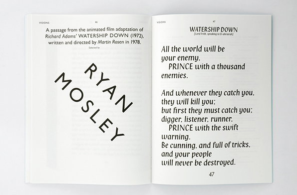
An open book shows two pages of text. The left page features the name “RYAN MOSLEY” in large, bold letters set at an angle. The right page contains a passage from the film Watership Down, beginning with the line “All the world will be your enemy.”
Above

Studio Laucke Siebein: Visions

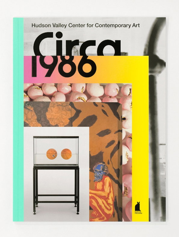
A book cover for the Hudson Valley Center for Contemporary Art titled “Circa 1986”. The design features a collage of images, including a row of pink spheres, a figure with a blue face, and a glass display case.
Above

Studio Laucke Siebein: Circa 1986

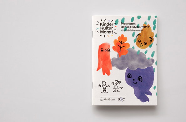
A booklet cover featuring colourful, childlike drawings of a purple figure, a grey cloud, and autumn leaves. Text at the top reads “Kinder Kultur Monat” and “Programm Berlin, Oktober 2012”.
Above

Studio Laucke Siebein: KinderKulturMonat
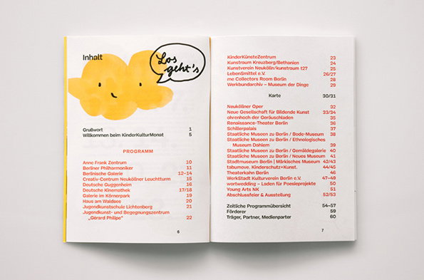
An open booklet showing a table of contents titled “Inhalt”. The left page features a yellow illustration of two smiling clouds and a speech bubble that reads “Los geht’s”.
Above

Studio Laucke Siebein: KinderKulturMonat
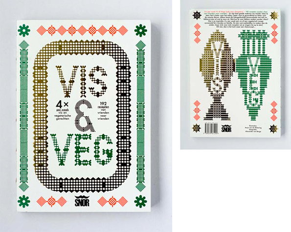
The front and back covers of a cookbook. The front cover features a bold, pixelated design with the title “VIS & VEG” and the brand name “SNOR”.
Above

Studio Laucke Siebein: Vis en Vega

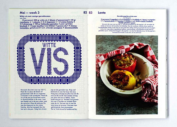
An open cookbook showing two pages of recipes. The left page features a large, blue typographic title “WITTE VIS” set against a patterned background, with a recipe for fish and shrimp sauce below. The right page shows a photo of two stuffed peppers in a white baking dish, accompanied by a recipe for “Gevulde paprika uit de oven”.
Above

Studio Laucke Siebein: Vis en Vega

Share Article

About the Author

Liv Siddall

—

Liv joined It’s Nice That as an intern in 2011 and worked across online, print and events, and was latterly Features Editor before leaving in May 2015.


It's Nice That Newsletters

Fancy a bit of It's Nice That in your inbox? Sign up to our newsletters and we'll keep you in the loop with everything good going on in the creative world.