Launch Recite Me assistive technology
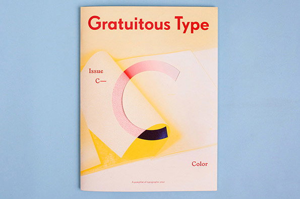
The cover of a magazine titled “Gratuitous Type” in bold red lettering. A large, pink, three-dimensional letter “C” curves across a pale yellow and white background. Smaller text reads “Issue C—” and “Color”.

Graphic Design: New issue Gratuitous Type knocks our ruddy socks off

—
Date
16 October 2013

There are many great things about the latest issue of Gratuitous Type, Elana Schlenker’s gorgeous printed publication celebrating this geekiest corner of the graphics world. The third instalment is the first based around a theme; kicking off with colour (or “color” as the Canadian publishers insist on having it…).

Firstly, it’s subtitled “A pamphlet of typographic smut” which is just a really excellent sentence whichever way you look at it. Secondly, it’s really nicely designed, from the die-cut wrap-around cover to the change-up of paper stock on the centrefold and the image-rich layouts. Thirdly, the names involved are eclectically international and uniformly excellent; from long-time favourites of ours like Hato Press, Hvass & Hannibal and Jordy van den Nieuwendijk (who designed the risograph postcard which comes with the magazine) to Bendita Gloria and Fanette Mellie.

But most of all what I love is that while typographic celebrations are often visual affairs, Elana’s editorial approach results in genuinely insightful interviews to run alongside the (plentiful) aesthetic perving on offer.
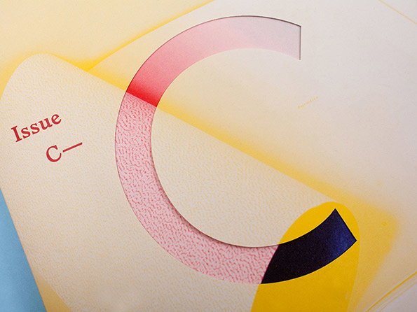
A close-up of a printed publication featuring a large, circular graphic in red and pink tones. To the left, red text reads “Issue C–”.
Above

Elana Schlenker: Gratuitous Type, C – Color
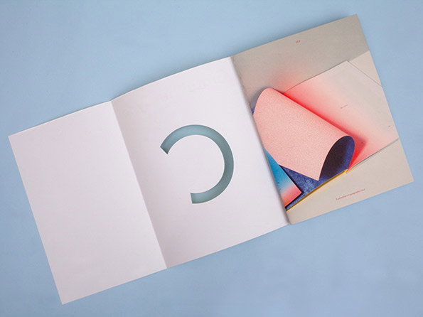
An open white booklet lies on a light blue surface. One page features a large circular cutout, while the opposite page shows a pink and blue gradient image with a curled piece of paper.
Above

Elana Schlenker: Gratuitous Type, C – Color
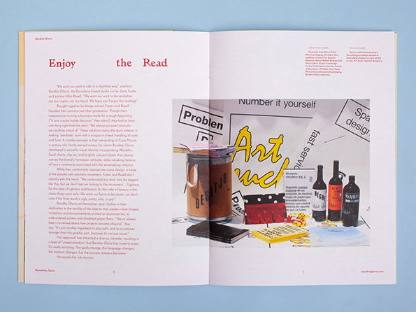
An open magazine spread featuring a layout of text and a collage. The left page contains a long article under the headline “Enjoy the Read”. The right page shows a collection of objects, including bottles, a yellow notepad and a piece of paper with the words “Art nud” written in bold, yellow script.
Above

Elana Schlenker: Gratuitous Type, C – Color
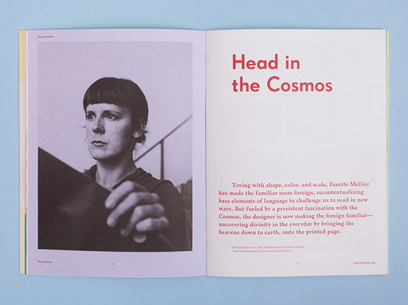
An open magazine spread featuring a black and white portrait of a person with a short fringe. The opposite page has a red headline that reads “Head in the Cosmos” above a short paragraph of introductory text.
Above

Elana Schlenker: Gratuitous Type, C – Color
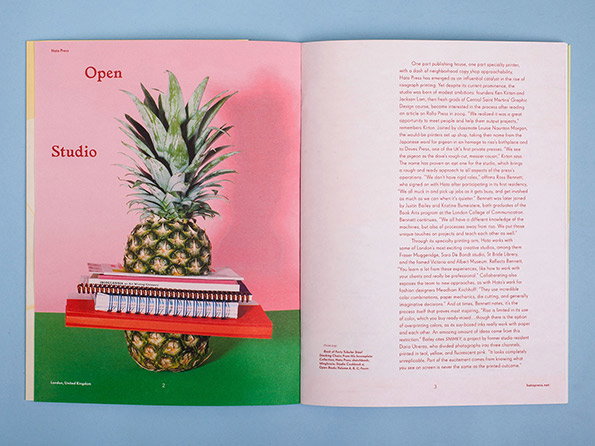
An open magazine spread. The left page features a pineapple resting on a red plinth, with a notebook and pens balanced on top, beside the text “Open Studio”. The right page contains a full column of editorial text.
Above

Elana Schlenker: Gratuitous Type, C – Color
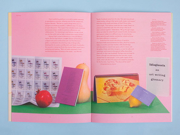
An open magazine spread featuring two pages of text and a still life photograph. The image shows a pomegranate, a butternut squash and a lemon arranged with several purple notebooks and a grid of chair illustrations. On the right, a pink text box reads “Idioglossia an art writing glossary”.
Above

Elana Schlenker: Gratuitous Type, C – Color
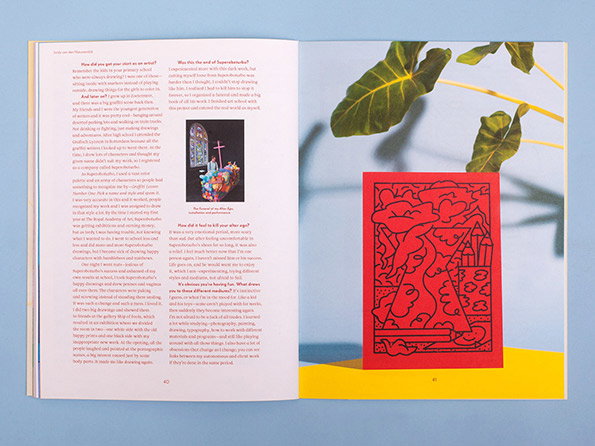
An open magazine spread featuring an interview and a red graphic illustration. The left page contains columns of text and a small, colourful illustration of a figure in a gothic setting.
Above

Elana Schlenker: Gratuitous Type, C – Color
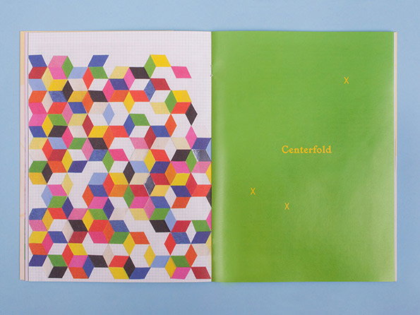
An open book shows a colourful geometric pattern on the left page and a solid green page on the right. The green page features the word “Centerfold” and three small “x” marks in yellow.
Above

Elana Schlenker: Gratuitous Type, C – Color
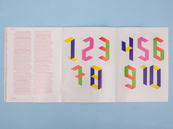
An open magazine spread featuring an interview alongside a series of colourful 3D numbers from one to 10. The numbers are rendered in a geometric, isometric style using a vibrant palette of pink, yellow, green and blue.
Above

Elana Schlenker: Gratuitous Type, C – Color
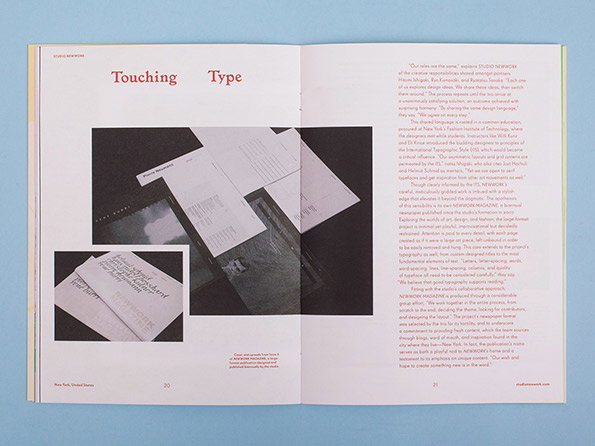
An open magazine spread featuring a layout titled “Touching Type”. The left page shows a close-up of printed pages and a book, while the right page contains several paragraphs of text.
Above

Elana Schlenker: Gratuitous Type, C – Color
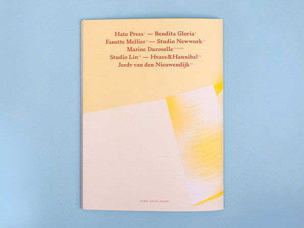
A cream-coloured book cover featuring a list of names in red serif type. The text includes “Hato Press”, “Bendita Gloria”, “Fanette Mellier”, “Studio Nework”, “Marine Duroselle”, “Studio Lin”, “Hvass&Hannibal” and “Jordy van den Nieuwendijk”.
Above

Elana Schlenker: Gratuitous Type, C – Color
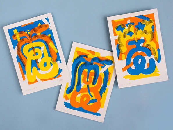
Three abstract prints with bold, curving shapes in blue, orange and yellow. The prints are laid out on a pale blue background.
Above

Elana Schlenker: Gratuitous Type, C – Color

Share Article

About the Author

Rob Alderson

—

Rob Alderson is a freelance writer, editor and strategist. He was previously editor-in-chief of It’s Nice That and WePresent, and editor of Design Week. He publishes the newsletter Undo, which tries to make sense of how AI is changing design work, the design process and the design industry.

It's Nice That Newsletters

Fancy a bit of It's Nice That in your inbox? Sign up to our newsletters and we'll keep you in the loop with everything good going on in the creative world.