



Launch Recite Me assistive technology
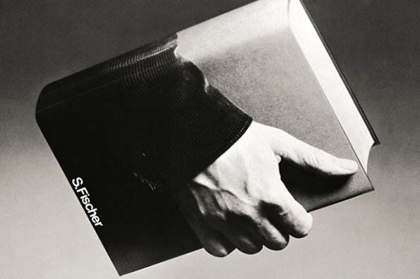
A black and white photograph of a hand emerging from a book to grip its own cover. The spine of the book features the text “S. Fischer”.

Amazing 1970s publishing posters from German designer Gunter Rambow

—
Date
22 July 2014

If you aren’t familiar with The Casual Optimist blog about publishing and book culture then it’s well worth checking out (I’ll wait). Anyway last week its author shared these amazing posters created by the leading German graphic designer Gunter Rambow for the S. Fischer Verlag publishing house back in the 1970s. What’s interesting is that some of them tiptoe right up to the edge of being gimmicky, but always stay the right side of the line thanks to Gunter’s unerring image-making brilliance. I really can’t get enough of these.
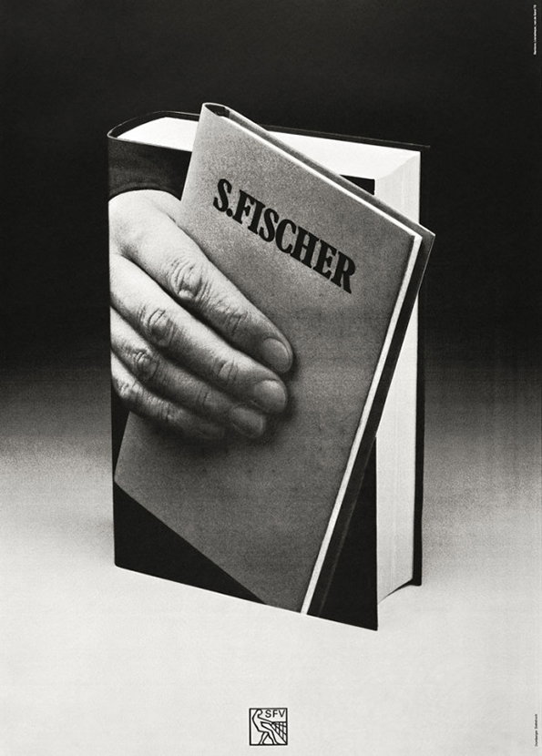
A black and white image of a thick book standing upright. The cover features a photograph of a hand gripping the book, with the text “S.FISCHER” printed across the top.
Above

Gunter Rambow: S. Fischer Verlag poster
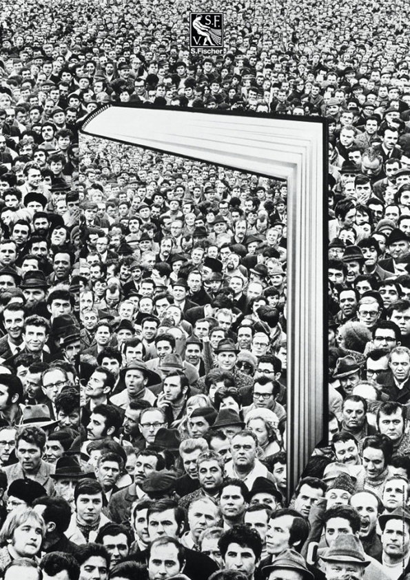
A black and white collage shows a vast, dense crowd of people. In the centre, a large open book acts as a frame, with the crowd continuing seamlessly through its pages. A small logo at the top reads “S. Fischer”.
Above

Gunter Rambow: S. Fischer Verlag poster
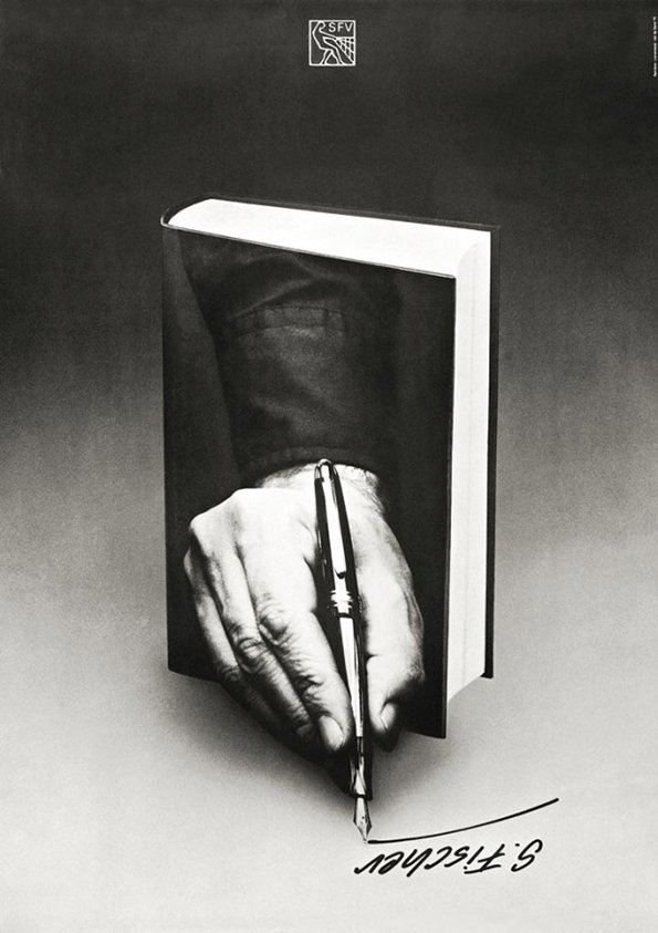
A black and white image of a hand holding a fountain pen, emerging from the pages of an open book. The pen writes a signature that reads “S. Fischer” on the surface below.
Above

Gunter Rambow: S. Fischer Verlag poster

A black and white advertisement shows a lightbulb hanging from the top of an open book. The bulb glows brightly, casting a white light across the pages and the dark background. The name “S. Fischer” is printed at the bottom.
Above

Gunter Rambow: S. Fischer Verlag poster

A black and white image of a brick wall with a large open book embedded in the masonry. The book's pages form a window frame, revealing a bright sky with fluffy clouds.
Above

Gunter Rambow: S. Fischer Verlag poster
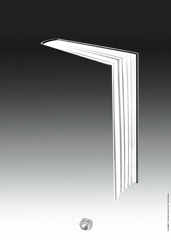
A 3D render of a thick, white book standing open to form a right angle. The pages create a sharp, architectural shape against a gradient background that fades from black to white.
Above

Gunter Rambow: S. Fischer Verlag poster
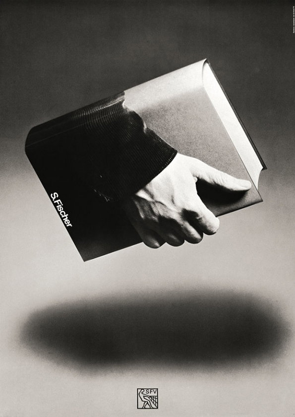
A black and white image of a hand emerging from the spine of a book to grip its cover. The spine features the text “S. Fischer” in a white sans-serif font.
Above

Gunter Rambow: S. Fischer Verlag poster

Share Article

About the Author

Rob Alderson

—

Rob Alderson is a freelance writer, editor and strategist. He was previously editor-in-chief of It’s Nice That and WePresent, and editor of Design Week. He publishes the newsletter Undo, which tries to make sense of how AI is changing design work, the design process and the design industry.


It's Nice That Newsletters

Fancy a bit of It's Nice That in your inbox? Sign up to our newsletters and we'll keep you in the loop with everything good going on in the creative world.