Launch Recite Me assistive technology
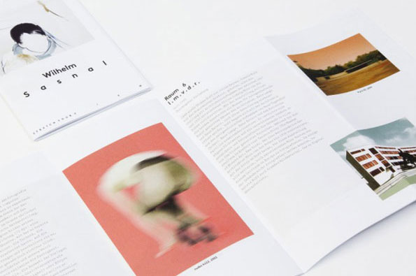
An open exhibition catalogue displays pages of text and images. One page features a blurred, red-toned photograph and the heading “Raum 6”.

Base Design's identity for Haus Der Kunst is an absolute belter

—
Date
7 November 2012

Surely the perfect client for any graphic design studio is an arts organisation? All that creative freedom, the engaging artworks to use on promotional material and the responsive audience, open to the avant-garde experimentation in your promotional visuals. But then maybe it’s a nightmare, with loads of inventive egos wanting to impose their own ideas upon your genius.

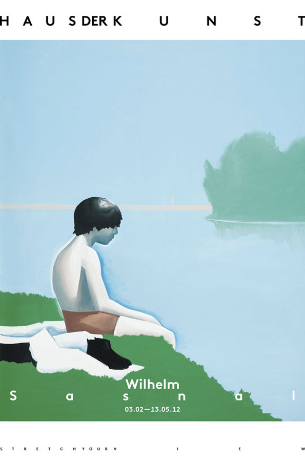
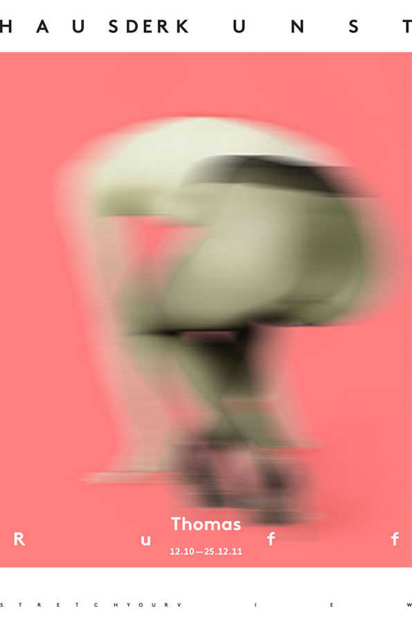
However it played out when Base Design and Munich’s Haus Der Kunst worked together on the gallery’s latest identity, the results are seriously impressive, granting the celebrated institution an aesthetic that places them firmly at the forefront of the art world. Based on the idea of flexibility, resilience and adaptability, the malleable logotype affords numerous iterations depending on the context of its use and the requirements of individual briefs.

It’s clean, simple and allows the real star of the show (that’s the exhibitions) to shine without being overshadowed by any fussy design. We’re pretty sure Base and Haus Der Kunst had a great time working together on this one.
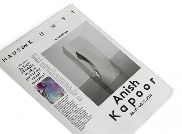
A magazine spread for an exhibition by Anish Kapoor at the Haus der Kunst. A large black and white photograph shows a curved, reflective sculpture set against a minimalist architectural backdrop.
Above

Base Design: Haus Der Kunst Identity

An illustration of a person sitting on a grassy bank, looking out over a calm body of water. A green, blurred landmass sits on the horizon under a pale blue sky. Text at the top reads “Haus der Kunst”. Text at the bottom reads “Wilhelm Sasnal” and the dates “03.02–13.05.12”.
Above

Base Design: Haus Der Kunst Identity

A blurred figure in pale green and white is captured in motion against a bright pink background. Text at the top reads “HAUSDERKUNST” and the bottom reads “Thomas Ruf” with the dates “12.10–25.12.11”.
Above

Base Design: Haus Der Kunst Identity

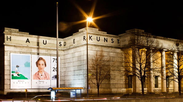
The Haus der Kunst museum at night, its stone facade illuminated by a bright street lamp. Large posters on the wall feature the names “Wilhelm Sasnal” and “Thomas Ruff”.
Above

Base Design: Haus Der Kunst Identity

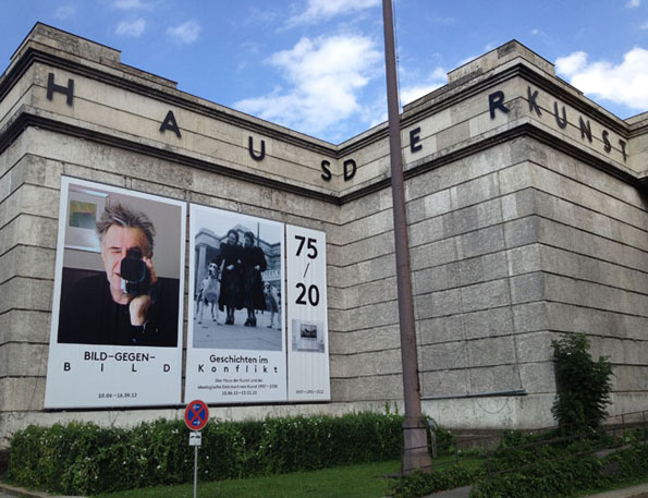
The stone facade of the Haus der Kunst museum features the building’s name in large letters across the top. Two large exhibition posters are mounted on the wall, one showing a person holding a camera and the other reading “Geschichten im Konflikt”.
Above

Base Design: Haus Der Kunst Identity

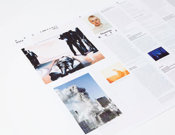
A printed exhibition catalogue layout featuring works by Thomas Ruff. The pages include a portrait of the artist, a large image of a figure in a suit, and a photograph of smoke rising between city buildings.
Above

Base Design: Haus Der Kunst Identity

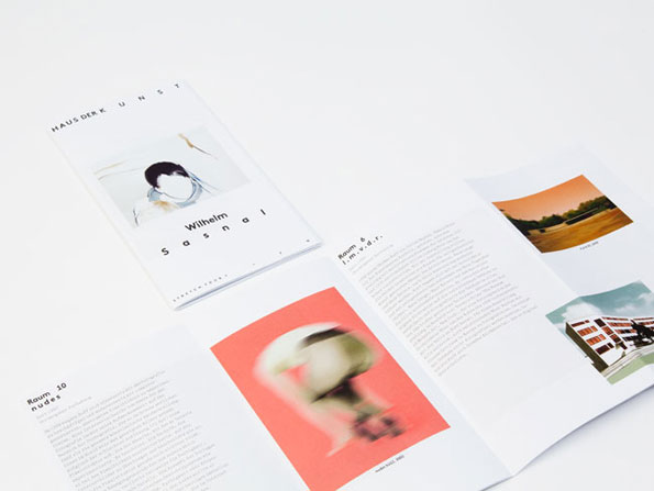
An open exhibition catalogue and a separate booklet lie on a white surface. The booklet cover features a portrait of Wilhelm Sasnal and the text “Haus der Kunst” and “Wilhelm Sasnal”.
Above

Base Design: Haus Der Kunst Identity

Share Article

About the Author

James Cartwright

—

James started out as an intern in 2011 and came back in summer of 2012 to work online and latterly as Print Editor, before leaving in May 2015.


It's Nice That Newsletters

Fancy a bit of It's Nice That in your inbox? Sign up to our newsletters and we'll keep you in the loop with everything good going on in the creative world.