Launch Recite Me assistive technology
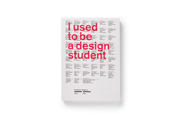
The white cover of a book features the title “I used to be a design student” in bold red type. The text is laid over a dense grid of smaller black text listing names and locations.

Great new book looks at prominent design figures' current and student selves

—
Date
21 February 2013

There’s a famous Jesuit maxim which says: “Give me a child until he is seven and I will give you the man” which is all well and good, but I would suggest that it’s our student days that really shape us. With that in mind, this ace new book from Frank Philippin and Billy Kiosoglou of Brighten The Corners is a real eye-opener as it interviews 50 practising designers about their current work and their art school days. With the likes of Margaret Calvert, Ken Garland, Stefan Sagmester and Andy Stevens of Graphic Thought Facility all taking part, alongside younger talents like Daniel Eatock, Jan Wilker and Kirsty Carter of A Practice for Everyday Life, there is a real cross-section of the creative community to compare.

As well as the illuminating interviews, the front of the book is given over to some handy charts which show us the participants’ waking-up times, favourite foods and even weights then and now. A great read for anyone interested in the way creative process works, or needs to know what exercise Andreas Gnass does (badminton and snowboarding). Fittingly, it’s really well designed too…
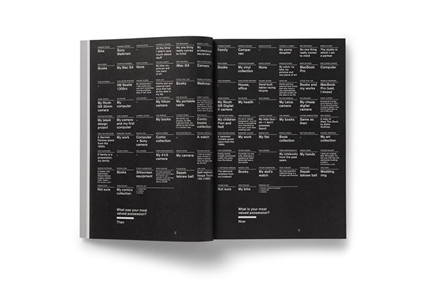
An open book with black pages and white text. The pages are filled with a dense, grid-like arrangement of short phrases and lists of possessions.
Above

Frank Philippin and Billy Kiosoglou: I Used To Be A Design Student
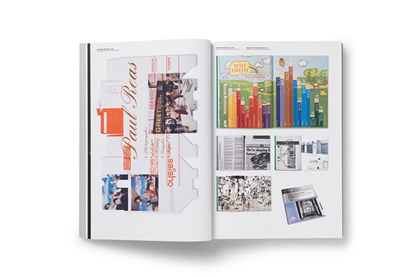
An open book displays two pages of graphic design work. The left page features a layout for “Paul Reas” with a mix of photography and vertical typography, while the right page shows a colourful illustration of a city skyline and several smaller design samples.
Above

Frank Philippin and Billy Kiosoglou: I Used To Be A Design Student
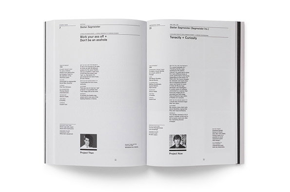
An open book showing two pages of a profile on Stefan Sagmeister. Bold headlines read “Work your ass off + Don’t be an asshole” and “Tenacity + Curiosity”. Small black and white portraits of the designer appear at the bottom of each page.
Above

Frank Philippin and Billy Kiosoglou: I Used To Be A Design Student
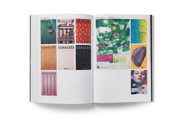
An open book displays two pages of graphic design work. The left page shows a grid of seven rectangular cards featuring the word “Ronacher” in various colours and textures. The right page contains a collage of abstract shapes, a portrait of a person, and a blue poster with the word “praça”.
Above

Frank Philippin and Billy Kiosoglou: I Used To Be A Design Student
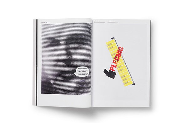
An open book shows a two-page spread. The left page features a high-contrast, lined portrait of a person with an open mouth, while the right page shows a yellow graphic strip with the word “PLEGNIC” in red.
Above

Frank Philippin and Billy Kiosoglou: I Used To Be A Design Student
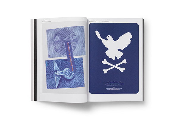
An open book shows two pages of graphic design. The left page features two blue-toned images of an eagle emblem, while the right page shows a white silhouette of a dove above crossed bones on a dark blue background.
Above

Frank Philippin and Billy Kiosoglou: I Used To Be A Design Student
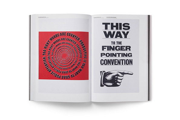
An open book shows two contrasting graphic pages. The left page features a red square with white text spiralling inward, reading “Too many words are counter productive”. The right page shows a black and white illustration of a pointing hand below the text “This way to the finger pointing convention”.
Above

Frank Philippin and Billy Kiosoglou: I Used To Be A Design Student
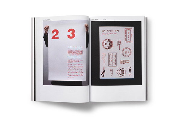
An open book shows two pages of a layout. On the left, a person holds up a large white sheet of paper with the red numbers “23” and a block of text. The right page is a black background featuring white and red graphic elements, including stamps and the year “2007”.
Above

Frank Philippin and Billy Kiosoglou: I Used To Be A Design Student
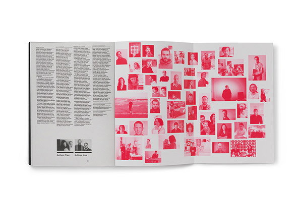
An open book shows a page of dense text alongside a collage of red-tinted photographs. The images feature various people in a grid-like arrangement, with two small black and white portraits at the bottom left labelled “Authors Then” and “Authors Now”.
Above

Frank Philippin and Billy Kiosoglou: I Used To Be A Design Student

Share Article

About the Author

Rob Alderson

—

Rob Alderson is a freelance writer, editor and strategist. He was previously editor-in-chief of It’s Nice That and WePresent, and editor of Design Week. He publishes the newsletter Undo, which tries to make sense of how AI is changing design work, the design process and the design industry.
It's Nice That Newsletters

Fancy a bit of It's Nice That in your inbox? Sign up to our newsletters and we'll keep you in the loop with everything good going on in the creative world.