



Launch Recite Me assistive technology
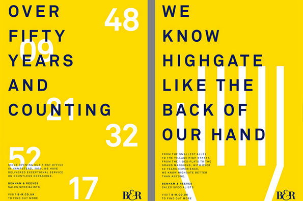
Two yellow posters with bold blue typography. The first reads “OVER FIFTY YEARS AND COUNTING”, surrounded by white numbers. The second reads “WE KNOW HIGHGATE LIKE THE BACK OF OUR HAND”, with a white graphic of a hand laid over the text. Both feature the Benham & Reeves “B&R” logo.

One of London's premium estate agents just got MUCH better looking

—
Date
6 February 2013

Bit of an exciting one from the guys over at Ideas Factory who have just finished rebranding Highgate estate agents Benham and Reeves. I know what you’re thinking, but don’t. Put aside your phobic attitude towards those real estate vendors and just enjoy the fact that for once, one of them has an identity that’s actually rather pleasant to look at.

Ideas Factory have carefully balanced the company’s 50 year heritage and classic logotype with graphic motifs and contemporary typography that pulls them comfortably into the present. Coupled with a punchy navy and yellow colour palette and some luxuriously printed promotional materials (nothing says big business like thick, inky stock) this is an undeniably premium piece of branding that maintains substance over style throughout. After all, it’s the properties you should be focussing on, not the packaging they come wrapped in.
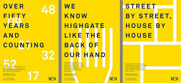
Three yellow posters for Benham & Reeve estate agents. The first reads “Over fifty years and counting”, the second “We know Highgate like the back of our hand”, and the third “Street by street, house by house”.
Above

Ideas Factory: Benham and Reeves rebrand
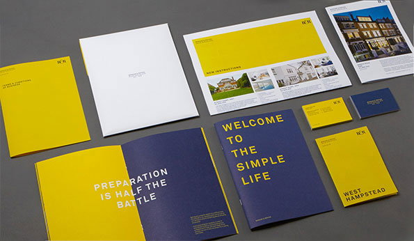
A collection of brand identity materials in yellow, navy blue and white. A navy blue booklet reads “WELCOME TO THE SIMPLE LIFE”, while an open yellow brochure reads “PREPARATION IS HALF THE BATTLE”.
Above

Ideas Factory: Benham and Reeves rebrand
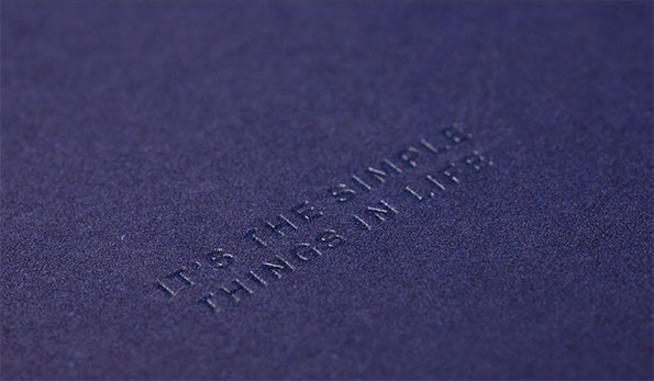
A close-up of a textured purple surface with the words “IT’S THE SIMPLE THINGS IN LIFE” debossed into the material.
Above

Ideas Factory: Benham and Reeves rebrand
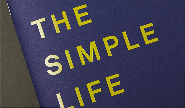
Yellow text on a dark blue background reads “THE SIMPLE LIFE”. The words are arranged in three lines and angled across the frame.
Above

Ideas Factory: Benham and Reeves rebrand
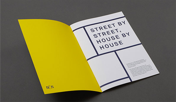
An open brochure with a bright yellow left page and a white right page. The right page features a bold typographic layout that reads “STREET BY STREET, HOUSE BY HOUSE”.
Above

Ideas Factory: Benham and Reeves rebrand
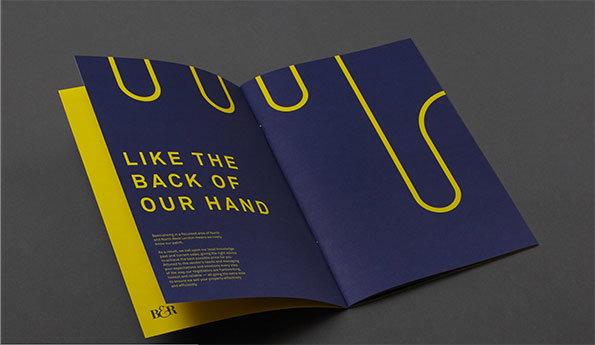
An open brochure with deep blue pages and yellow accents. The left page features the headline “LIKE THE BACK OF OUR HAND” above a block of smaller text and a “B&R” logo.
Above

Ideas Factory: Benham and Reeves rebrand
A yellow card features a dark blue logo reading “B&R”. The card is angled across a dark grey background.
Above

Ideas Factory: Benham and Reeves rebrand
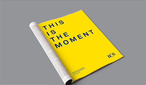
A bright yellow brochure lies on a grey surface, with its pages partially curled. Bold black text reads “THIS IS THE MOMENT”, with a small “B&R” logo in the corner.
Above

Ideas Factory: Benham and Reeves rebrand

Share Article

About the Author

James Cartwright

—

James started out as an intern in 2011 and came back in summer of 2012 to work online and latterly as Print Editor, before leaving in May 2015.


It's Nice That Newsletters

Fancy a bit of It's Nice That in your inbox? Sign up to our newsletters and we'll keep you in the loop with everything good going on in the creative world.

