Jorge León's impressively coherent identity for a Barcelona skate shop
It’s always refreshing to see a creative being really honest about the challenges of a particular brief before showing us their solution. So it is with Barcelona-based graphic designer and art director Jorge León, who sets up his work for the Amigos skate shop by referring to the “many problems” it had encountered with its brand.
“Among other things, they had used many different logos in the last few years and were still unsure how to apply and use them effectively,” he writes.
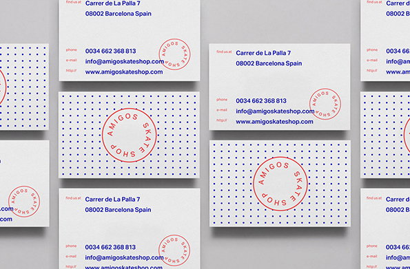
His response was to standardise the graphic language across print collateral, web presence and other ephemera, and use the red and blue so associated with the city to contextualise the shop in its locale. The results are simple and cohesive and exemplify how to use some of the visual elements associated with trendy graphic design in a way that really works.
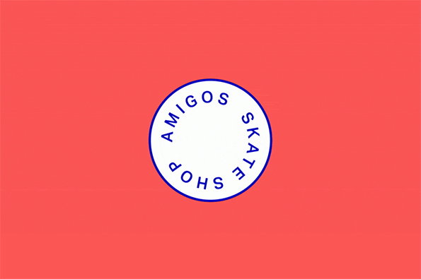
Jorge León and Iris Tarraga: Amigos Skate Shop
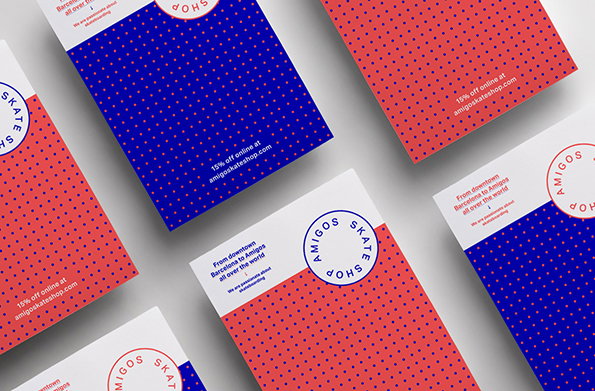
Jorge León and Iris Tarraga: Amigos Skate Shop
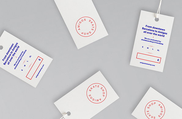
Jorge León and Iris Tarraga: Amigos Skate Shop
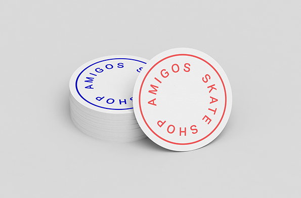
Jorge León and Iris Tarraga: Amigos Skate Shop
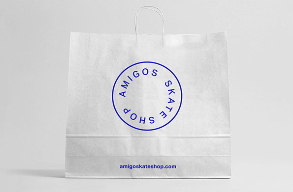
Jorge León and Iris Tarraga: Amigos Skate Shop
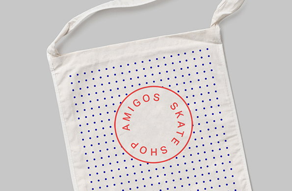
Jorge León and Iris Tarraga: Amigos Skate Shop
Share Article
Further Info
About the Author
—
Rob Alderson is a freelance writer, editor and strategist. He was previously editor-in-chief of It’s Nice That and WePresent, and editor of Design Week. He publishes the newsletter Undo, which tries to make sense of how AI is changing design work, the design process and the design industry.