




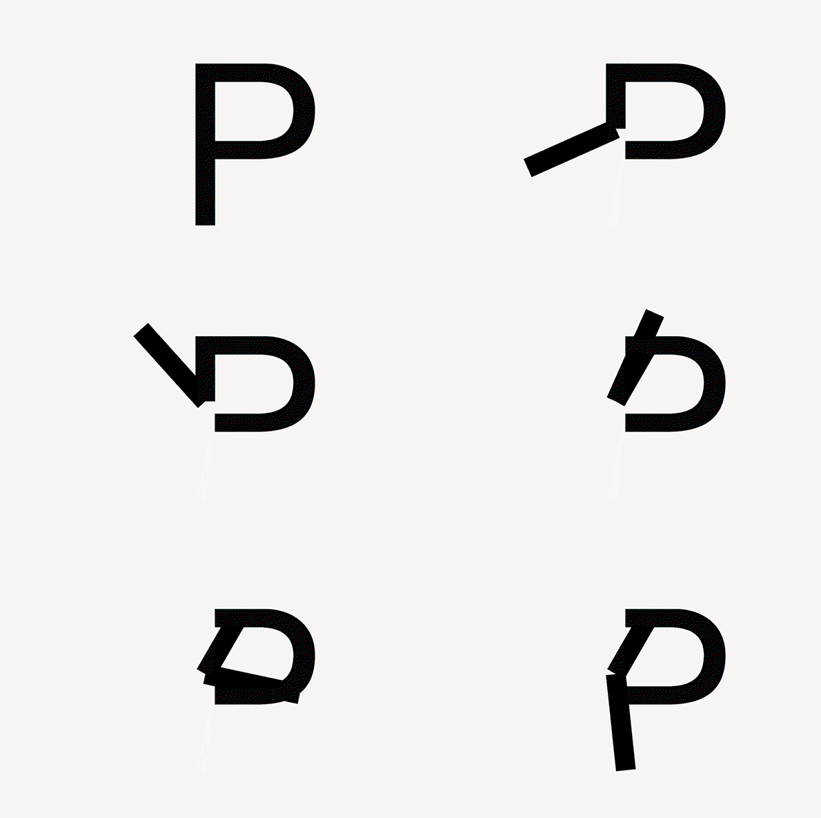
Introducing Peace, a typeface which tells the time, by Kia Tasbihgou
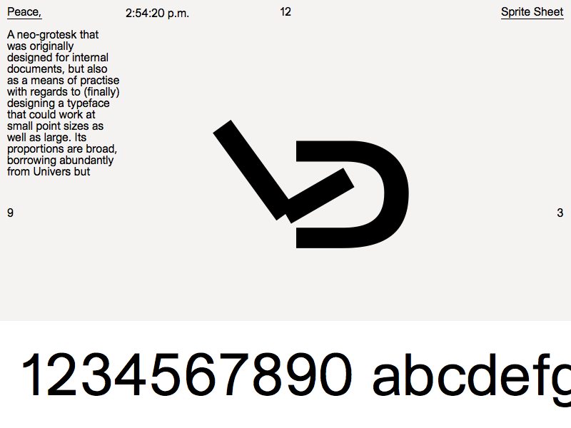
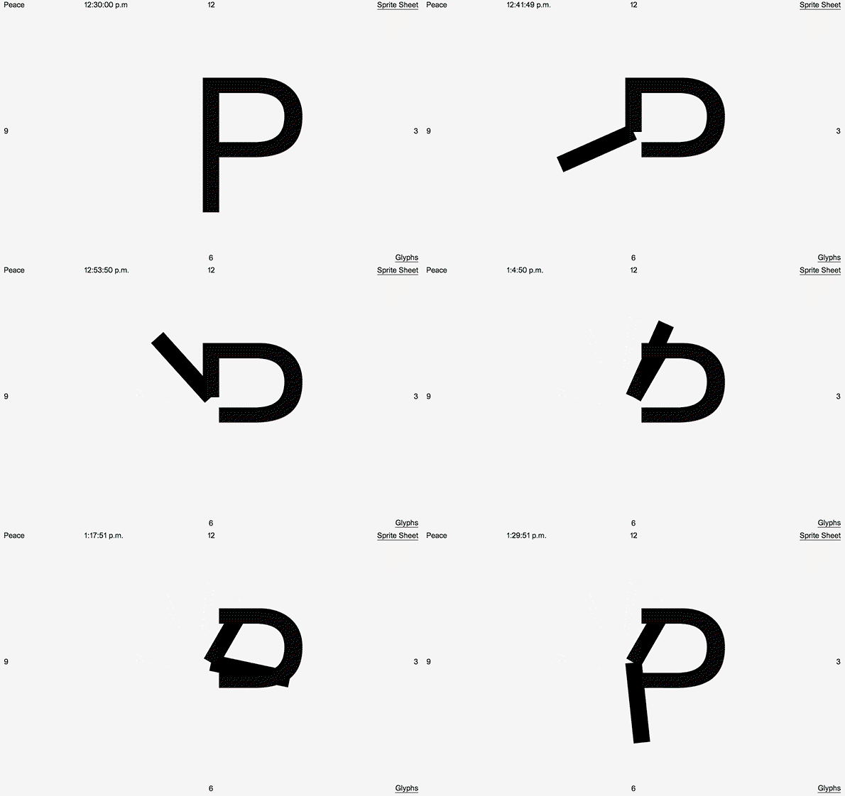
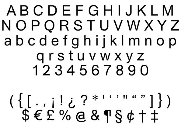
Just over a week ago, graphic designer Kia Tasbihgou was finishing up a ten-week freelance stint with us at It’s Nice That, during which time he designed the identity for the Graduates 2015 competition, among a bunch of other stuff. So we knew he had some skills under his belt – bespoke typefaces, lettering, web design, etc. What we didn’t know until his last day was the the Kingston graduate had just finished off a personal project called Peace, a fully-formed Neo-Grotesk typeface, which Kia manipulated so that its first letter can also tell the time.
Peace was initially created for relatively unexciting applications, as it turns out. “I thought it would be great to be able to work on projects with completely native type, and to be able to add ‘type designer’ to my (limited) gamut,” Kia explains. “So, originally I designed Peace as a typeface that I could use for internal documents – notes, PDFs for clients, invoices, the boring stuff.” But having stumbled across Peace, digital type foundry Placeholder Type liked the look of it, and decided to distribute it. “So it has already outgrown its original purpose, in a way.”
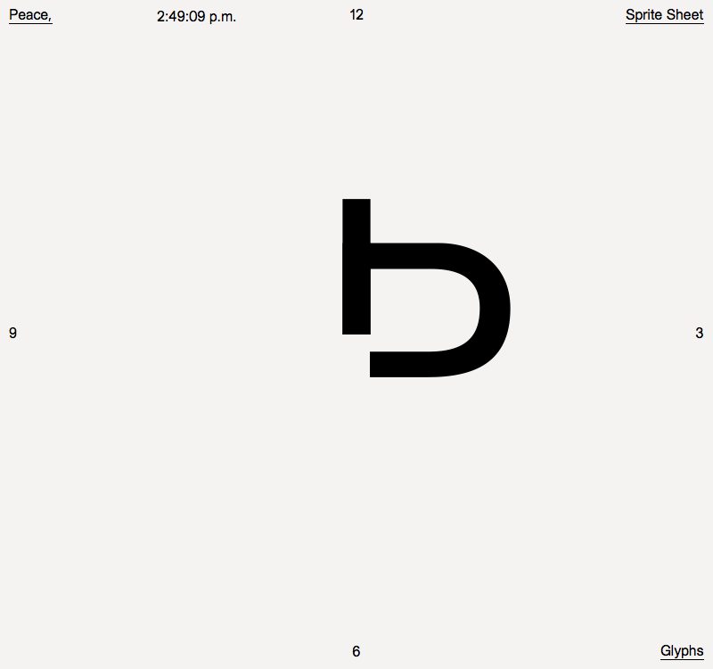
Kia Tasbihgou: Peace
Not content with having simply crafted his own typeface, however, Kia also built a microsite to house it. “The microsite came about after a very brief exchange with a type foundry called Dinamo,” Kia continues. “Originally I asked them to send me a type specimen for their typeface Favorit, to which they responded that a type specimen to them is the work produced by others with their typefaces.” This revelation, in turn, inspired Kia to put Peace to work, telling the time with its own first letter to start with.
“As Peace was originally intended for internal use to be used in the most mind-numbing contexts, I felt the best way to display would be to illustrate these monotonies using the characters themselves,” he continues. “Anthropomorphising the typeface is about as useful as showing a page that has been carefully typeset – useless.”
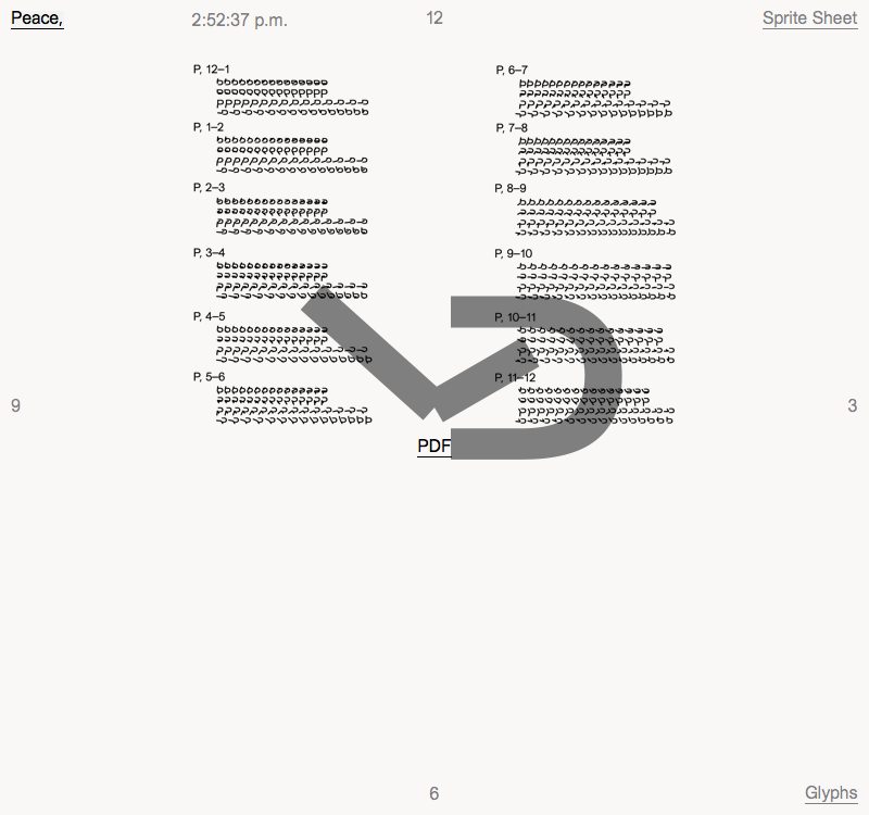
Kia Tasbihgou: Peace
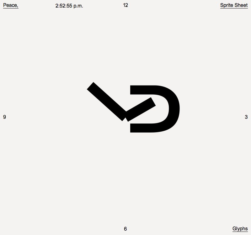
Kia Tasbihgou: Peace
Kia Tasbihgou: Peace
Kia Tasbihgou: Peace
Kia Tasbihgou: Peace
Share Article
Further Info
About the Author
—
Maisie joined It’s Nice That fresh out of university in the summer of 2013 as an intern before joining full time as an Assistant Editor. Maisie left It’s Nice That in July 2015.


