




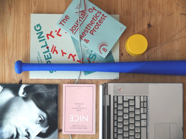
Introducing... We get up close and personal with the talented Mathis Pfäffli
Mathis Mathis Pfäffli is very, very good at what he does. And what he does is flipping great graphic design. Want proof? Right this minute he’s undertaking a residency in Chicago in which he’s paid and housed in return for creating personal work on a daily basis. Nobody gives you a house and a wage to make things unless you’re really great at it. That’s just a fact.
Mathis’ visual style is deeply playful and draws as much inspiration from 3D work and illustration as it does from traditional graphic design. Yes he’s got polished typographic skills and an understanding of grids that most of us would balk at, but his work is peppered with inviting illustrative elements and coloured textures that demand your attention in a very immediate way.
Like all great creatives Mathis has a strict daily routine to which he adheres in order to maintain the standard of his work, and he explains it in great detail below…
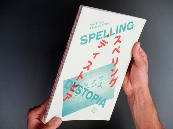
Mathis Pfäffli: Spelling Dystopia
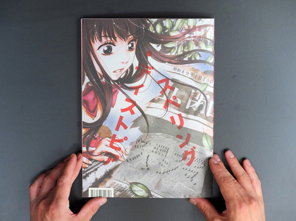
Mathis Pfäffli: Spelling Dystopia
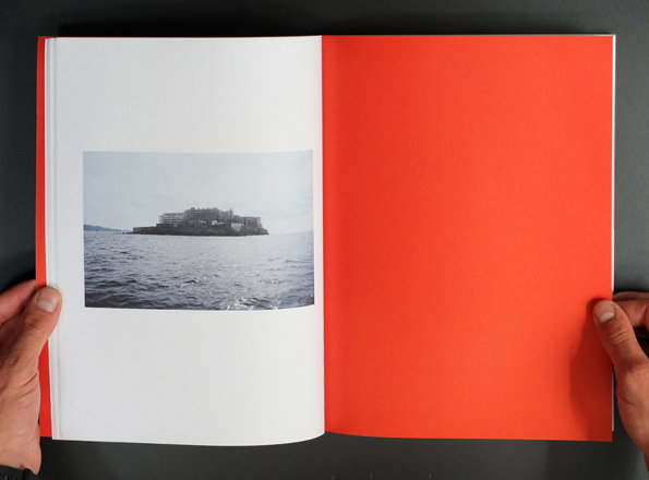
Mathis Pfäffli: Spelling Dystopia
Where do you work?
Since the end of my studies four years ago, I turned into a kind of a nomad in my working and living habits. The past year I spent basically in Leipzig because of some book projects I was working on. Somehow over the last three years this city has turned into a kind of second home. So practically I’d say I work between Lucerne and Leipzig.
Lucerne is the place where I have my family and tons of age-old friendships. There I also founded the studio “Detektiv Bureau” together with my friends Nadine Gerber, Daniel Peter and Christopher Barmettler. That quickly turned into an Offspace, and almost every other week we organized readings, exhibitions or philosophical discussions. We even published small editions of publications which we riso-printed at the Südpol, a cultural centre in Lucerne for which we all designed posters at that time.
Leipzig is another story; it has a lot to offer for a young graphic designer because of the deep humility on the tradition of graphic design surrounding the Leipzig Academy of Visual Arts, and the serious discussions about it. It’s something I learn a lot from.
How does your working day start?
My typical working day in Leipzig starts usually in the next-door coffee shop, where I read the newspaper. That’s really important, I think it’s a way of combing my thoughts in the morning. Later I drop into the studio where everyone is already at work. I’m always a bit later, usually I start actual working at about 11 am. Since my partners and customers are all in different places, I need to deal a lot by Skype and Dropbox which takes a lot of time, especially when you’re also interested in the latest gossip.
How do you work and how has that changed?
Earlier I was kind of a ’"do it yourself" guy. I really liked to make things with my hands; cutting stuff out, pouring paint, sawing logs of wood apart. That had a great influence on my work which was pretty illustrative and handmade at that time. But because of the lack of a permanent studio I had to reduce the amount of physical work, which is a bit of a pity.
I’d say I’m still fighting material battles at the beginning of a project, but now in a more digital way. I usually make tons of designs and often have to change everything several times during the realisation. My working practice is also affected by side projects I take on.
For example right now I’m staying in Chicago in a studio in the middle of Wicker Park where I do nothing but self-initiated projects. Until December Nadine and I will produce some art-related projects, and that will certainly have some influence on my future design as well.
Where would we find you when you’re not at work?
I have the pleasure to say that most of the time I don’t feel like being at work since most people I work with are actual friends; that’s why it’s possible to work and be silly at the same time. But when I’m not at the studio I like to have lengthy dinners with friends, hanging out in bars or going to concerts. Actually I’m kind of a music addict and I really miss having a touchable record collection at the moment.
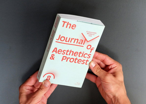
Mathis Pfäffli: The Journal of Aesthetics and Protest
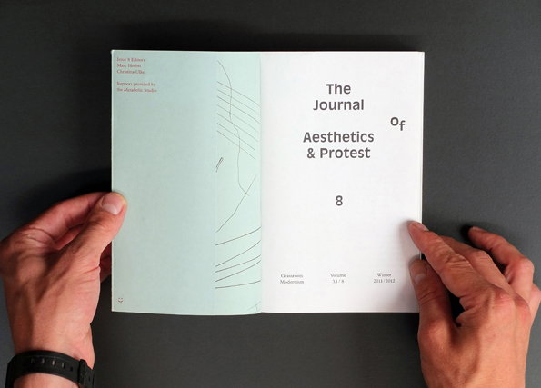
Mathis Pfäffli: The Journal of Aesthetics and Protest
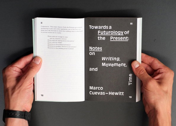
Mathis Pfäffli: The Journal of Aesthetics and Protest
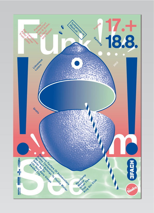
Mathis Pfäffli: Funk am See
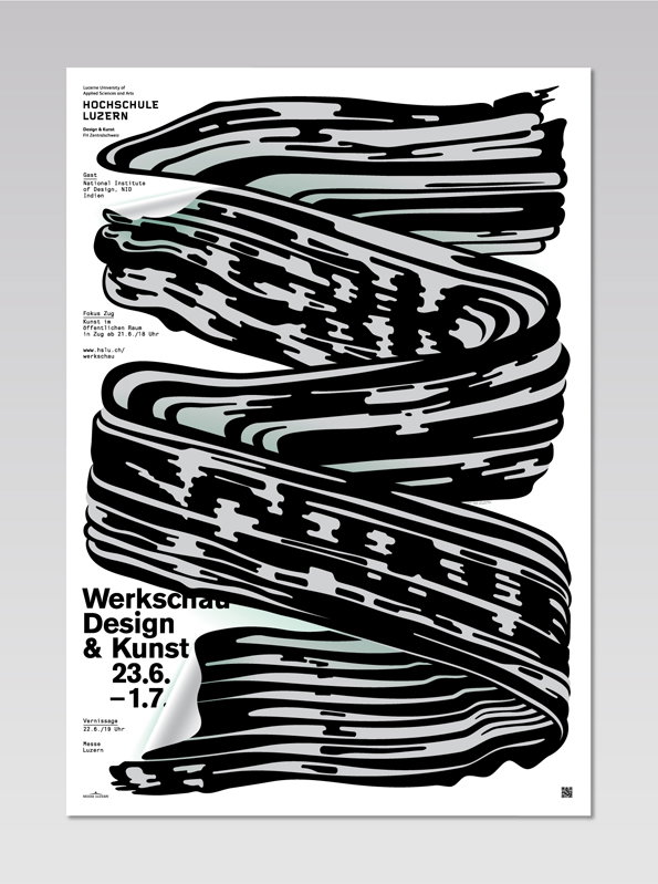
Mathis Pfäffli: Werkshau Design & Kunst
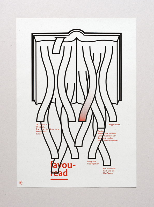
Mathis Pfäffli: Favouread # 1
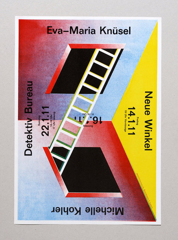
Mathis Pfäffli: Neue Winkel
Share Article
Further Info
About the Author
—
James started out as an intern in 2011 and came back in summer of 2012 to work online and latterly as Print Editor, before leaving in May 2015.



