Launch Recite Me assistive technology
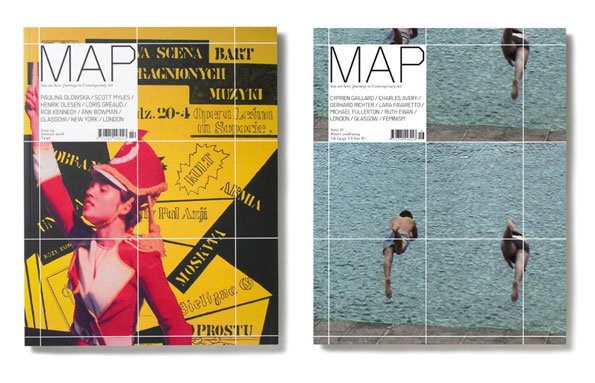
Two covers of Map magazine. The first features a person in a red and yellow costume against a yellow background with bold black text. The second shows figures diving into a turquoise pool, overlaid with a white grid.

Matt Willey's back in business with a shiny new website of killer design

—
Date
16 November 2012

You may have noticed from some of the articles we’ve posted over the last few week that we used to have a bit of a crush on the now-defunct Studio8. Those guys knew how to design great stuff and were instrumental in shaping some of our (well mine at least) interests in graphic design. But while we were sad they decided to close their doors, we’re thrilled that they’ve all gone off to develop their own practices and are still producing work that gets us pretty damn excited.

Matt Willey, former founder of Studio8 and creative director of Port, has just put his new website online that showcases the best of what he’s been up to for the past couple of years (in his words “a badly edited, non-chronological and incomplete dumping ground of bits and pieces”). As expected there’s some seriously tasty content on there ranging from experimental type design for the likes of Wired, editorial for The New York Times and a whole host of striking posters and promotional material. Matt’s been at the top of his game for a number of years now, but he’s still producing work that feels fresh and exciting – a feat that shouldn’t go without deserved recognition.
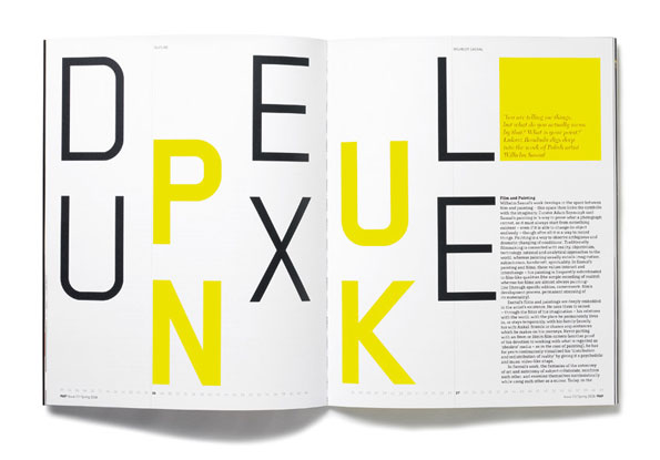
An open magazine spread featuring bold, oversized typography. Large black and yellow letters are arranged in a fragmented grid, with a block of text and a yellow square on the right page.
Above

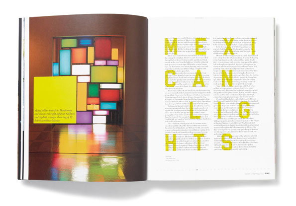
Matt Willey: Map

An open magazine spread. The left page shows a large, colourful geometric light installation made of glowing rectangular panels in a dark room. The right page features a long article with the word “MEXICAN LIGHTS” printed in large, bold yellow letters.
Above

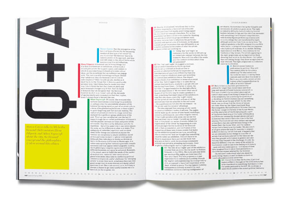
Matt Willey: Map

An open magazine spread featuring a bold, black typographic element on the left page. The right page is filled with columns of text and a vertical strip of pink and purple blocks.
Above

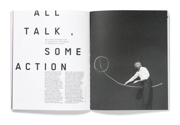
Matt Willey: Map

An open book shows a bold typographic layout on the left and a black and white photograph on the right. The text reads “ALL TALK, SOME ACTION”, while the image shows a person in a white shirt holding a long, looping piece of wire.
Above

Matt Willey: Map

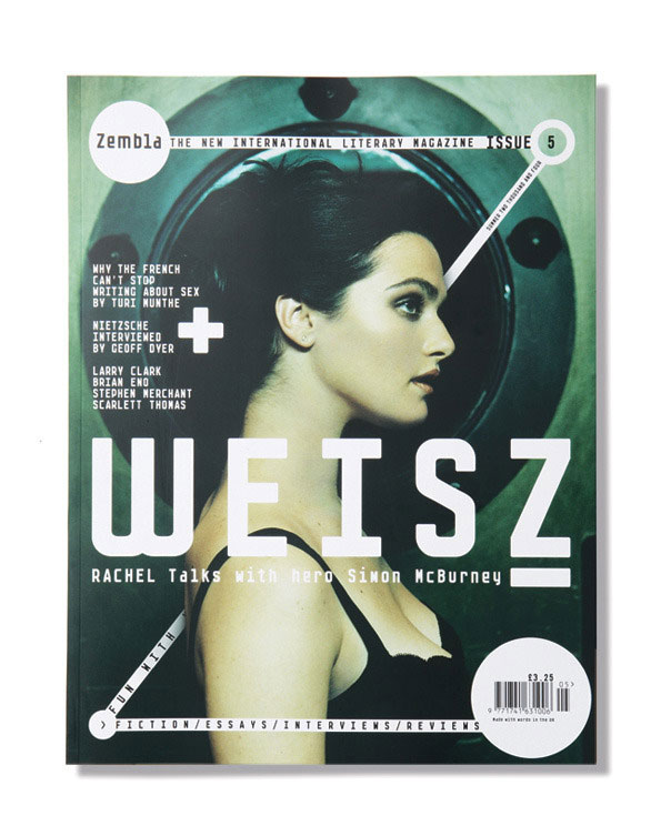
The cover of Zembla magazine features a profile portrait of a person looking to the right. Large white text across the centre reads “WEISZ”, with a smaller headline below stating “Rachel talks with hero Simon McBurney”.
Above

Matt Willey: Zembla

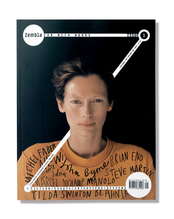
The cover of Zembla magazine, issue 1, featuring a portrait of Tilda Swinton. They wear an orange T-shirt covered in handwritten names, including “Brian Eno” and “Steve Martin”.
Above

Matt Willey: Zembla

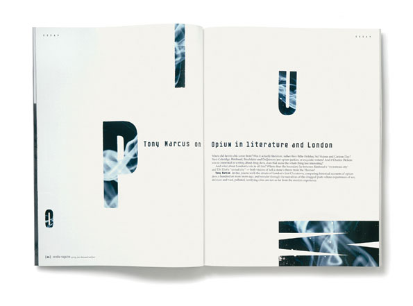
An open magazine spread featuring an essay by Tony Marcus. Large, fragmented letters spelling “Opium” are layered with wisps of white smoke across the pages. The headline reads “Tony Marcus on Opium in literature and London”, followed by several paragraphs of body text.
Above

Matt Willey: Zembla

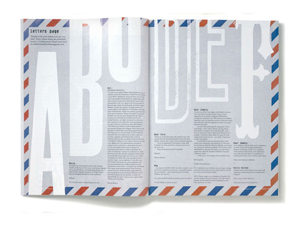
An open magazine spread featuring a “letters page”. Large, pale blue typographic letters are layered behind columns of text and a red and blue border.
Above

Matt Willey: Zembla

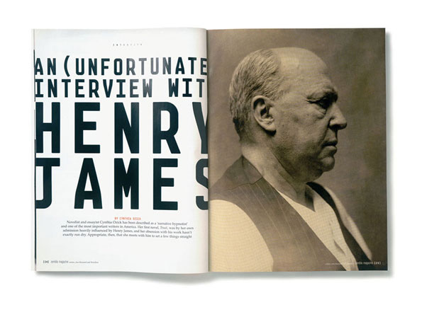
An open magazine spread featuring a profile portrait of Henry James. The opposite page displays a bold headline that reads “AN (UNFORTUNATE) INTERVIEW WITH HENRY JAMES”.
Above

Matt Willey: Zembla

Share Article

About the Author

James Cartwright

—

James started out as an intern in 2011 and came back in summer of 2012 to work online and latterly as Print Editor, before leaving in May 2015.

It's Nice That Newsletters

Fancy a bit of It's Nice That in your inbox? Sign up to our newsletters and we'll keep you in the loop with everything good going on in the creative world.