




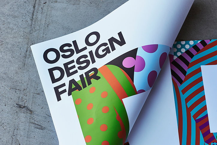
Bielke&Yang creates bright, playful Oslo Design Fair identity
When you think Scandinavian design, you think clean, white minimalism. But some new designs for Oslo Design Fair manage to take that clean aesthetic and inject a bit of colour and playfulness into it, courtesy of Bielke&Yang. The agency, which is also based in Oslo, created a custom typeface based on traditional Grotesk sans serifs for the event, but using “subtle yet recognisable contemporary touches that balance the tone of the identity between the past and present," according to the agency. The typography was created with Bobby Tannam.
Bielke&Yang adds: “This year’s identity plays on the idea of extracting abstract patterns, colours, shapes and forms from the diverse range of products, materials and textiles.” It’s a neat, legible but fun look and feel that uses illustrations by Magnus Voll Mathiassen within the letterforms spelling out ODF, aiming to reflect the eclectic nature of the designs the fair showcases.
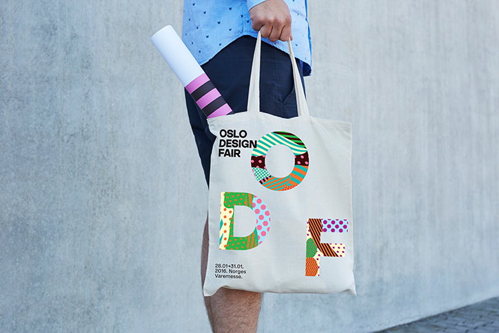
Bielke&Yang: Oslo Design Fair identity
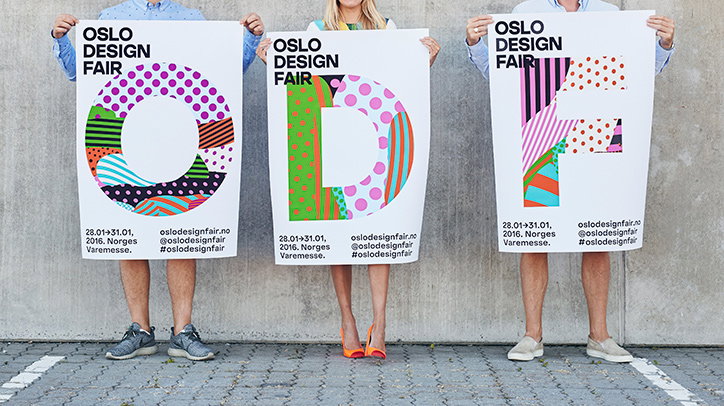
Bielke&Yang: Oslo Design Fair identity
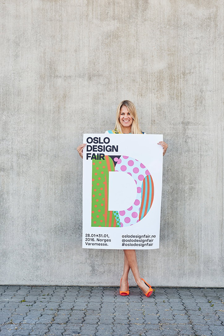
Bielke&Yang: Oslo Design Fair identity
Share Article
Further Info
About the Author
—
Emily joined It’s Nice That as Online Editor in the summer of 2014 after four years at Design Week. She is particularly interested in graphic design, branding and music. After working It's Nice That as both Online Editor and Deputy Editor, Emily left the company in 2016.

