



Launch Recite Me assistive technology
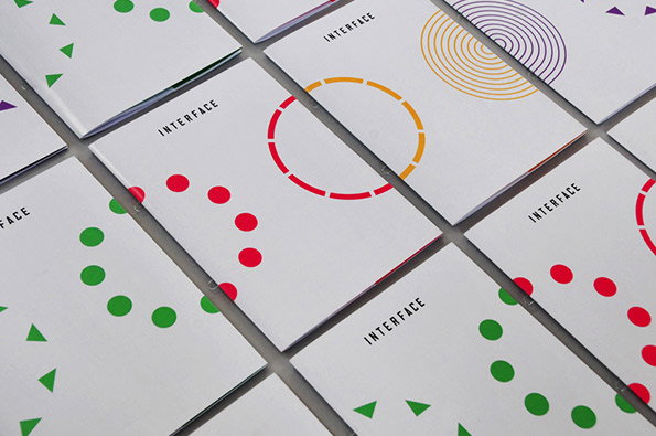
A grid of white booklets, each featuring the word “INTERFACE” and a different geometric pattern. The designs include circles and triangles in red, green, yellow and purple.

Patrick Fry produces a striking identity for The Globe theatre's digital event

—
Date
12 February 2013

Shakespeare’s Globe next to the Thames is famous for many reasons, but it’s fair to say that digital networking events would not be the first thing to spring to mind. So when the iconic theatre launched its first such event Interface recently, it turned to a graphic designer with the abilities to marry these seemingly incongruous worlds. Patrick Fry, once of this parish, created a striking identity combining geometric coloured patterns and clean white space for a look that manages to be both contemporary and characterful. Interesting enough on their own, as a set the pamphlets really come together, a nice nod to the ideas behind the event they are promoting.
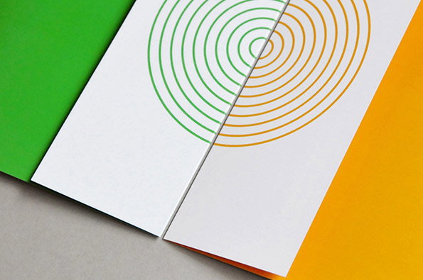
Two white cards overlap on a grey surface, each featuring a series of concentric circles. One set of circles is green and the other is orange, mirrored across the divide.
Above

Patrick Fry: Identity for Shakespeare’s Globe Interface event
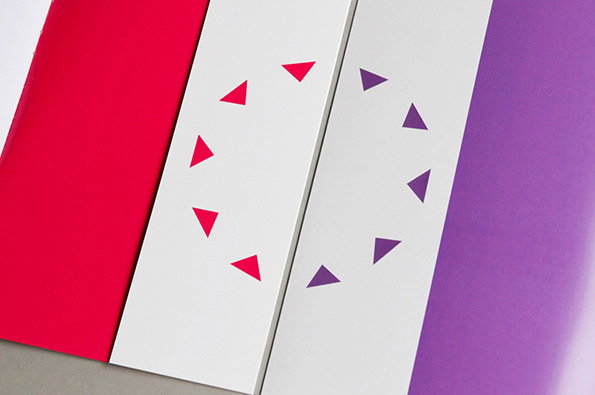
Four vertical panels stand side by side. The outer panels are solid red and purple, while the inner white panels feature circles of small, coloured triangles.
Above

Patrick Fry: Identity for Shakespeare’s Globe Interface event
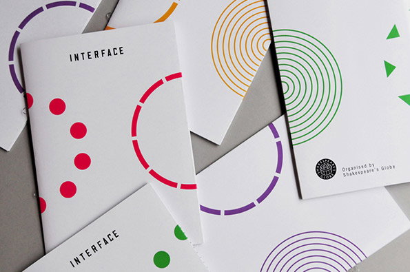
A collection of white booklets with the word “Interface” printed in a clean, black sans-serif font. Each cover features a different minimalist graphic in bright colours, including concentric circles and dotted arcs. One booklet includes the text “Organised by Shakespeare’s Globe” next to a small circular logo.
Above

Patrick Fry: Identity for Shakespeare’s Globe Interface event
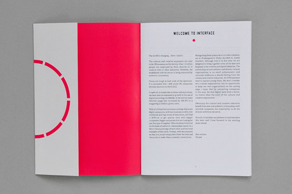
An open brochure with a bold red page facing a white page of text. The right page is titled “Welcome to Interface” and contains a letter of introduction.
Above

Patrick Fry: Identity for Shakespeare’s Globe Interface event
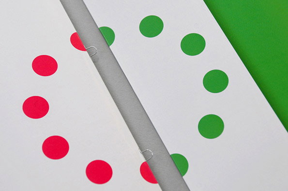
Two sheets of white paper are held together by two staples. A circle of red and green dots is split across the pages, creating a mirrored effect.
Above

Patrick Fry: Identity for Shakespeare’s Globe Interface event
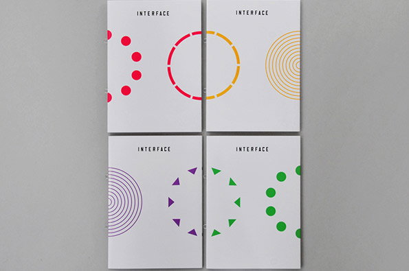
Four white booklets are arranged in a grid, each featuring the word “Interface” at the top. Each cover displays a different abstract circular motif in red, yellow, purple or green.
Above

Patrick Fry: Identity for Shakespeare’s Globe Interface event
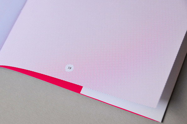
A close-up of an open book page featuring a fine, purple dot grid pattern. A small white circle at the bottom contains the number “19”, and a bright pink edge is visible beneath the page.
Above

Patrick Fry: Identity for Shakespeare’s Globe Interface event
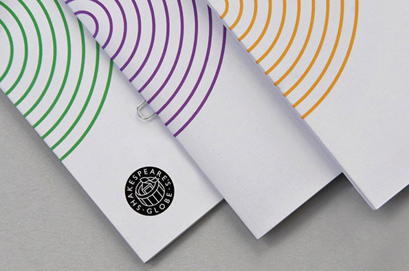
Three white booklets are fanned out, each featuring a series of concentric semi-circles in green, purple or orange. The bottom booklet displays a black circular logo for “Shakespeare’s Globe”.
Above

Patrick Fry: Identity for Shakespeare’s Globe Interface event
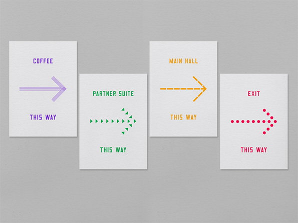
Four minimalist directional signs on a grey background. Each features a different coloured arrow and text reading “this way” beneath destinations including “coffee”, “partner suite”, “main hall” and “exit”.
Above

Patrick Fry: Identity for Shakespeare’s Globe Interface event
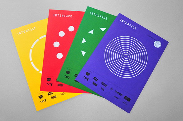
Four brightly coloured posters in yellow, red, green and purple are fanned out across a grey surface. Each features the word “INTERFACE” at the top and a different white geometric pattern, including circles, dots, triangles and concentric rings.
Above

Patrick Fry: Identity for Shakespeare’s Globe Interface event
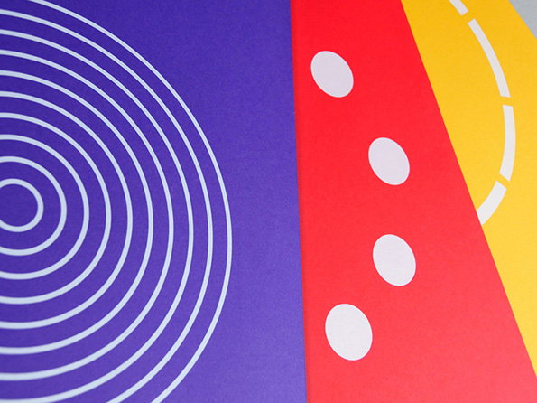
An abstract composition of bold coloured shapes. A purple section features white concentric circles, while a red diagonal strip contains four white dots and a yellow section shows a partial white arc.
Above

Patrick Fry: Identity for Shakespeare’s Globe Interface event

Share Article

About the Author

Rob Alderson

—

Rob Alderson is a freelance writer, editor and strategist. He was previously editor-in-chief of It’s Nice That and WePresent, and editor of Design Week. He publishes the newsletter Undo, which tries to make sense of how AI is changing design work, the design process and the design industry.


It's Nice That Newsletters

Fancy a bit of It's Nice That in your inbox? Sign up to our newsletters and we'll keep you in the loop with everything good going on in the creative world.