Launch Recite Me assistive technology
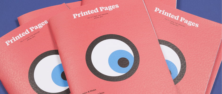
Three red magazines are fanned out against a blue background. The covers feature a large, stylised eye and the title “Printed Pages” above the text “The It’s Nice That Magazine Spring 2013”.

Over-excitement alert! Roll up, roll up for the first issue of our new magazine Printed Pages

—
Date
25 March 2013

Ring the bells, fly the flags and light the beacons from sea to shining sea good people of the internet, because have we got news for you. There’s been whispers, rumours and speculation, lies, damn lies and statistics but today is the day when we present our brand new magazine.

A new format, a new editorial approach and first and foremost a new name – everyone here is proud and excited to introduce you to Printed Pages. The 84-page, saddle-stitched publication is built around eight main features with a new cover price of just £4. Despite the changes our core values – breadth, accessibility and enthusiasm – have remained at the forefront of our thinking, as have the design values our readers have come to expect from our publications.

For this first issue we’ve got interviews with Sagmeister & Walsh and Chris Ware, a snoop around Apartamento founder Omar Sosa’s flat, features on sculpture parks, graphic design in Barcelona and Why Not Associates’ old slides, and chats with Guess Who? illustrator Jon Goode and young filmmaker Hanly Banks. Letters of Note founder Shaun Usher has written the introductory Nice piece and Emily Kai Bock told us about the unlikely beauty of security lighting.

Check out our sweet new website too, where you can also bag a copy of the first ever issue of Printed Pages and we are also pretty stoked to unveil our new shop as well, Company of Parrots, where you can pick up some specially-commissioned t-shirts as well as the magazine. We just hope you enjoy reading it as much as we loved putting it together…
Buy your copy of Printed Pages now!

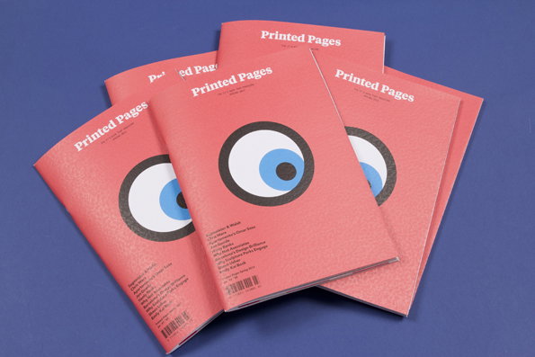
A stack of pink booklets titled “Printed Pages” rests on a blue surface. Each cover features a large, stylised eye with a blue pupil and a list of names in small white text.
Above

Printed Pages: Spring/Summer 2013

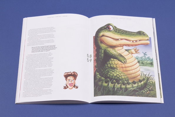
An open book shows a colourful illustration of a smiling green crocodile on the right page. The left page contains several paragraphs of text and a small illustration of a person’s face.
Above

Printed Pages: Spring/Summer 2013

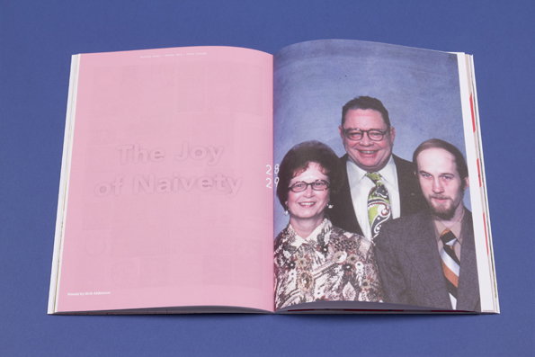
An open book shows a pink page on the left and a photograph on the right. The pink page features the title “The Joy of Naivety” and the page numbers “28 29”. The photo shows three people posing together against a blue backdrop.
Above

Printed Pages: Spring/Summer 2013

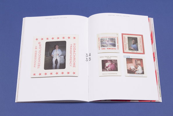
An open book displays several vintage photographs on white pages. On the left, a single photo of a person in a white outfit is framed by a border reading “PROCESSED BY TECHNICOLOR” and “KODACHROME TRANSPARENCY”. The right page shows four smaller photos, including one of a person sitting at a desk.
Above

Printed Pages: Spring/Summer 2013

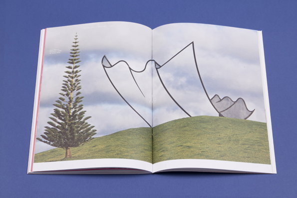
An open book shows a collage of a tall, thin evergreen tree on a grassy hill. Large, white abstract shapes with black outlines float in a cloudy sky behind the tree.
Above

Printed Pages: Spring/Summer 2013

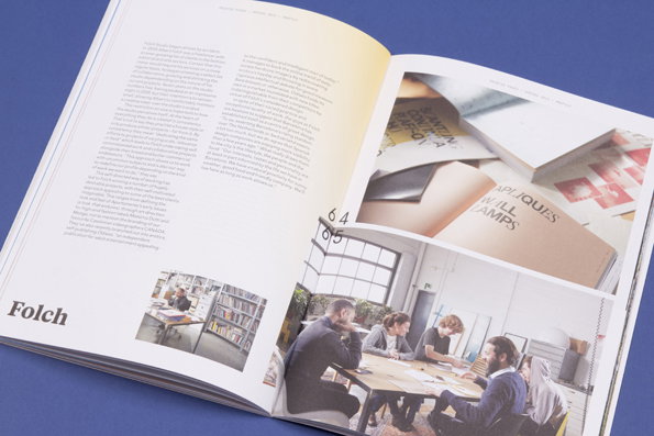
An open book shows a spread featuring text and photographs of a design studio. One image shows people working at long white desks, while another shows a person holding a series of small prints.
Above

Printed Pages: Spring/Summer 2013

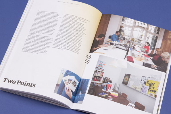
An open magazine lies flat against a blue background. One page features a long article and a small photo of a person at a desk, while the opposite page shows a close-up of design samples and a group of people gathered around a table in a bright studio.
Above

Printed Pages: Spring/Summer 2013

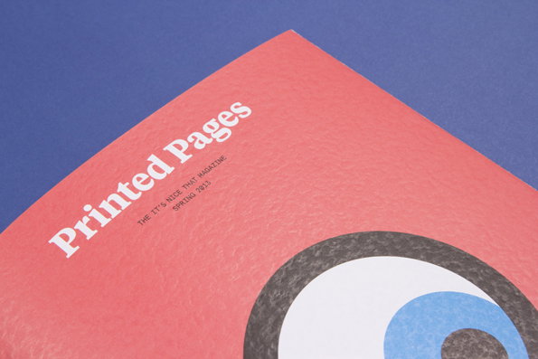
A red magazine cover titled “Printed Pages” rests against a blue background. Smaller text below the title reads “The It’s Nice That Magazine Spring 2013”.
Above

Printed Pages: Spring/Summer 2013

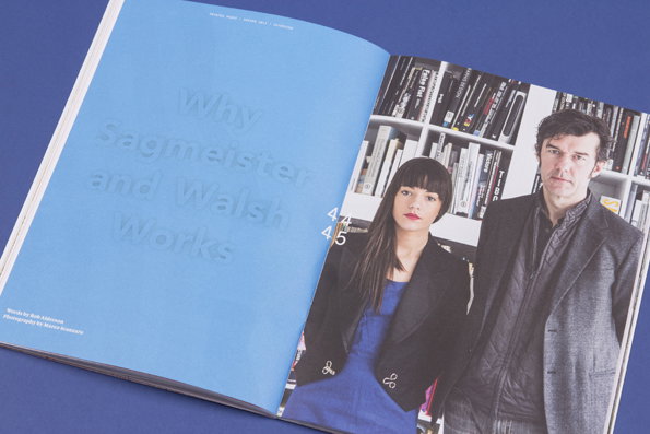
An open magazine spread against a blue background. The left page is light blue with the title “Why Sagmeister and Walsh Works”, while the right page shows a portrait of two people standing in front of a bookshelf.
Above

Printed Pages: Spring/Summer 2013

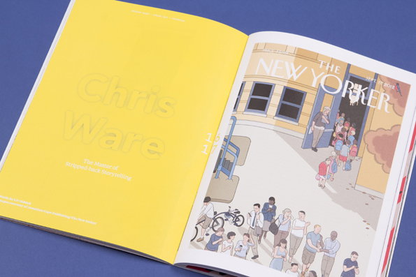
An open book shows a yellow page with the name “Chris Ware” and the phrase “The master of stripped back storytelling”. The opposite page features a New Yorker magazine cover illustration of people queuing outside a building.
Above

Printed Pages: Spring/Summer 2013

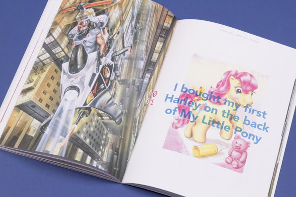
An open book shows two contrasting pages. The left page features a detailed illustration of a futuristic soldier on a flying vehicle, while the right page shows a My Little Pony illustration with the text “I bought my first Harley on the back of My Little Pony”.
Above

Printed Pages: Spring/Summer 2013

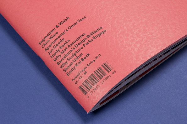
A close-up of a pink magazine spine listing contributors including “Sagmeister & Walsh”, “Chris Ware” and “Jon Goode”. Text at the bottom reads “Printed Pages Spring 2013” above a barcode.
Above

Printed Pages: Spring/Summer 2013

Share Article

About the Author

Rob Alderson

—

Rob Alderson is a freelance writer, editor and strategist. He was previously editor-in-chief of It’s Nice That and WePresent, and editor of Design Week. He publishes the newsletter Undo, which tries to make sense of how AI is changing design work, the design process and the design industry.
It's Nice That Newsletters

Fancy a bit of It's Nice That in your inbox? Sign up to our newsletters and we'll keep you in the loop with everything good going on in the creative world.