An extract from a brilliant new book exploring punk graphics and their enduring legacy
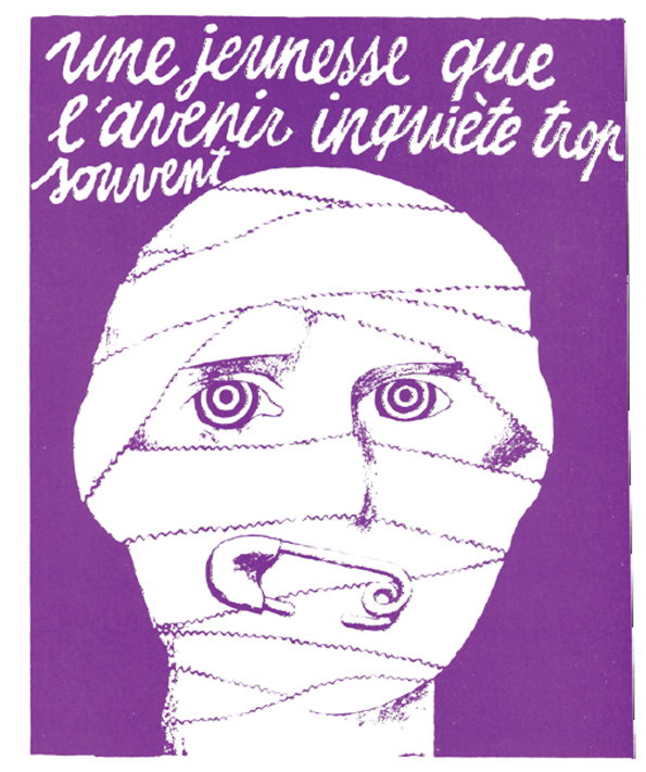
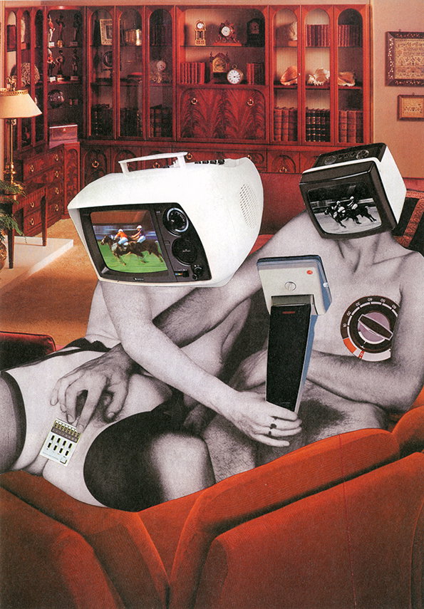
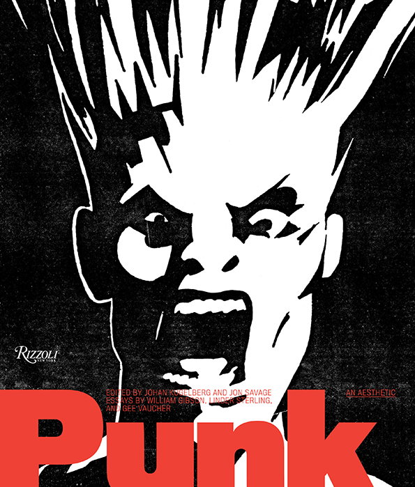
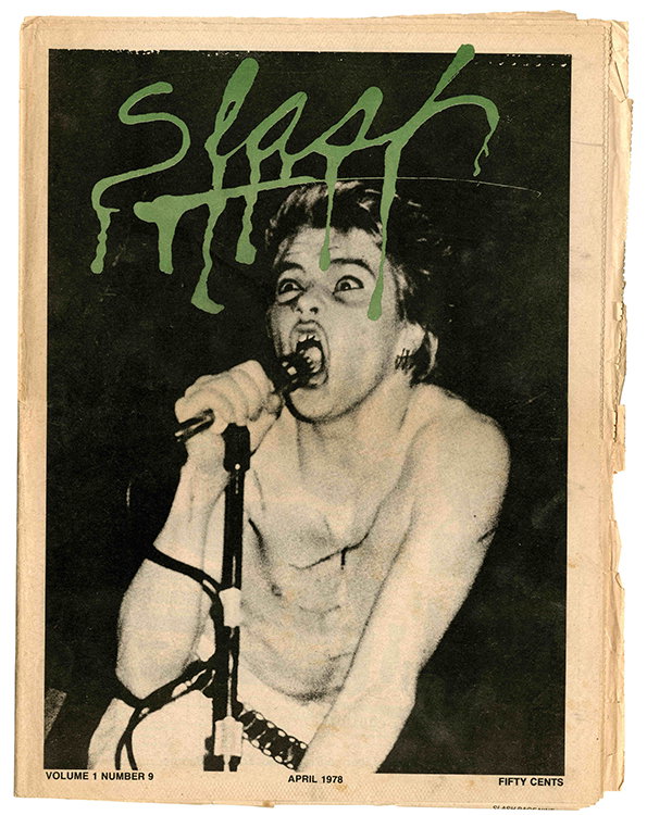
The punk movement is not something I remember and yet its graphic vernacular is immediately recognisable. A new book and show at London’s Hayward Gallery brings together posters, fanzines, flyers, clothes, photographs and other visual ephemera which sprung forth from this particularly British countercultural movement. But Johan Kugelberg and Jon Savage, the editors of Punk: An Aesthetic believe punk’s aesthetic can be enjoyed both on its own terms and for its legacy which still endures to this day.
In this extract from the foreword to their book, Johan explains why this movement was, and is so significant.
None of us has left the twentieth century. We are still infused by it. Punk and pop is everywhere. Hippie and Woodstock and the 100 Club and CBGB and geriatric icons are still aboveground, flaunting the richly saturated notion that what was once directly lived has receded into representation.
These representations ganged up on subsequent generations, implying that the summits of authenticity they reached can never again be scaled, and that the kids (in order to be all right) better follow these trodden paths toward punk or hippie Shangri-la. To live life mimicking the authentic, even though it will always remain an imitation, a representation of what was directly lived.
A lot of ink is spilled on punk now; a new retrospective of seminal punk history rears its (balding) head every thirty minutes. The meaning with which we infuse these strands of the pop-culture spectacle, or the simplifications we cookie-cut to an historical mold, are modifications of historical record with which the winners, losers, or not-there-at-alls are slowly fattening our collective brains, foie gras–style.
©PUNK: An Aesthetic edited by Johan Kugelberg and Jon Savage, Rizzoli, 2012
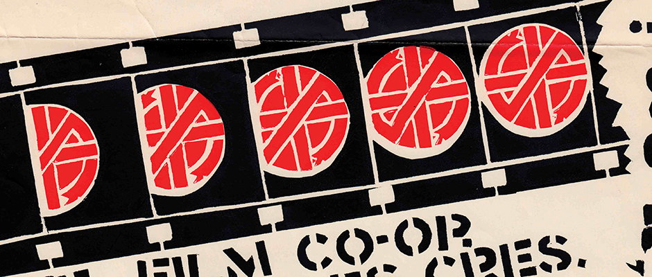
Unlike its hippie counterpart, the aesthetic of the punk movement has not really become the sole discretion of nostalgia hounds, history rewriters, or reenactors. More common is to see the trickle-down of a punk graphic style infusing anything from the work of contemporary streetart satirists like Kozik, Banksy, or Zevs to corporate advertising for Nike or John Varvatos—or, for that matter, the superbly amusing Johnny Rotten commercials for Country Life butter.
We also see the punk do-it-yourself ethos impregnate blogs, literary salons, the curatorial slant of major cultural institutions, and, less fortunately perhaps, mall shops and youth-targeted branding. We hear the rudimentaries of the punk sound of 1977 infuse any number of Disney Channel bands, and the recent antiquarian frenzy surrounding mimeographed poetry publications and rock-and-roll fanzines originates here too.
"Unlike its hippie counterpart, the aesthetic of the punk movement has not really become the sole discretion of nostalgia hounds, history rewriters, or reenactors."
Johan Kugelberg and Jon Savage
The first generation of punk truly was popular culture on the margins: new ideas germinated out of urgency and necessity, as the cliché goes. Where edges overlap and aesthetics unfold seemingly at random and often by accident, the freedom of choices for the creators results in work of almost supernatural vibrancy, work which can reverberate for decade after decade, sometimes for centuries.
This work, the residue of all this frenzied activity, becomes the stuff the dreams of collectors and curators are made of. This usually and naturally takes place a few decades after the events in question and, quite often, the embrace most hot and bothered comes from the members of the very same establishment that rejected the movement en masse as it first unfolded.
©PUNK: An Aesthetic edited by Johan Kugelberg and Jon Savage, Rizzoli, 2012
©PUNK: An Aesthetic edited by Johan Kugelberg and Jon Savage, Rizzoli, 2012
©PUNK: An Aesthetic edited by Johan Kugelberg and Jon Savage, Rizzoli, 2012
©PUNK: An Aesthetic edited by Johan Kugelberg and Jon Savage, Rizzoli, 2012
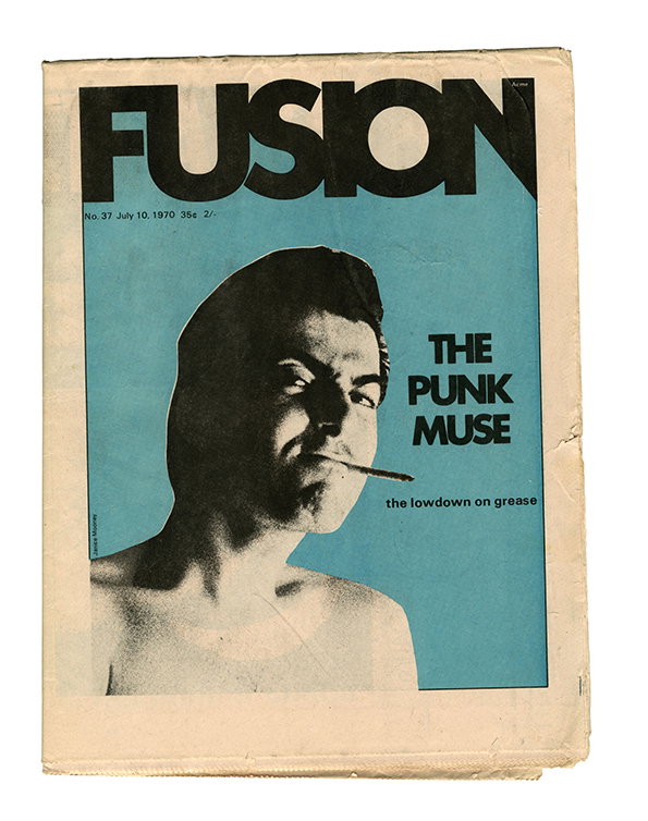
©PUNK: An Aesthetic edited by Johan Kugelberg and Jon Savage, Rizzoli, 2012
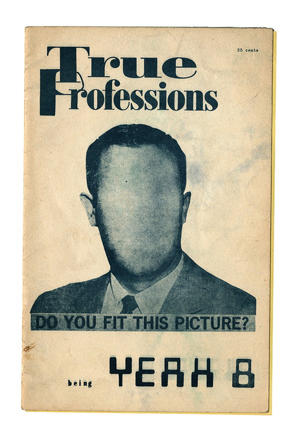
©PUNK: An Aesthetic edited by Johan Kugelberg and Jon Savage, Rizzoli, 2012
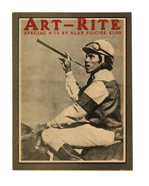
©PUNK: An Aesthetic edited by Johan Kugelberg and Jon Savage, Rizzoli, 2012
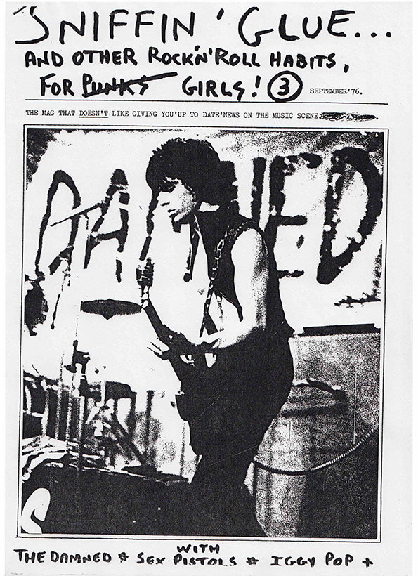
©PUNK: An Aesthetic edited by Johan Kugelberg and Jon Savage, Rizzoli, 2012
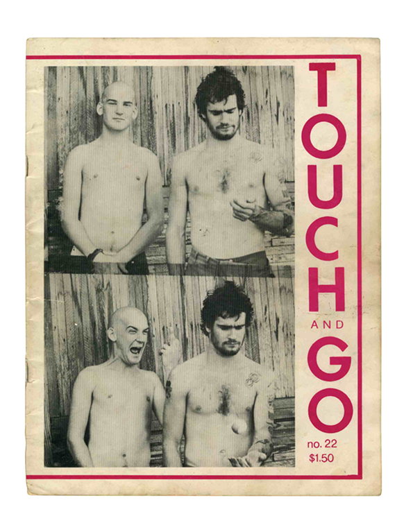
©PUNK: An Aesthetic edited by Johan Kugelberg and Jon Savage, Rizzoli, 2012
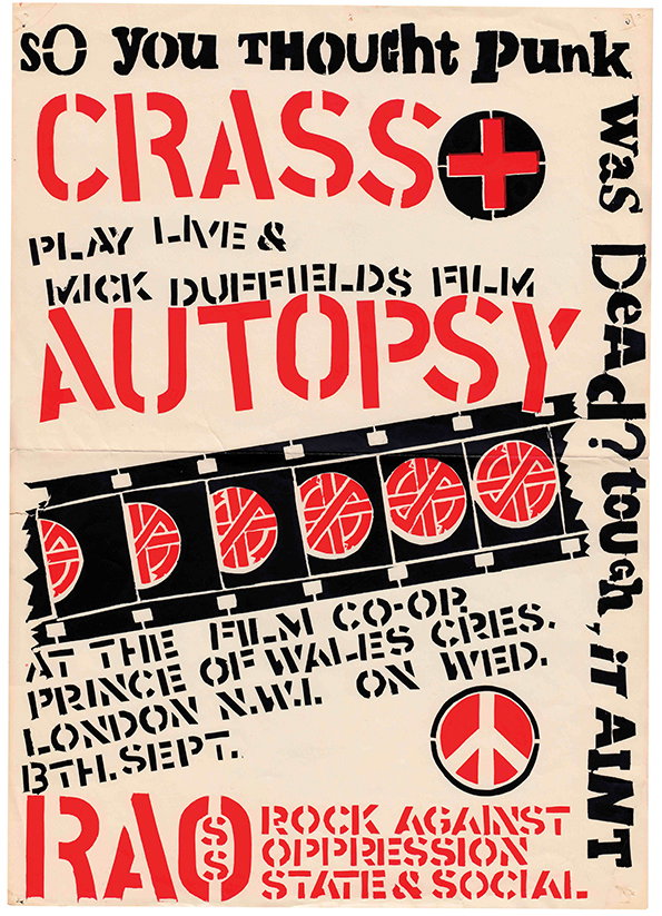
©PUNK: An Aesthetic edited by Johan Kugelberg and Jon Savage, Rizzoli, 2012
Someday all the adults will die! Punk Graphics 1971 – 1984 is at the Hayward Gallery Project Space until November 4.
Share Article
About the Author
—
Rob Alderson is a freelance writer, editor and strategist. He was previously editor-in-chief of It’s Nice That and WePresent, and editor of Design Week. He publishes the newsletter Undo, which tries to make sense of how AI is changing design work, the design process and the design industry.