




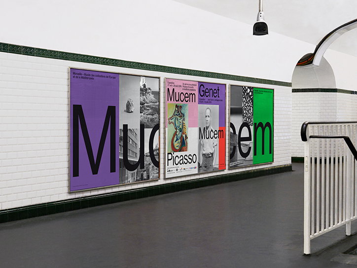
Spassky Fischer’s colourful overhaul of Mucem’s graphic communication system
Paris-based design agency Spassky Fischer have followed up their stylish previous offerings for publishing house Flammarion by designing a new communication system for Mucem (Musée des Civilisations de l’Europe et de la Méditerranée) in Marseille.
Having won the brief earlier this year, against stiff competition, the brief called for full graphic refresh of Mucem’s communications instituting a new typeface, design language and colour palette across all its printed and digital media. One exception to this total overhaul was Mecum’s logo, designed before Spassky Fischer won the account: “As we designed the posters, we made the previous logo disappear, and changed all the graphic rules. So, at the end of the day, we designed the identity, but without a logo,” say the designers.
The attention-grabbing deliverables range from the print advertising and Parisian Metro post campaign, to the interior and exterior signage for the museum, and all printed materials (brochures, maps, calendars, leaflets). “We want the name of the museum to be read equally to the rest of the text,” they explain.
Offering a full-service job, Spassky Fischer explain: “most of the pictures are made by us, to get a coherent direction.” These are presented in montage throughout, overlaid with the Neue Haas Grotesk typeface, and contoured with bold blocks of primary and secondary colour. “Colour is used to make signal. “The system we developed is based on three basic elements — word + photography + colour…It’s the presence of the colour that make it identifiable,” say Spassky Fischer.
Spassky Fischer are due to launch a complete overhaul of the website, applying these newly designed conventions in the coming weeks. “The Mucem is a National Museum, so it’s a great opportunity for us to work at a larger scale. What you see here are the first steps of a long term collaboration.”
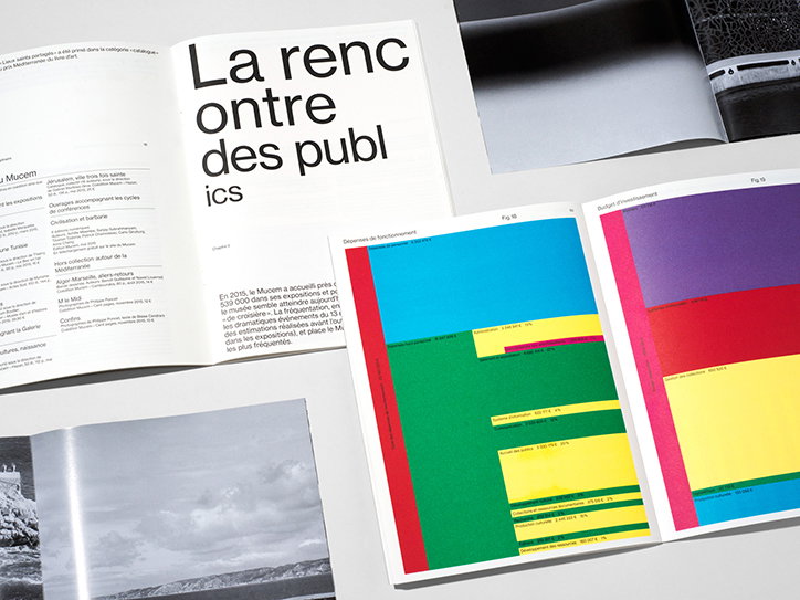
Spassky Fischer: Mucem’s annual report
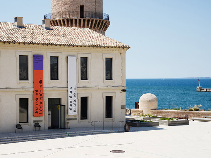
Spassky Fischer: Mucem’s exterior signage
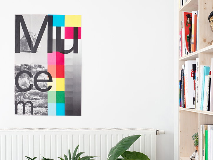
Spassky Fischer: Mucem poster (unfolded cover of the annual report)
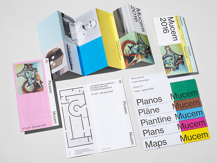
Spassky Fischer: MucMucemeum printed materials (maps, leaflets, brochures)
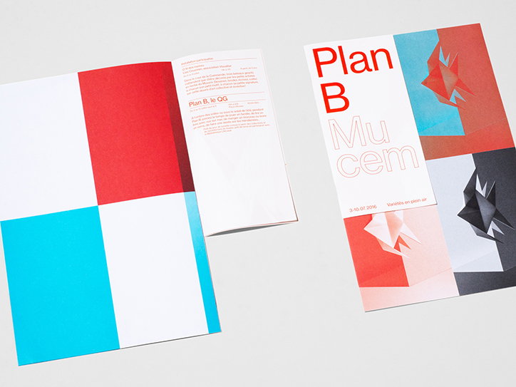
Spassky Fischer: Mucem printed materials (exhibition catalogue)
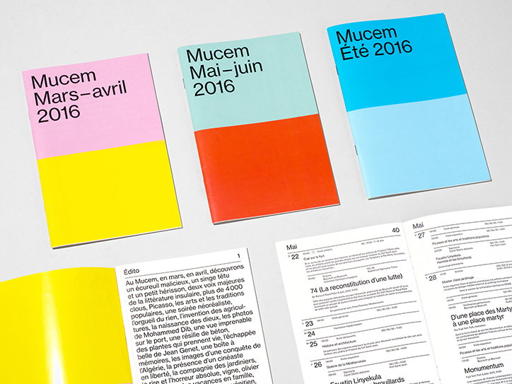
Spassky Fischer: Mucem printed materials (exhibition brochures)
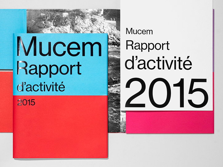
Spassky Fischer: Mucem printed materials (annual report)
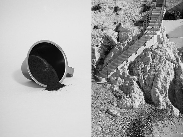
Spassky Fischer: Photographs for use in Mucem printed materials
Share Article
Further Info
About the Author
—
Jamie joined It’s Nice That back in May 2016 as an editorial assistant. And, after a seven-year sojourn away planning advertising campaigns for the likes of The LEGO Group and Converse, he came back to look after New Business & Partnerships here at It’s Nice That until September 2024.
