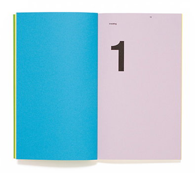
Making it look so easy– impeccable graphic design from Stout/Kramer
These guys are good – very good. How can some yellow letters spelling out “play” be so seductive? You may well have seen some of the work of Stout/Kramer floating about on the internet at the moment, and you can see why. Their style is so universally appealing in that it’s clean, fresh, bright and fun – a winning combination. Not just that though; their choice of projects seems to be second-to-none, choosing to work on well researched things that really mean something to them, or for legitimate, sometimes underground causes that people really feel genuinely strongly about. Work like this is a great example of what little rules you really need in design, as long as you have the fundamental passion, courage and, of course, an eye for what looks great and what doesn’t.
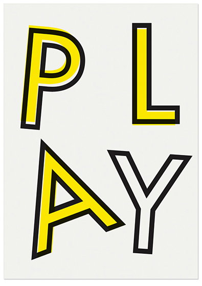
Stout/Kramer: On Growth, & Forms of Meaning, Poster series and publication for the project On Growth, & Forms of Meaning, Duncan of Jordanstone College of Art and Design, University of Dundee, Scotland.
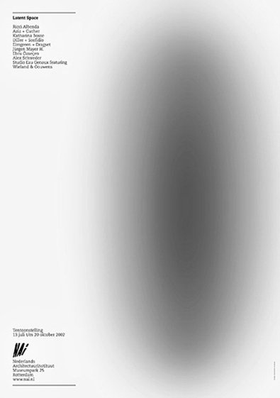
Stout/Kramer: Latent Space Campaign, exhibition typography/routing, Netherlands Architecture Institute
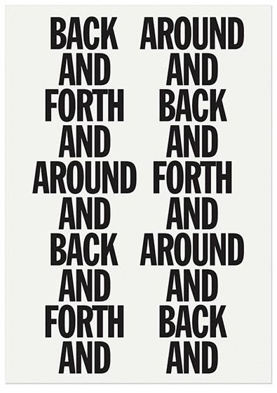
Stout/Kramer: On Growth, & Forms of Meaning, Poster series and publication for the project On Growth, & Forms of Meaning, Duncan of Jordanstone College of Art and Design, University of Dundee, Scotland.
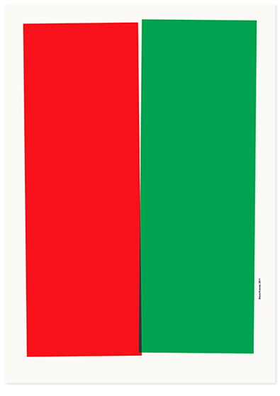
Stout/Kramer: Poster for the exhibition Extremes / The power of the poster, Self-published
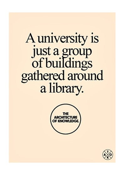
Stout/Kramer: The Architecture of Knowledge Campaign, Netherlands Architecture Institute
Share Article
Further Info
About the Author
—
Liv joined It’s Nice That as an intern in 2011 and worked across online, print and events, and was latterly Features Editor before leaving in May 2015.