Launch Recite Me assistive technology
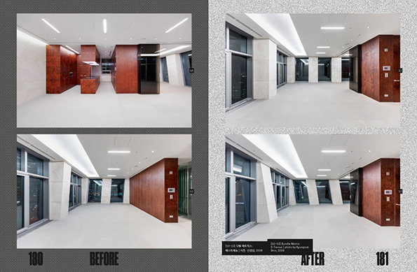
Two pages from a book show “before” and “after” photographs of a minimalist interior space. The “before” images show a room with large, dark wood panels and a central counter, while the “after” images show the same space with the counter removed.

Brilliantly logical graphic design work from Sulki and Min Choi

—
Date
9 February 2015

Seoul-based designers Sulki and Min Choi produce bright, geometric and responsive work. Their practice is rooted in typography; its form, histories and behaviour. It’s driven by concepts that engage with the content at hand whilst managing to consistently retain legibility.

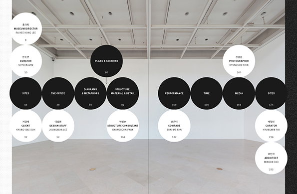
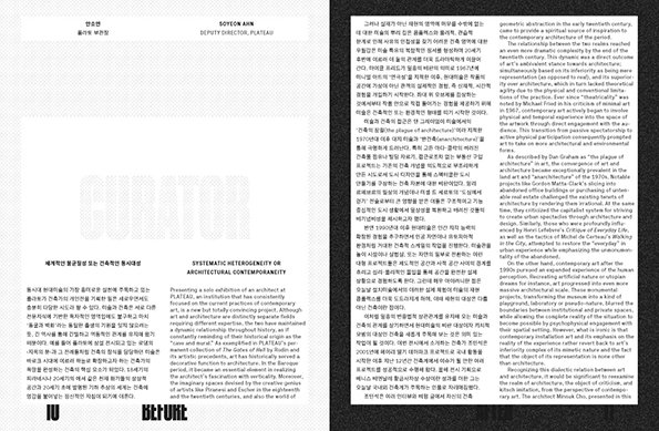
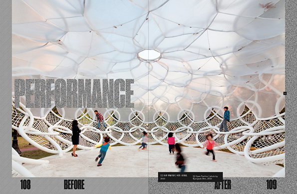
Sulki and Min work with publishers, galleries and cultural institutions, for the Asian Arts Theatre, Gwangju Biennale and Plateau, Seoul. Their catalogue for Before/After: Mass Studies Does Architecture, an exhibition of the work of architect Minusk Cho at Plateau, communicated the process of building through its physical sections. The design decisions were based on symmetry and cycles, with sections divided by shifting background tones. So “Before” focusses on ideas, and “After” on how a building is used and how it is portrayed publicly.

The poster design for These Are the People in Your Neighbourhood, a performance that took place at an elementary school as part of a community programme, used a stencil type that reflected the provisional nature of the programme. The poster started off plain and then took on layers, colours and traces as each event took place.
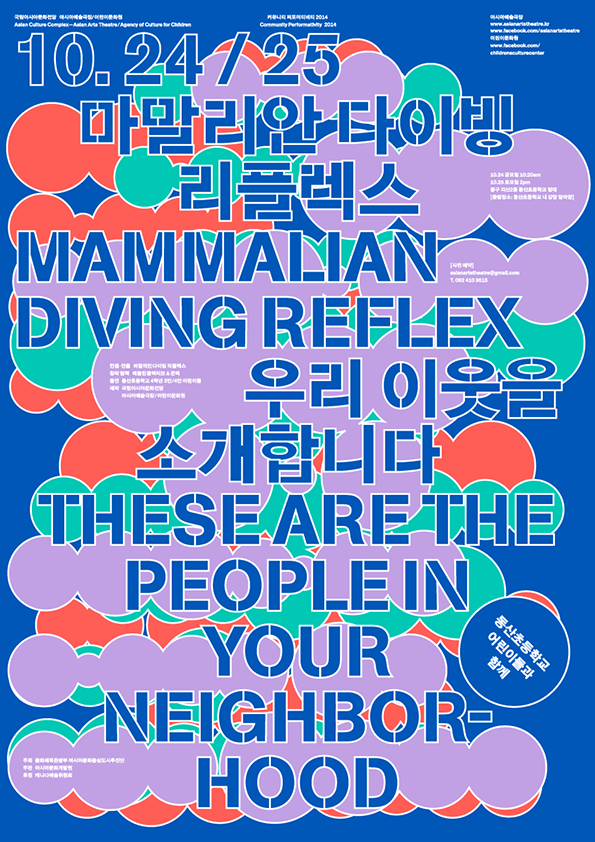
A bold, colourful typographic poster featuring overlapping circles in red, orange, purple and green. Large blue text reads “MAMMALIAN DIVING REFLEX” and “THESE ARE THE PEOPLE IN YOUR NEIGHBORHOOD”, accompanied by Korean script.
Above

Sulki & Min: These Are the People in Your Neighbourhood
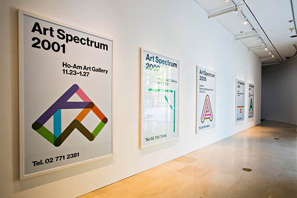
A row of framed posters hangs on a white gallery wall. The first poster reads “Art Spectrum 2001” and features a colourful, geometric abstract shape.
Above

Sulki & Min: Revisionism

A gallery installation features a series of black and white circles arranged in a network across a white wall. The circles contain text such as “Museum Director”, “Plans & Sections” and “Performance”, connected by thin black lines.
Above

Sulki & Min: Before/After

A two-page spread from a publication featuring a mix of Korean and English text. The left page is mostly white space with a small block of text at the bottom, while the right page is filled with dense columns of writing.
Above

Sulki & Min: Before/After

A double-page spread from a book shows a large, white, bubble-like structure with a netted floor. Children play and climb across the netting under a translucent canopy. The word “PERFORMANCE” is written in large, silver glittery letters across the centre, with the labels “BEFORE” and “AFTER” at the bottom.
Above

Sulki & Min: Before/After

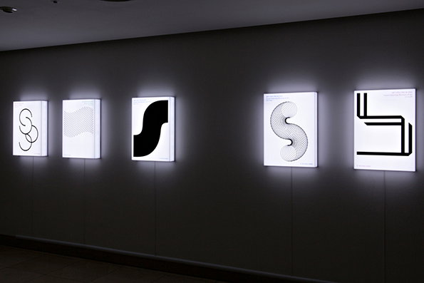
Five glowing white lightboxes are mounted in a row on a dark grey wall. Each box displays a different black abstract shape or pattern.
Above

Sulki & Min: Revisionism

Share Article

Further Info

About the Author

Billie Muraben

—

Billie studied illustration at Camberwell College of Art before completing an MA in Visual Communication at the Royal College of Art. She joined It’s Nice That as a Freelance Editorial Assistant back in January 2015 and continues to work with us on a freelance basis.


It's Nice That Newsletters

Fancy a bit of It's Nice That in your inbox? Sign up to our newsletters and we'll keep you in the loop with everything good going on in the creative world.