



Launch Recite Me assistive technology
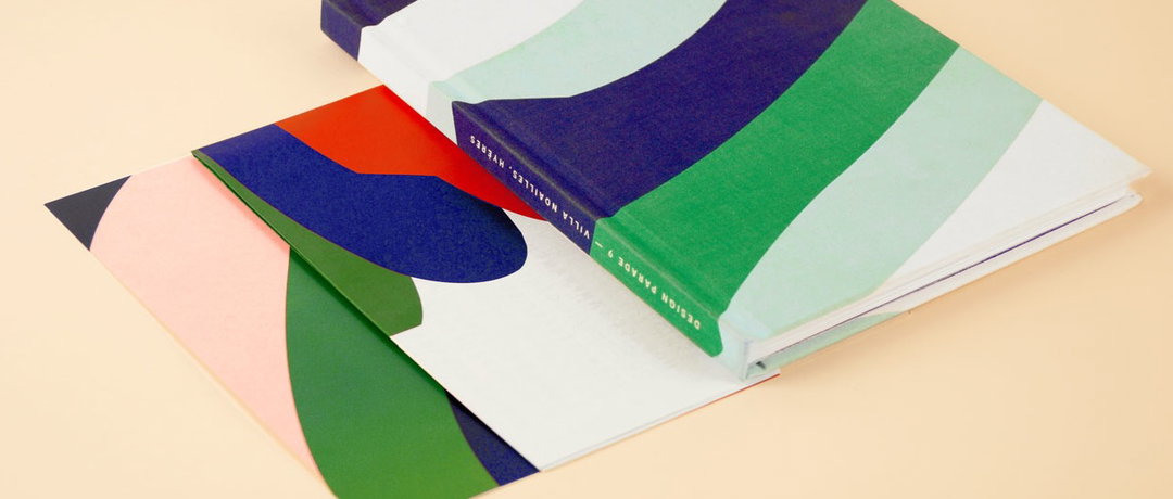
A hardcover book and two prints with abstract, organic shapes in blue, green, red and pink. The book spine reads “Design Parade 9 – Villa Noailles, Hyères”.

Paris-based studio Twice have made a gorgeous book you'll want to hold

—
Date
23 July 2014

My favourite thing about Paris-based design studio Twice is that they continually combine texture and colour in such a way that I’m practically banging my hands into my computer screen with wanting to hold their publications in my hands. That’s the trouble with tactility – it’s not practical – but that shouldn’t mean designers abandon it altogether in favour of a wipe-clean, stark, sterile aesthetic that makes us lose all hope in print.

For this project, Fanny Le Bras and ClĂ©mentine Berry created an identity and print collateral for Design Parade 9 at Villa Noailles, Hyères. It’s a testament to the kind of tactility that’s got me looking so daft, with a cloth-bound cover and a primary school-esque palette that’s bold but confident in its restrained approach. Here’s to publications that are crying out to be held.
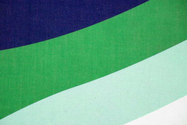
A close-up of a textured fabric featuring broad, diagonal stripes. The colours transition from deep navy blue to bright green, pale mint, and white.
Above

Twice: Arts & Culture Design Parade 9
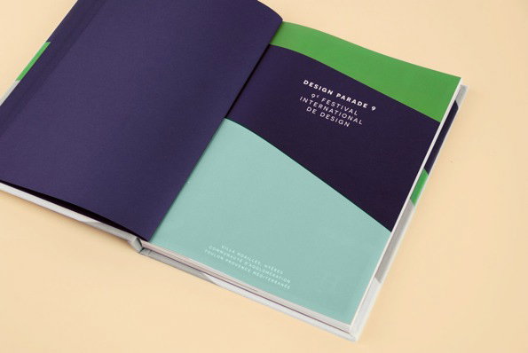
An open book shows a page with a bold, diagonal split of dark purple and mint green. White text reads “Design Parade 9” and “9e Festival International de Design”.
Above

Twice: Arts & Culture Design Parade 9
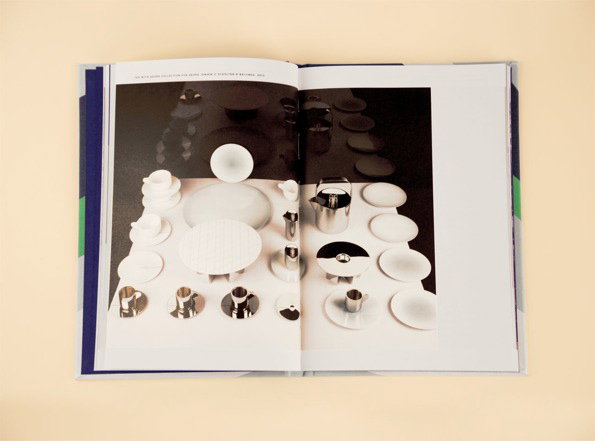
An open book displays a photograph of a collection of white and silver tableware. The objects, including plates, bowls and jugs, are arranged on a white surface against a dark background.
Above

Twice: Arts & Culture Design Parade 9
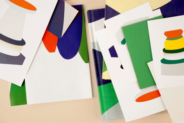
A collection of printed cards and booklets scattered across a pale surface. They feature bold, abstract shapes in primary colours, including red, blue, yellow and green.
Above

Twice: Arts & Culture Design Parade 9
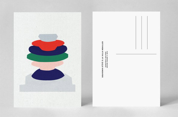
An illustration of a stack of colourful, organic shapes in red, blue and green, topped with a small grey form. To the right, a postcard back features vertical text that reads “Souvenir d’été à la Villa Noailles”.
Above

Twice: Arts & Culture Design Parade 9
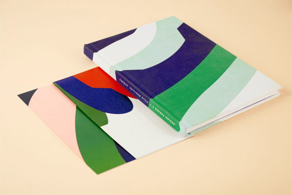
Three books with abstract, colourful covers are stacked on a pale beige surface. The top book features flowing shapes in blue, green and mint, with the text “Design Parade x Villa Nobili, Ryekers” on the spine.
Above

Twice: Arts & Culture Design Parade 9
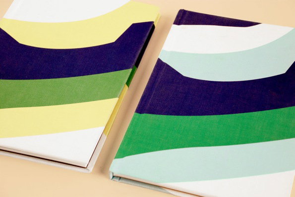
Two cloth-bound books lie side by side on a pale surface. Their covers feature bold, sweeping organic shapes in shades of navy, green, yellow and mint.
Above

Twice: Arts & Culture Design Parade 9

Share Article

Further Info

About the Author

Maisie Skidmore

—

Maisie joined It’s Nice That fresh out of university in the summer of 2013 as an intern before joining full time as an Assistant Editor. Maisie left It’s Nice That in July 2015.
It's Nice That Newsletters

Fancy a bit of It's Nice That in your inbox? Sign up to our newsletters and we'll keep you in the loop with everything good going on in the creative world.