





Yuma Naito talks us through his inventive fictional rebrand for Afropunk Festival
We were introduced to the work of Los Angeles-based graphic designer Yuma Naito through his incredibly in-depth university project fictionally rebranding Afropunk festival. Yuma’s introduction to graphic design wasn’t exactly the usual route, but as a result his projects pull inspiration from numerous references in a very exciting way.
Originally from Tokyo, the designer developed an interest in creativity through “playing with Microsoft paint as a child,” he tells It’s Nice That. “Back in Japan, I started making flyers and team T-shirts when I was in a breakdance team in high school.” Yet, Yuma decided to study a BA in Business at university, but moved to America to “seek new adventures and experiences in the graphic design field”. This eclectic background means that Yuma uses visual communication “to create emotional connections between design and people,” he says. “I believe that discoveries through research and a thoughtful approach to the design process will create a strong narrative.”
Yuma’s interest in “learning different histories and cultures through the lens of visual communication,” means his execution of an Afropunk rebrand communicates the powerful disposition of the festival. Created as a project while studying at the ArtCenter College of Design, his goal was “to communicate the idea of the festival as a celebration of music and human rights movement”.
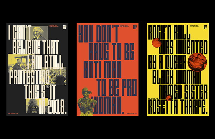
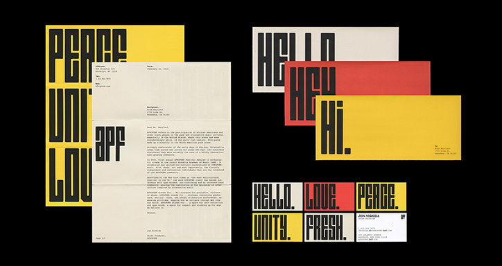
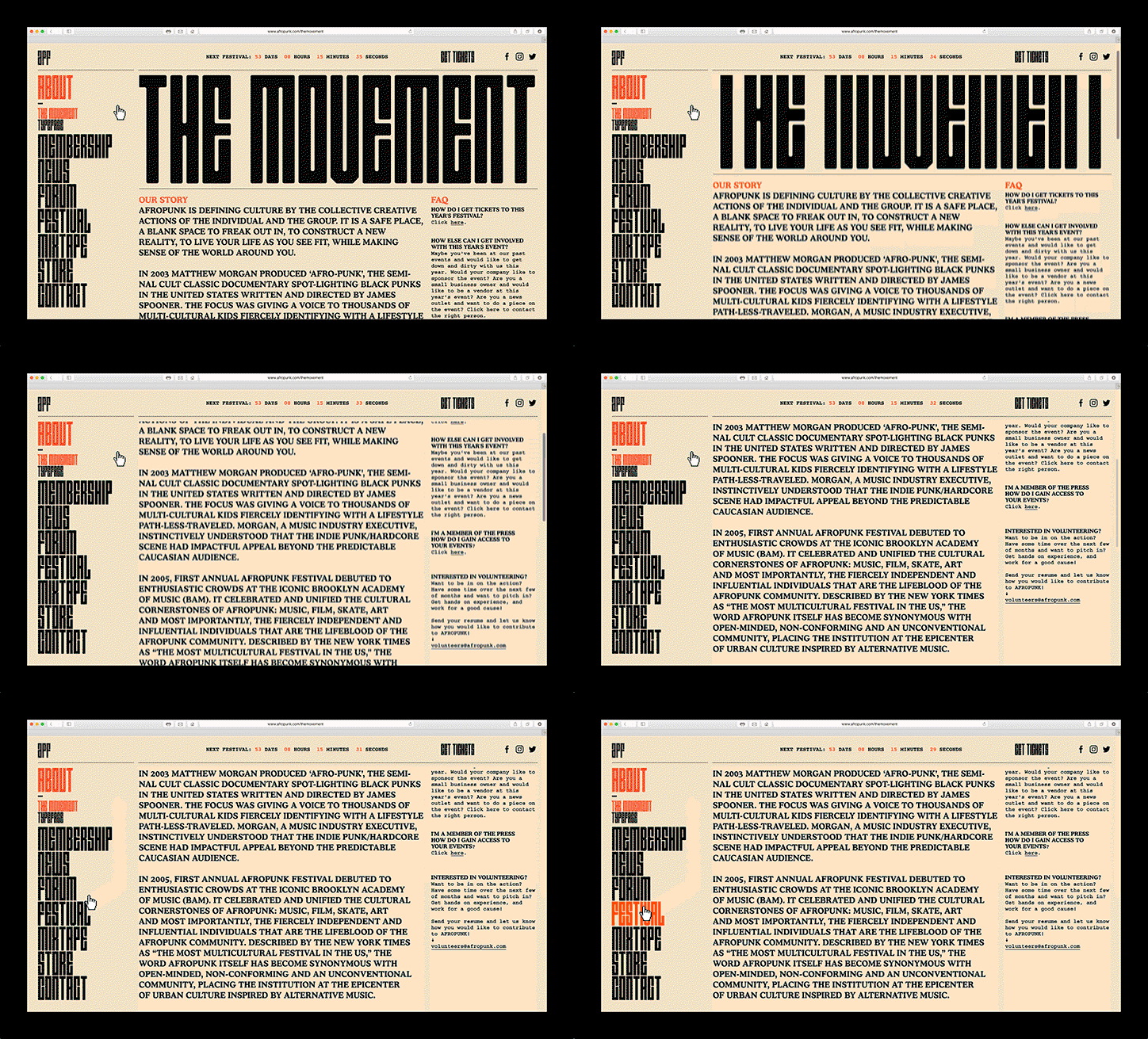
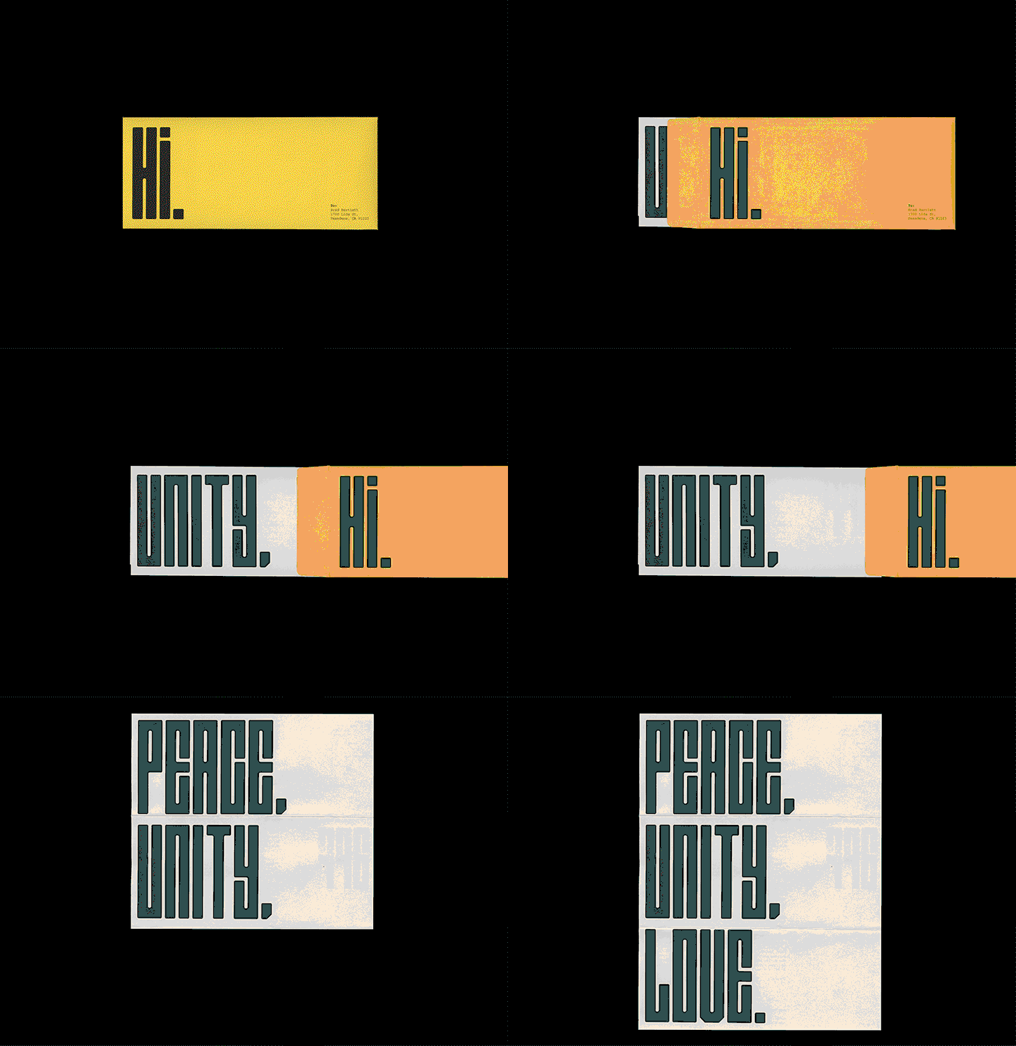
To piece the rebrand together Yuma created a custom typeface, APF Display, which represents the festival’s unique sensibility forming its own visual language “in a very playful way”. Alongside this, the designer has created a second poster series for its 15th anniversary event, Afrotopia. “The series of posters demonstrates how logotype would be used as a pattern, along with collages that represent DIY aspects of both Afropunk culture and Afrofuturism,” he explains.
The result is bold and brave, with long elongated type that slots together satisfyingly and by “introducing onomatopoeia, the posters tell stories about what people would feel and experience at the event in a typographic way”.

Yuma Naito: Afropunk
Yuma Naito: Afropunk
Yuma Naito: Afropunk
Yuma Naito: Afropunk
Yuma Naito: Afropunk
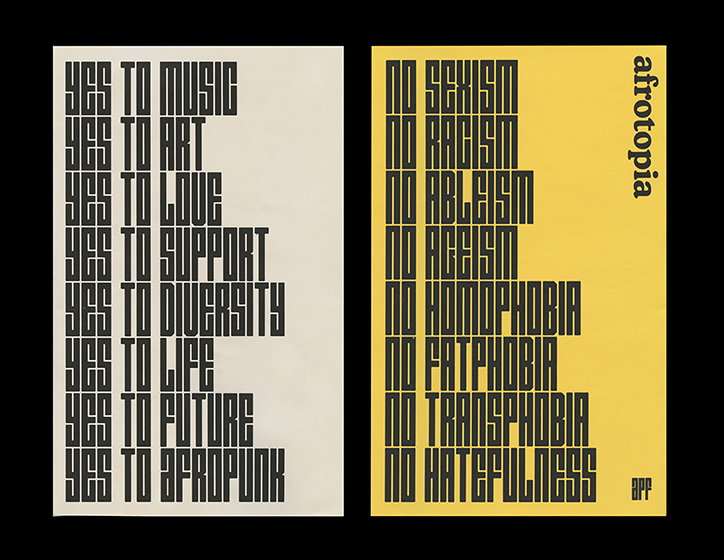
Yuma Naito: Afropunk
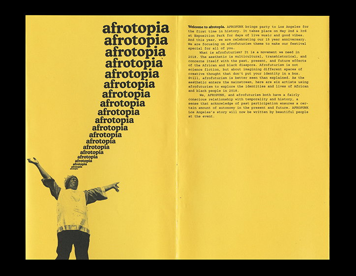
Yuma Naito: Afrotopia
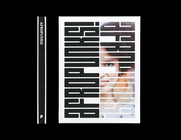
Yuma Naito: Afropunk
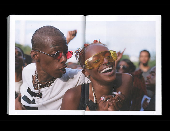
Yuma Naito: Afropunk
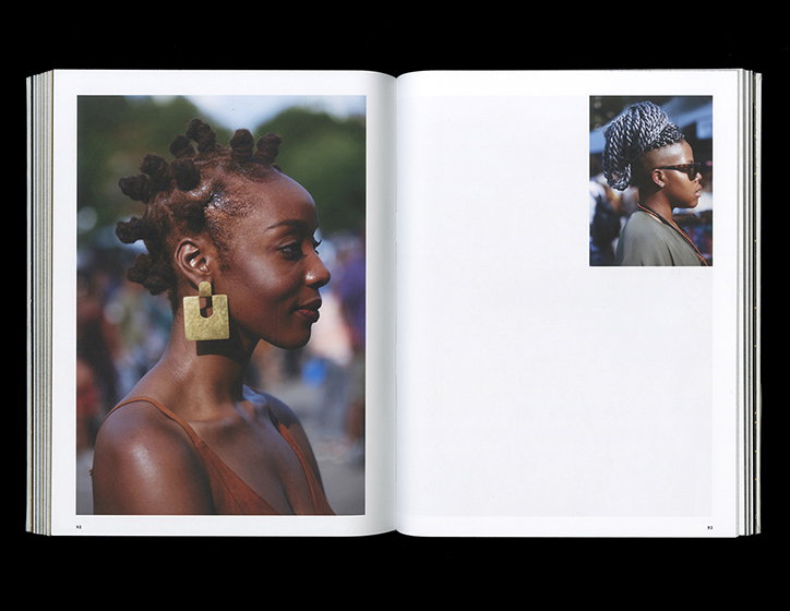
Yuma Naito: Afropunk
Share Article
Further Info
About the Author
—
Lucy (she/her) was part of the It’s Nice That team from 2016–2025, first joining as a staff writer after graduating from Chelsea College of Art with a degree in Graphic Design Communication, eventually becoming a senior editor on our editorial team, and most recently at Insights, a research-driven department with It’s Nice That.

