The much-anticipated British Rail Corporate Identity Manual reproduction is here
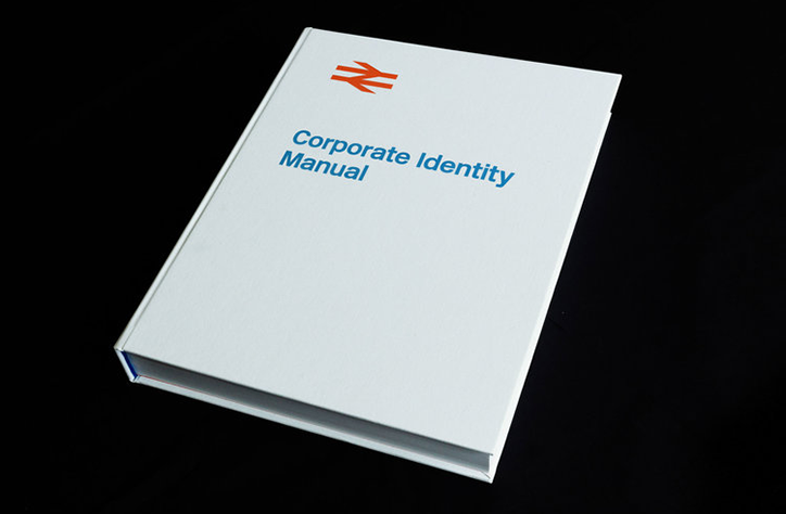
The British Rail Corporate Identity Manual has been reproduced and published by London-based graphic designer Wallace Henning. Funded via Kickstarter, the book showcases the national rail service’s entire 1965 graphic identity by Design Research Unit including its enduring “double arrow” logo by Gerry Barney.
Originally issued in July 1965, the manuals spanned four volumes detailing everything from the symbol, logotype, lettering and colour palette, to guidance on signposting, vehicles, stationery and uniforms.
This new reproduction includes an interview with Gerry Barney himself, plus a foreword by Michael C Place, founder of Build; an introduction by Tony Howard, former head of design at British Rail, now managing director of Transport Design Consultancy; an essay by James Greenfield, founder of Koto; and an essay from Paul Rennie from Central Saint Martins.
It is a 372-page, clothbound, foil-blocked hardback publication featuring all 220 pages of the original manuals. It has been developed in collaboration with Nick Job, a custodian of the British Rail Corporate Identity Manual, and is produced with agreement from the Department of Transport.
Wallace says it was an article by Michael C Place about the manual that first got him interested in the subject, and led to him dedicating his MA in communication design to “creating an identity for a renationalised transport network”, as well as instigating his collection of British Rail ephemera.
“It means a great deal to me that these documents – created for an organisation with the singular aim of operating the railways of Britain – will now be available for the public to appreciate. The number of hits and enquiries I receive via my British Rail Flickr collection are evidence enough that there is substantial interest in these manuals being readily available.”
The project raised £55,102 from 886 backers and is available to buy here for £45.
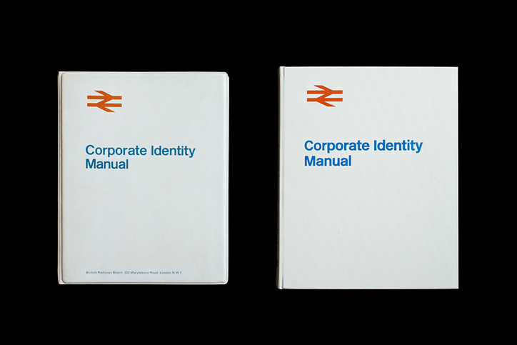
Wallace Henning: British Rail Corporate Identity Manual reproduction
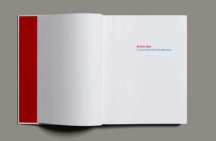
Wallace Henning: British Rail Corporate Identity Manual reproduction
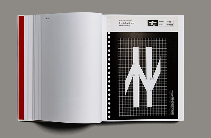
Wallace Henning: British Rail Corporate Identity Manual reproduction
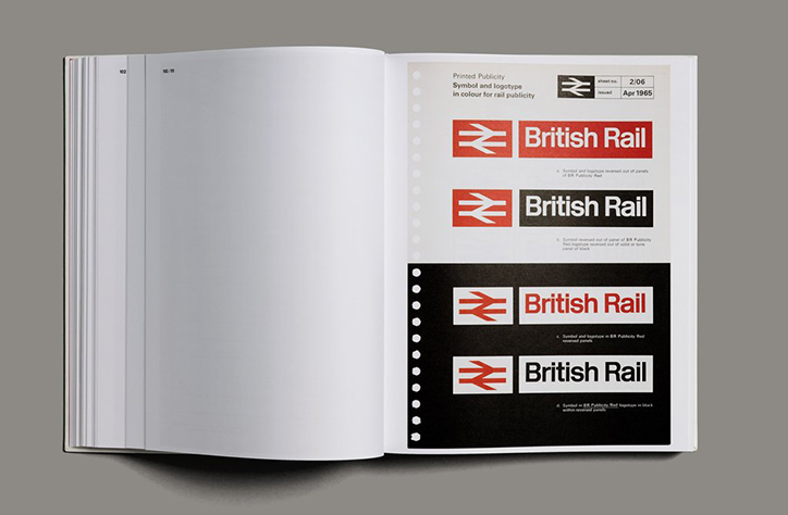
Wallace Henning: British Rail Corporate Identity Manual reproduction
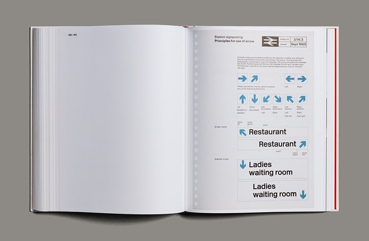
Wallace Henning: British Rail Corporate Identity Manual reproduction
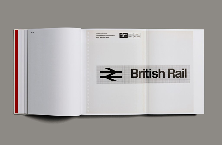
Wallace Henning: British Rail Corporate Identity Manual reproduction
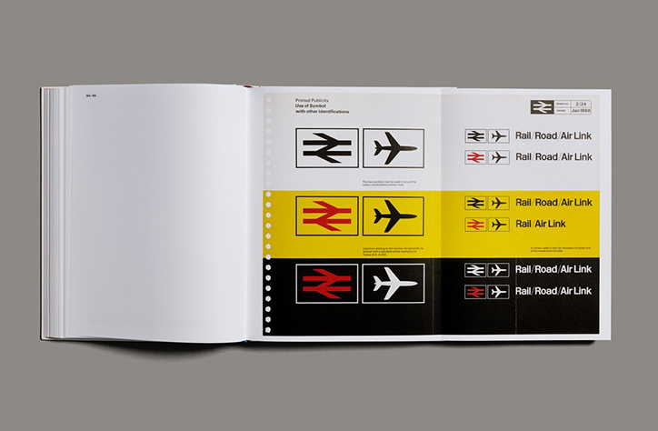
Wallace Henning: British Rail Corporate Identity Manual reproduction
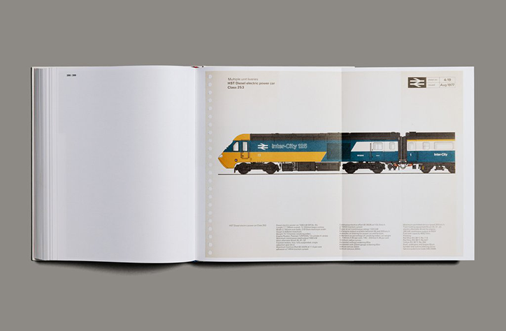
Wallace Henning: British Rail Corporate Identity Manual reproduction
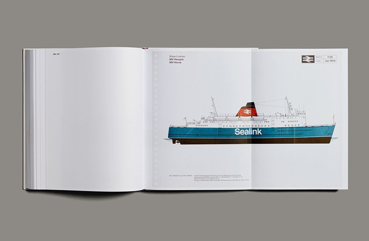
Wallace Henning: British Rail Corporate Identity Manual reproduction
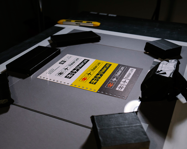
Wallace Henning: British Rail Corporate Identity Manual reproduction
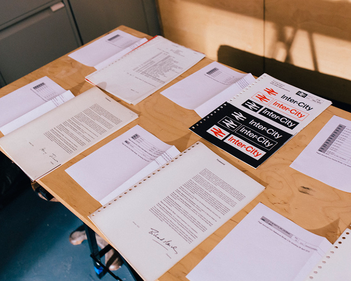
Wallace Henning: British Rail Corporate Identity Manual reproduction
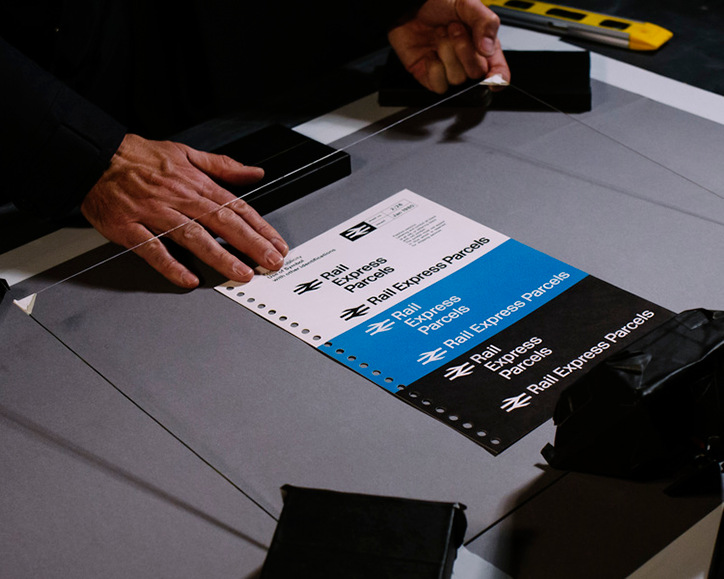
Wallace Henning: British Rail Corporate Identity Manual reproduction
Share Article
Further Info
About the Author
—
Jenny oversees editorial output across It’s Nice That. Get in touch with writing pitches for features or opinion pieces, big creative story tips, or questions about all things editorial. [email protected]
To submit your work to be featured on the site, please see our Submissions Guide.