Launch Recite Me assistive technology
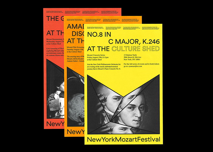
Three posters for the “New York Mozart Festival” are layered against a black background. The front poster is yellow and features a fragmented, collage-style portrait of Mozart with the text “C MAJOR, K.246 AT THE CULTURE SHED”.

The prolific output of graphic design student Ben Hutchings

—
Date
3 February 2017

The prolific output of Ben Hutchings would make you think he is a part of a studio of graphic designers burrowing away on multiple projects. However, Ben is actually a third-year graphic design student at Central Saint Martins with a love for, “all things to do with books, publications, space and experimental typography”.

Over the past year Ben has created three projects that caught our eye, each with their own noteworthy design entities. The most recent A Blue, White, Green and Brown Jewel is a research-led publication, investigating, “the societal effects of space exploration and the cultural narrative it has developed,” he explains. Throughout the book, which serves as the designed counterpart to his dissertation, the designer explores artists and designers work who have “interacted with and reinterpreted the world of space exploration” as case studies. It additionally celebrates the design of counter-culture magazine, The Whole Earth Catalog and the human side of space exploration.

A further two projects Ben created last year during a semester at New York at the School of Visual Arts include an identity for the New York Mozart Festival. Based in the Culture Shed in midtown Manhattan, “celebrates the life and work of Wolfgang Amadeus Mozart through classic recitals and modern adaptations”. Ben’s identity concentrates upon the M, “hinting at the explorative and boundary-pushing work of Mozart,” serving not only as a logo, but a frame for imagery.

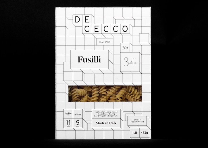
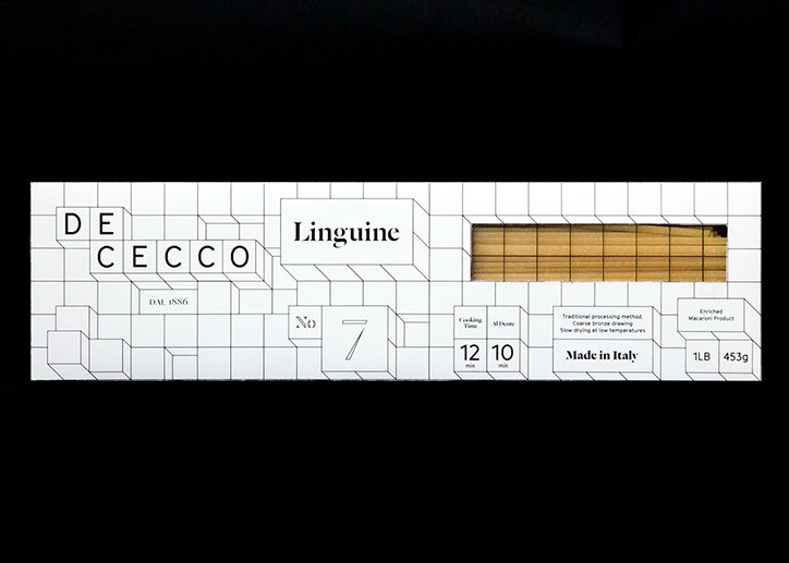
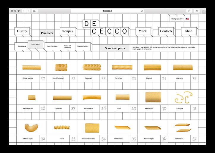
The second of Ben’s projects while at the School of Visual Arts, was created when a student in Louise Fili’s food packaging class. In his re-design of pasta company De Cecco, the designer built a concept around De Secco’s mammoth output of pasta in all shapes and sizes, attempting “to categorise this into a minimalistic yet sophisticated brand identity,” he tells It’s Nice That. I designed each product to be easily identifiable and differentiated by its bold titling and numeric typographic system.”
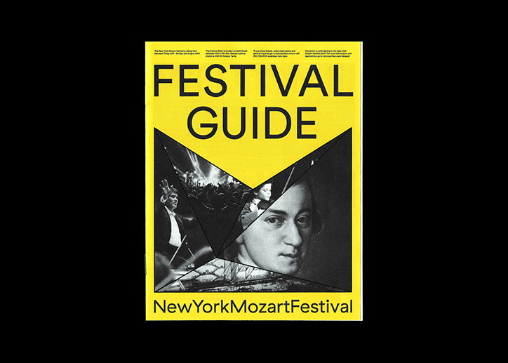
A yellow festival guide featuring a black and white collage of Wolfgang Amadeus Mozart and a crowd of people. Bold black text reads “FESTIVAL GUIDE” at the top and “NewYorkMozartFestival” at the bottom.
Above

Ben Hutchings: New York Mozart Festival
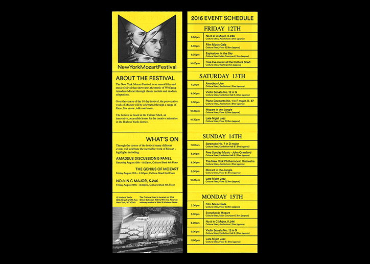
A yellow and black promotional brochure for the “New York Mozart Festival”. The left panel features a stylised portrait of Mozart and an overview of the event, while the right panel lists a detailed “2016 Event Schedule”.
Above

Ben Hutchings: New York Mozart Festival
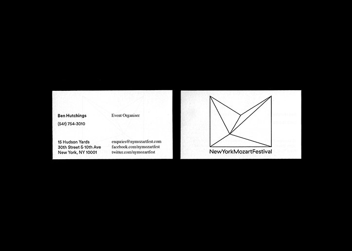
Two business cards for the “New York Mozart Festival” set against a black background. One card lists contact details for event organiser Ben Hutchings, while the other features a geometric, angular logo above the festival name.
Above

Ben Hutchings: New York Mozart Festival
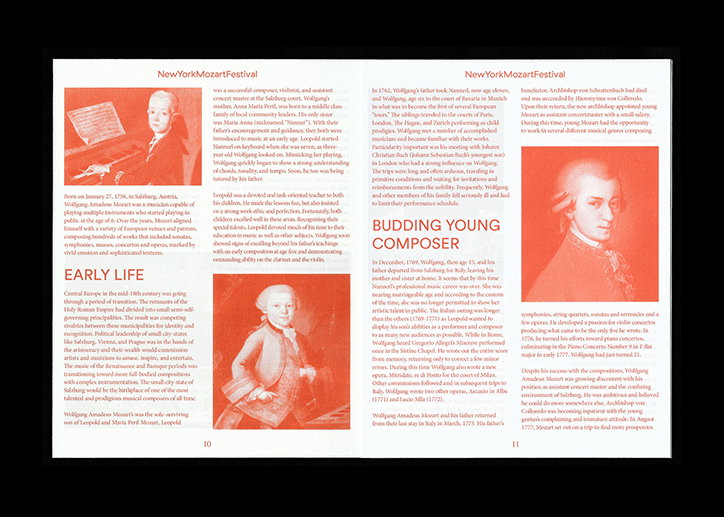
A two-page spread from a brochure for the “NewYorkMozartFestival”. The layout features a portrait of Mozart and a photograph of a person in a red dress, alongside columns of text. Large headings read “Early Life” and “Budding Young Composer”. A caption below the second photo identifies the figures as Wolfgang Amadeus Mozart and his father.
Above

Ben Hutchings: New York Mozart Festival
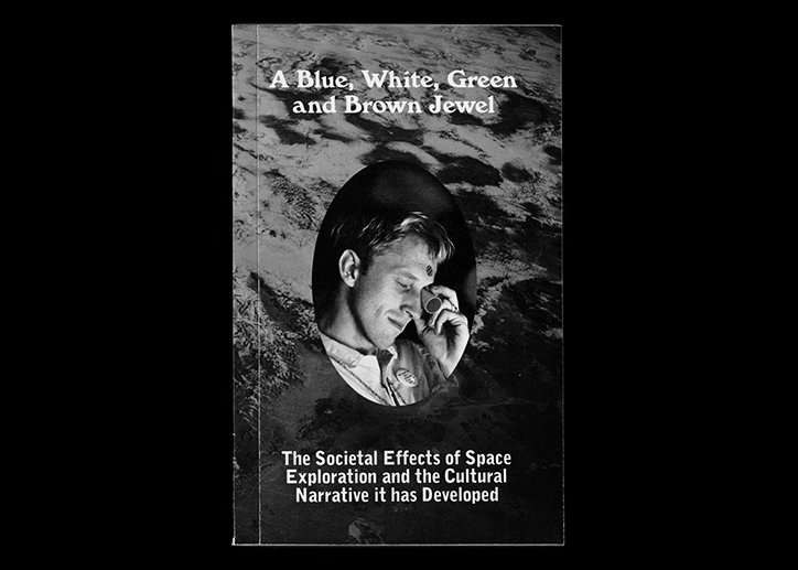
A black and white book cover featuring a portrait of a person looking down and smiling. Text at the top reads “A Blue, White, Green and Brown Jewel”. Text at the bottom reads “The Societal Effects of Space Exploration and the Cultural Narrative it has Developed”.
Above

Ben Hutchings: A Blue, White, Green and Brown Jewel
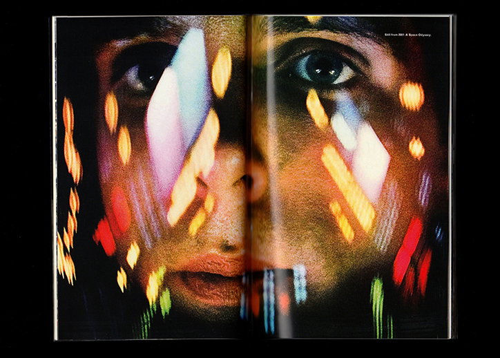
A close-up of a person’s face across a two-page magazine spread, with blurred streaks of colourful light layered over their features. Small text in the top right corner reads “Still from 2001: A Space Odyssey”.
Above

Ben Hutchings: A Blue, White, Green and Brown Jewel
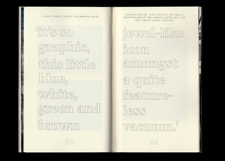
An open book shows two pages of large, outlined typography. The text reads “it’s so graphic, this little blue, white, green and brown jewel-like icon amongst a quite featureless vacuum.”
Above

Ben Hutchings: A Blue, White, Green and Brown Jewel
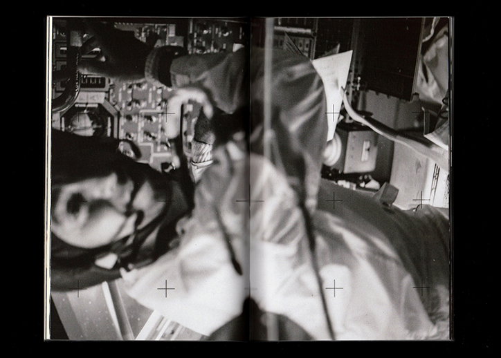
A black and white diptych showing a person in a cluttered technical environment. The images are blurred and distorted, with crosshair markers overlaid on the composition.
Above

Ben Hutchings: A Blue, White, Green and Brown Jewel
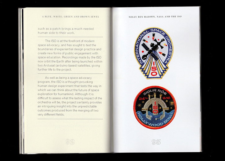
An open book shows a page of text opposite a page featuring two embroidered patches. The top patch is yellow and blue, reading “International Space Orchestra”, while the bottom circular patch reads “Sigur Rós” and “Hollywood Bowl”.
Above

Ben Hutchings: A Blue, White, Green and Brown Jewel
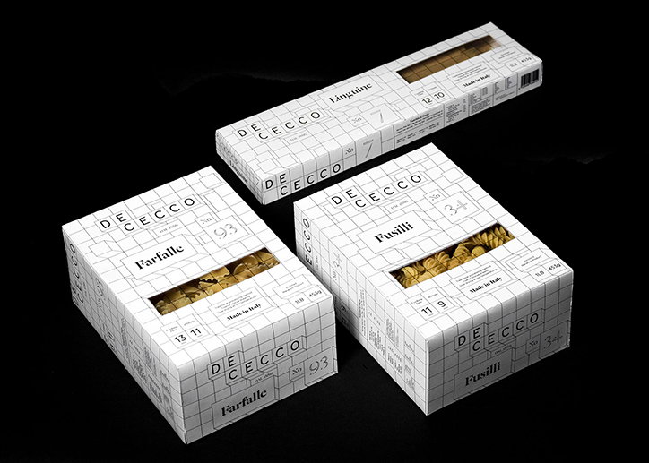
Three white boxes of De Cecco pasta are arranged against a black background. The minimalist packaging features a grid pattern and labels for “Farfalle”, “Fusilli” and “Linguine”, with cut-out windows showing the pasta inside.
Above

Ben Hutchings: De Cecco

A box of De Cecco fusilli pasta featuring a white and black isometric grid design. A clear window reveals the spiral pasta inside, with the word “Fusilli” printed in a bold serif font.
Above

Ben Hutchings: De Cecco

A white pasta box for De Cecco linguine features a grid-like geometric design. A rectangular cutout reveals the dried pasta inside, alongside the text “Linguine” and “Made in Italy”.
Above

Ben Hutchings: De Cecco

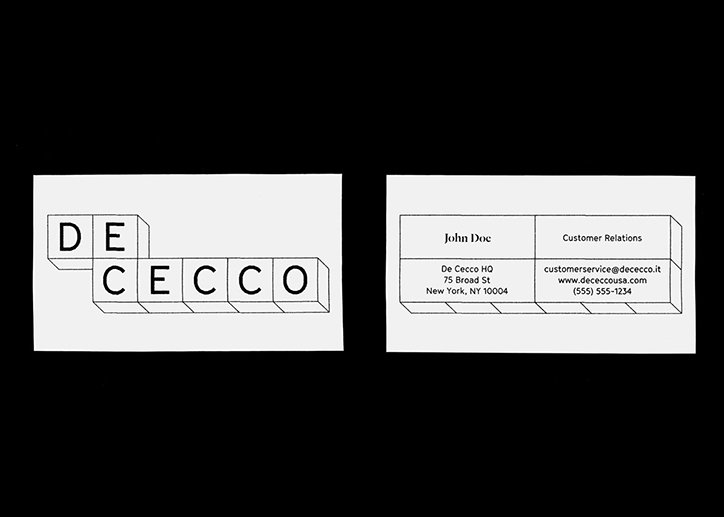
Two business cards for De Cecco are shown against a black background. The first card features the brand name “DE CECCO” rendered as 3D blocks. The second card lists contact details for “John Doe” in customer relations.
Above

Ben Hutchings: De Cecco

A website screenshot for De Cecco shows a grid layout of various semolina pasta shapes. Each piece of pasta is displayed in its own cell with a name and number below it.
Above

Ben Hutchings: De Cecco

Share Article

About the Author

Lucy Bourton

—

Lucy (she/her) was part of the It’s Nice That team from 2016–2025, first joining as a staff writer after graduating from Chelsea College of Art with a degree in Graphic Design Communication, eventually becoming a senior editor on our editorial team, and most recently at Insights, a research-driven department with It’s Nice That.


It's Nice That Newsletters

Fancy a bit of It's Nice That in your inbox? Sign up to our newsletters and we'll keep you in the loop with everything good going on in the creative world.