




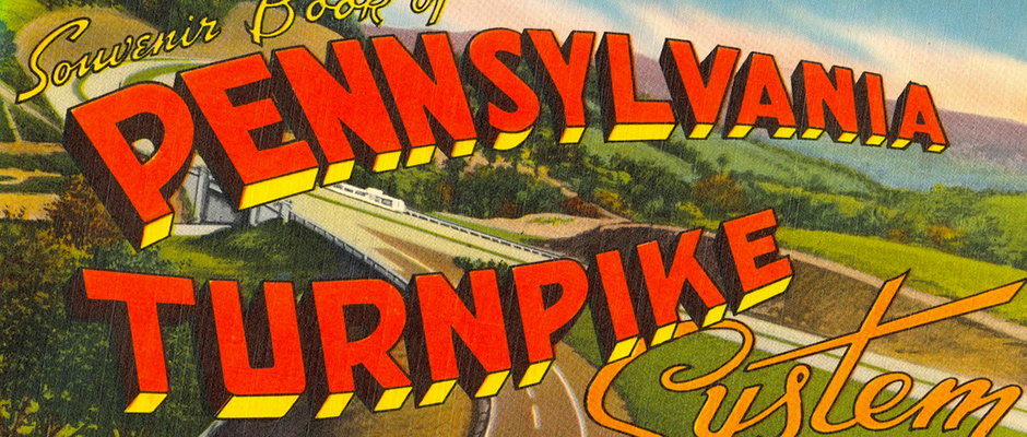
David Levine's collection of graphic ephemera is a well of design inspiration
There’s a lot to be said for the role of the collector in the design community, given that new trends in graphic design are so often informed by vintage and retro styles. Sourcing, hunting down, collecting and then carefully preserving graphic ephemera, these archivists have a passion for their subject which tends to go unrewarded by the designers pinning archival scans to mood boards and reference sheets.
David Levine is one such collector. We recently stumbled across his blog and found his archive of graphic ephemera to be one of the most extraordinary out there. Separated into categories from “advertising” and “automotive” to "graphic design journals” and “nautical,” every item on the site is carefully scanned, dated and accompanied by a description of its source and, where possible, the designer, written by David himself.
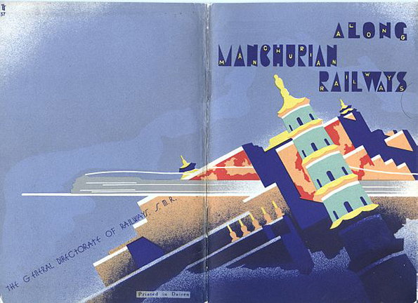
From the Collection of David Levine
Even more impressively, the site doesn’t even house David’s whole collection, but rather “just a portion,” he explains on the site. It’s hard to believe, given the quantity of stuff on show. “My basic passion is paper items such as travel brochures, airline time-tables, ocean liner time-tables, auto road maps, luggage labels, advertising, and graphic design publications from the 1920s and 1930s,” he continues. “Primarily in Europe but also Asia and, to a small degree, the USA.”
David started collecting travel ephemera in 1992, he explains, while travelling through Europe to Prague. “One day in London we visited the famous British Museum. Afterwards, we wandered down Museum Street, just south of the museum, and I stumbled on an antiquarian bookstore. In this store I noticed a small brochure which I would later learn was called ‘ephemera.’ I bought it thinking ‘how interesting!’ Little did I know…

From the Collection of David Levine
“Later, in Prague, I was walking through the streets of Prague’s Old Town and I passed an antiquarian bookstore. I went inside and there were bins of old paper items. There were travel brochures and ocean liner time-tables and luggage labels. That was it – I was hooked.”
It’s an incredibly impressive archive, not only for the breadth of its contents but also for David’s attention to detail in cataloguing them. Here’s a selection of some of our favourites of the travel brochure graphics. To see the full featured collection and to find out more information, check out his website.
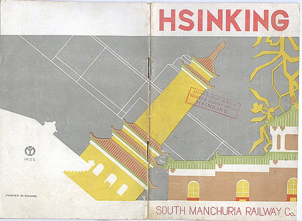
From the Collection of David Levine
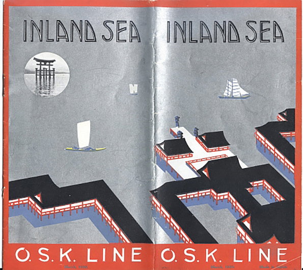
From the Collection of David Levine
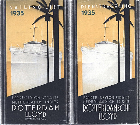
From the Collection of David Levine
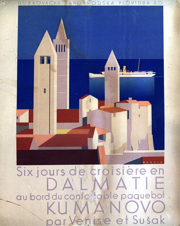
From the Collection of David Levine
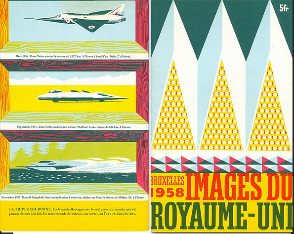
From the Collection of David Levine
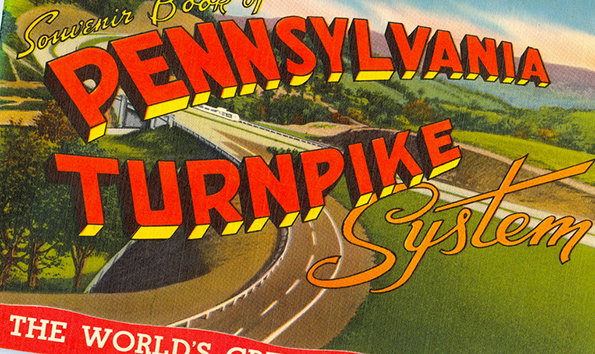
From the Collection of David Levine
Share Article
Further Info
About the Author
—
Maisie joined It’s Nice That fresh out of university in the summer of 2013 as an intern before joining full time as an Assistant Editor. Maisie left It’s Nice That in July 2015.

