




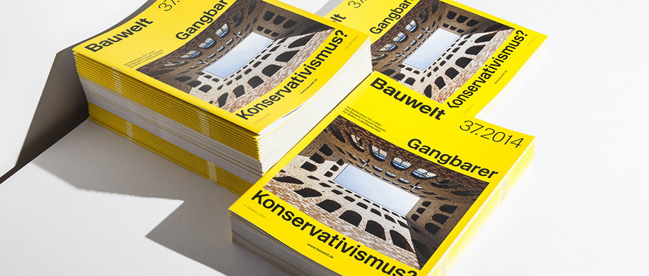
Double Standards redesign 100-year-old architecture magazine
When it comes to graphic design, there can be many reasons why certain jobs feel particularly pressurised; it may be the tightness of the deadlines, the ambition of the stated objective or the nature of the client. This latter comes in many forms but heritage can weigh very heavily, and when well-respected Berlin-based studio Double Standards were commissioned to overhaul the look of feel of Bauwlet, an architectural magazine that’s been around for 105 years, they appreciated the challenges they faced.
Of course, it being Double Standards, nobody need have worried. Bauwelt is an industry journal with a very specific readership so design was never going to be the star. Rather it had to support the content which has a very practical purpose “providing material for discussion and forming the opinions of competent readers from building authorities and leading architecture firms that make decisions about a large number of contracts.”
If that sounds dry (and it does) then Double Standards deserve extra credit for a redesign that feels clear and contemporary both where the print magazine and the bauwelt.de website are concerned. It’s one of a few new projects on Double Standards’ impressive new website which offers a masterclass in how to best show off a deign portfolio of the highest quality.
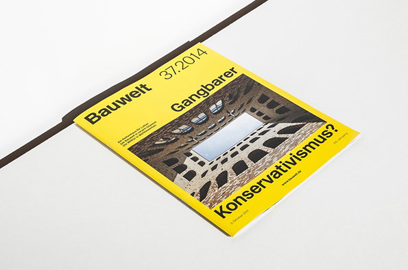
Double Standards: Bauwelt redesign
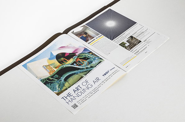
Double Standards: Bauwelt redesign
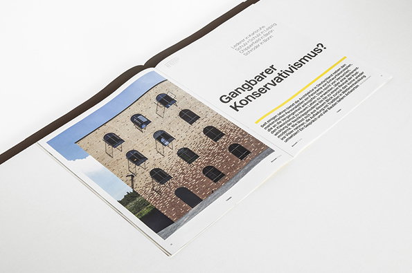
Double Standards: Bauwelt redesign
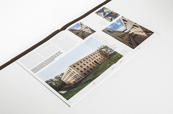
Double Standards: Bauwelt redesign
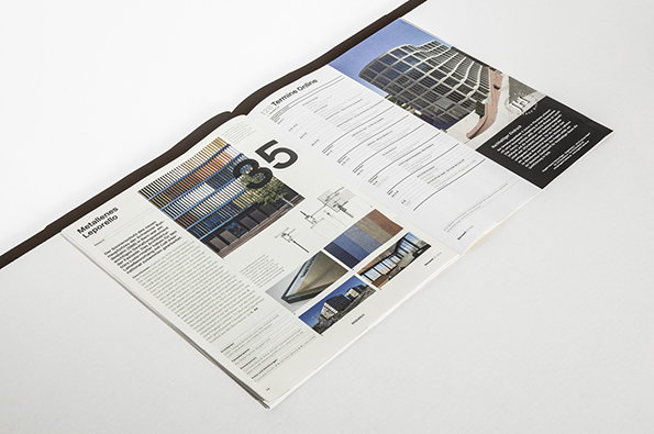
Double Standards: Bauwelt redesign
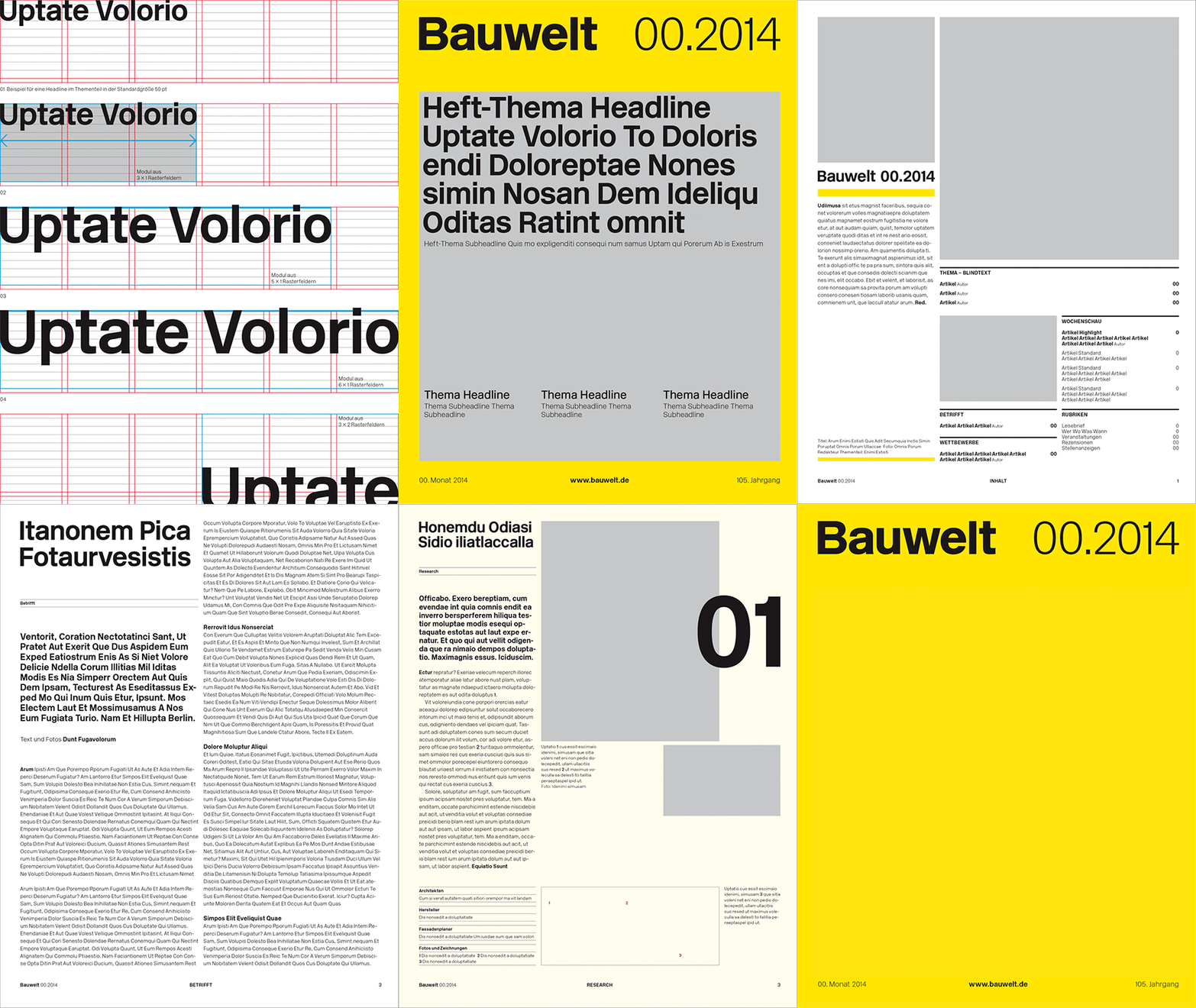
Double Standards: Bauwelt redesign
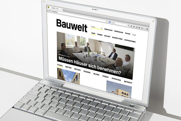
Double Standards: Bauwelt redesign
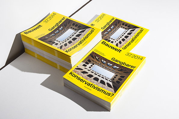
Double Standards: Bauwelt redesign
Share Article
Further Info
About the Author
—
Rob Alderson is a freelance writer, editor and strategist. He was previously editor-in-chief of It’s Nice That and WePresent, and editor of Design Week. He publishes the newsletter Undo, which tries to make sense of how AI is changing design work, the design process and the design industry.


