Launch Recite Me assistive technology
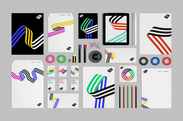
A brand identity mockup featuring a collection of stationery, including letterheads, envelopes, business cards and a tablet. The design uses a recurring motif of bold, flowing ribbons in primary colours, black and white.

Beautiful and cleanly designed pamphlets from Barcelona-based studio Hey

—
Date
28 May 2012

Rarely the most exiting thing you’ll ever be given, the pamphlet has built a bad rep for itself – even the name has an underwhelming ring. But you haven’t seen these bad boys designed by Hey, a studio based in Barcelona that’s definitely more than a casual greeting.

Creating work that’s clean, simple and so aesthetically pleasing that I want to frame it, it’s great to see them ridding the pamphlet of its clutter and overload of information. Bright snapshots of colourful patterns against neutral backgrounds give a sophisticated and well-considered edge to their projects. I love how they’re work is presented as well – so neat and beautiful. The attention to detail and the broad applications of their identities from business cards to envelopes gives not just an insight into the project but how they work as an agency too.
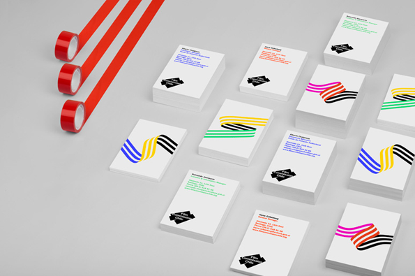
A 3D render of several stacks of white business cards arranged on a grey surface. Some cards feature colourful wavy lines, while others display contact details and a black diamond logo reading “Film Commission Chile”. Three rolls of red adhesive tape sit to the left, with strips trailing across the frame.
Above

Hey: Film Commission Chile

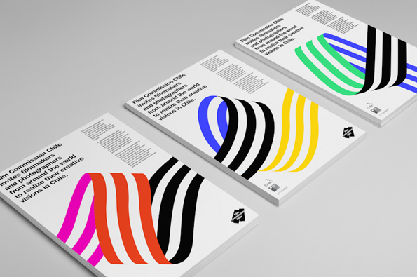
Three brochures for Film Commission Chile are laid out on a grey surface. Each features bold, curved stripes in different colours and the text “Film Commission Chile invites filmmakers and photographers from around the world to realize their creative visions in Chile.”
Above

Hey: Film Commission Chile

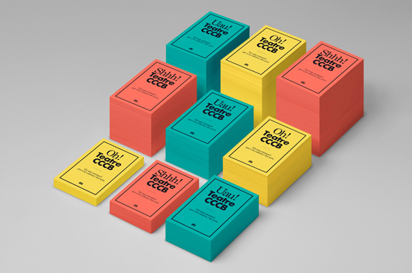
A collection of small, rectangular boxes in red, yellow and teal are arranged on a grey surface. Each box features bold black typography reading “Teatre CCCB” alongside an exclamation “Oh!”, “Shhh!” or “Uau!”.
Above

Hey: Teatre CCCB

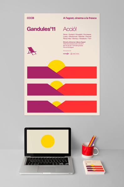
A poster for the “Gandules’11” cinema event features three abstract, colourful shapes resembling reclining chairs. The design uses a palette of purple, yellow and red on a pale pink background. The poster is displayed on a wall above a laptop and a red mug. The laptop screen shows a yellow circle on a pale background.
Above

Hey: Gandules’11

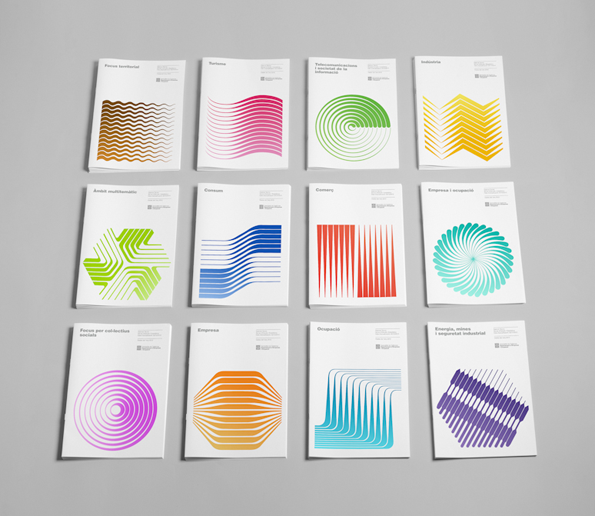
Twelve white booklets are arranged in a grid of three rows and four columns. Each cover features a different colourful abstract graphic made of linear patterns and a title in Catalan.
Above

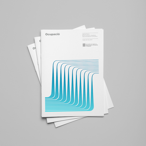
Hey: Enterprise and Labour

A stack of white reports with the word “Ocupació” printed at the top. The cover features a series of blue, curved lines that form a rhythmic, wave-like pattern.
Above

Hey: Enterprise and Labour

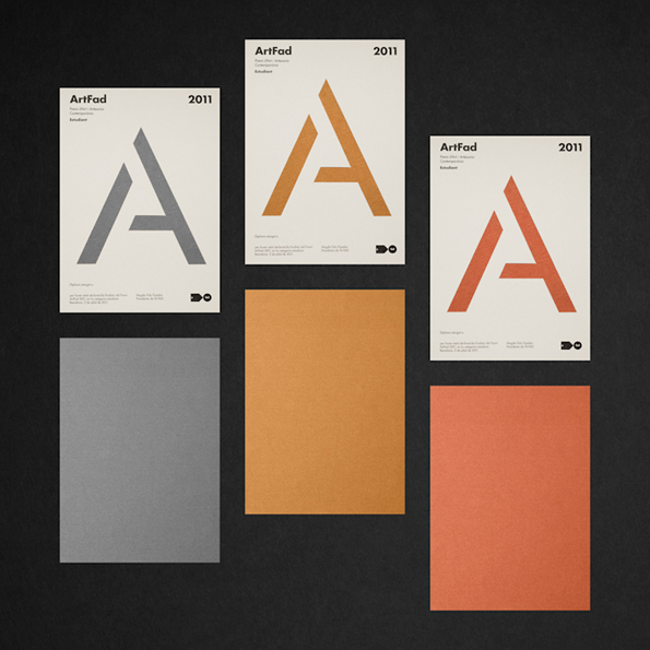
Three posters for “ArtFad 2011” are arranged in a grid, each featuring a large, stylised letter “A”. The posters are grey, ochre and terracotta, with matching coloured card sheets placed beneath them.
Above

Hy: Artfad Diploma

Share Article

Further Info

About the Author

Rebecca Fulleylove

—

Rebecca Fulleylove is a freelance writer and editor specialising in art, design and culture. She is also senior writer at Creative Review, having previously worked at Elephant, Google Arts & Culture, and It’s Nice That.


It's Nice That Newsletters

Fancy a bit of It's Nice That in your inbox? Sign up to our newsletters and we'll keep you in the loop with everything good going on in the creative world.