




Narrative and design: a chat with Penguin book cover designer Janet Hansen
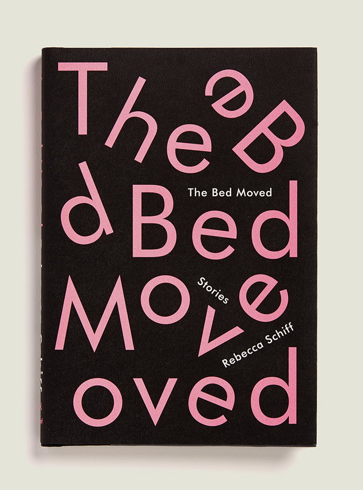
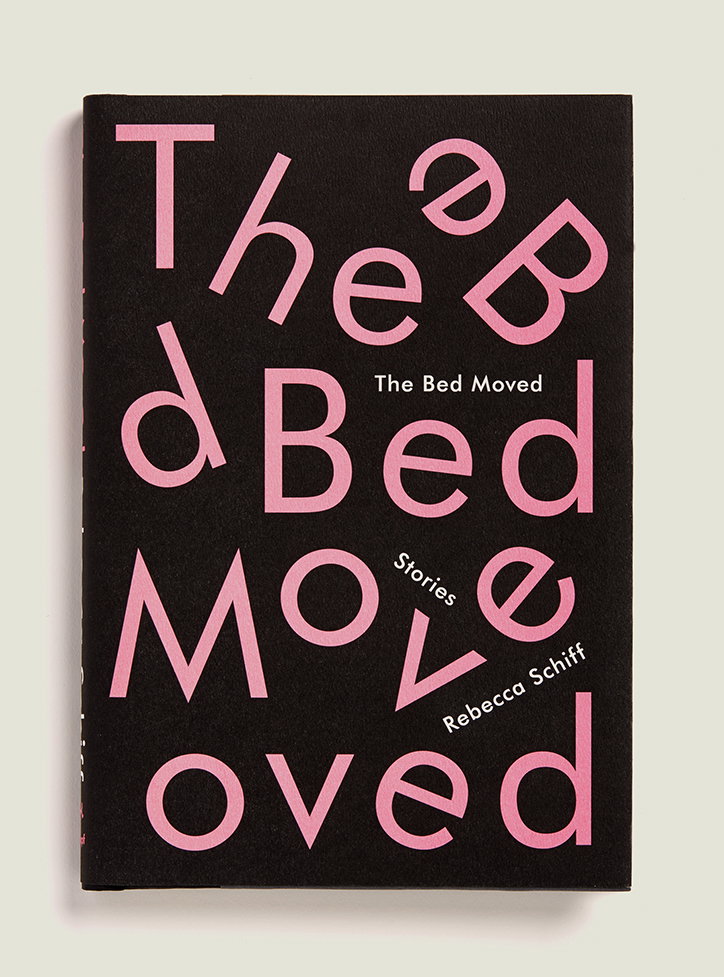
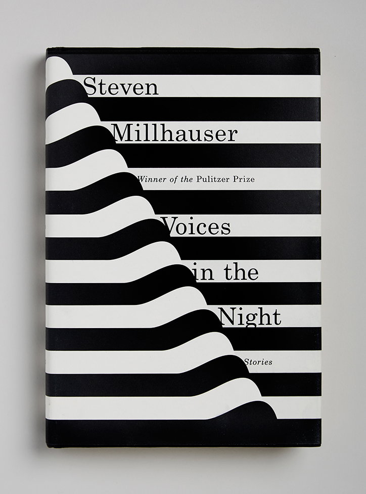
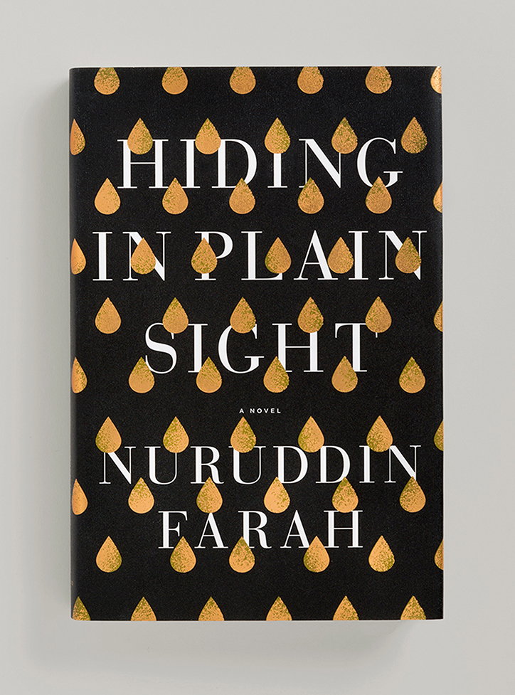
Towards the end of last year we spotted the delightfully designed book covers of Janet Hansen in The New York Times’ The Best Book Covers of 2016 list. The chosen design was a typographic illusion cover of Rebecca Schiff’s novel The Bed Moved, that would stop any avid reader or design fiend in their tracks. After discovering that Janet is a designer at Alfred A. Knopf, a division of Penguin Random House, we soon unearthed an array of thoughtfully apt book covers.
Here, we have a chat with Janet about her introduction to book cover design, the process of combining narrative and design, and her plans for the forthcoming year.
Janet Hansen
What was your introduction to designing book covers?
It definitely was not something I thought about growing up. I just knew that I wanted to work in a creative field and once I got to the School of Visual Arts I narrowed it down to design. After graduating I designed for cultural institutions, nonprofits, artists, and education. On paper, I was doing something I loved and was a part of things I felt passionate about, but in reality I didn’t feel as creatively fulfilled as I had hoped. My husband is a book cover designer, and we went to a party where I met the creative director of Penguin Books. He offered me a freelance project and then immediately a job as a designer.
I thought about it a lot, and what’s great about book cover design is that you get to dive into so many different subjects and ideas creatively. I love that my job is to give a face to ideas that are bigger than me, and I can be a part of things I am passionate about. Also I am constantly learning and am contributing to the education or pleasures of others, so it feels good.
What is your process when you receive a new brief?
If it’s a novel, I read the entire manuscript. If it’s not, I tend to just read a few chapters to get a feel of the tone and subject matter and work with it. I try to find common themes, I write them down on a grid sheet and pin it up next to me while I work. I research art and these themes for inspiration. Then I try to execute them in a way that is hopefully both unexpected and true to the book.
Janet Hansen
What is the relationship like between book designer and author?
I know some designers that mostly work in direct contact with the author, and I know some that aren’t even there when it’s presented in a meeting to the publishing team. It depends mostly on which publisher you work for and also perhaps on your level of experience. Though, I’m quick to say that most book cover designers do not work together with the author. For me, 80% of my contact with the author is indirectly through the editor or small comments and exchanges by email.
What are your plans for the future?
Working at Knopf has been a dream of mine since I started in book cover design. Everyone I looked up to is here or has previously worked here, so it’s safe to say I’m pretty happy where I am right now. But I imagine my next step would be art director.
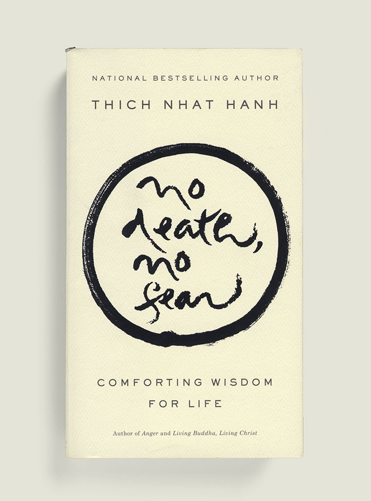
Janet Hansen
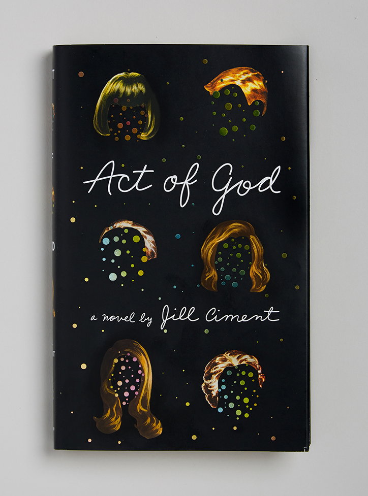
Janet Hansen
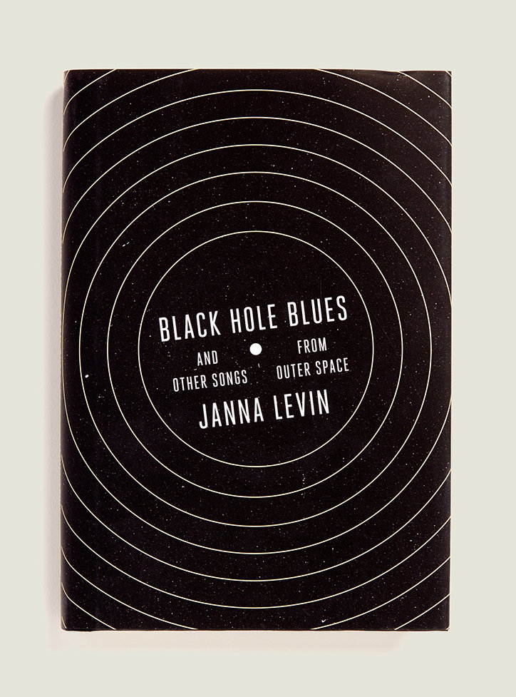
Janet Hansen
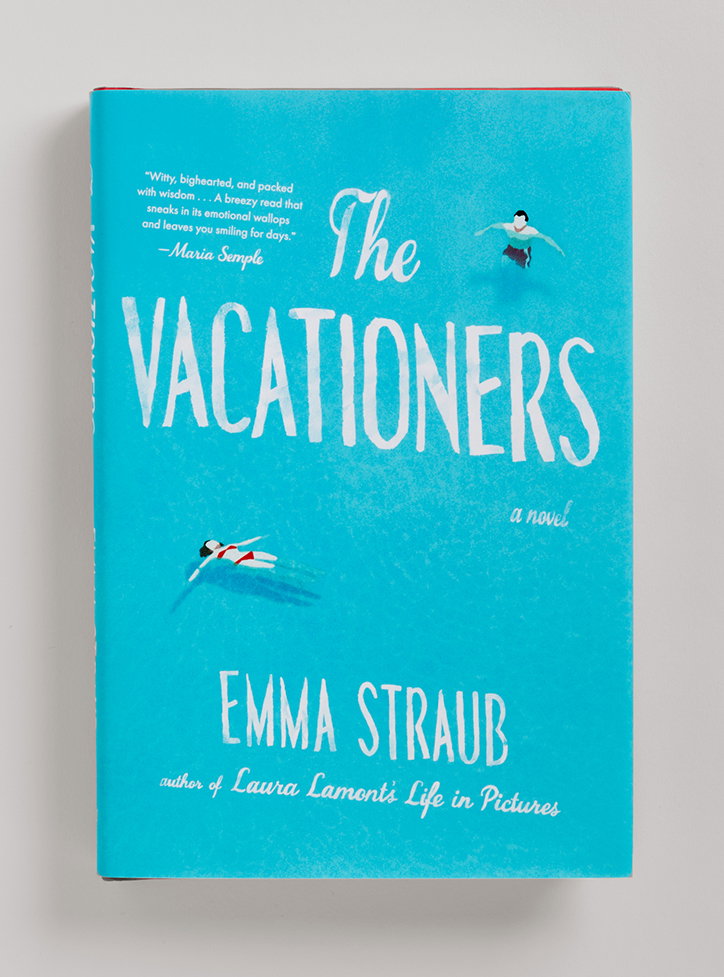
Janet Hansen
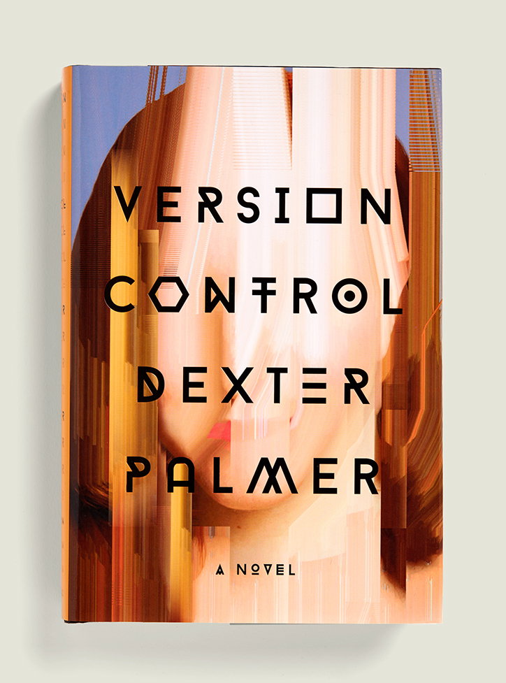
Janet Hansen
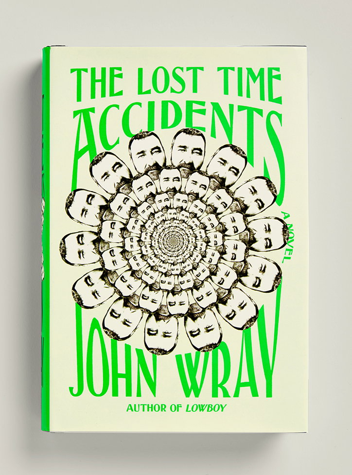
Janet Hansen

Janet Hansen
Share Article
Further Info
About the Author
—
Lucy (she/her) was part of the It’s Nice That team from 2016–2025, first joining as a staff writer after graduating from Chelsea College of Art with a degree in Graphic Design Communication, eventually becoming a senior editor on our editorial team, and most recently at Insights, a research-driven department with It’s Nice That.

