




Launch Recite Me assistive technology
An animation in which black geometric lines and red anchor points on a grid morph and rearrange. The shapes assemble to form the word “Resonate” in a minimalist typeface.

Pentagram’s dynamic and shifting identity for a Serbian digital arts festival

—
Date
29 January 2016

In their first project at Pentagram, Jody Hudson-Powell and Luke Powell have created a brand typeface for Resonate, an international festival of music, visual and digital arts in Belgrade, Serbia. The festival aims to create a forward-looking debate on the position of technology in art and culture. “To encourage this collaborative atmosphere, the identity includes a bespoke grid, font and glyph system which can be reinterpreted to refresh the festival’s look,” says Pentagram.

The identity adopts a clean, stripped-back approach, emphasised by the references to Paul Renner’s initial designs for his 1927 Futura typeface in the font’s shapes and symbols. During Jody and Luke’s design process this allusion was fully embraced by the pair both aesthetically and in Renner’s progressive approach to design.
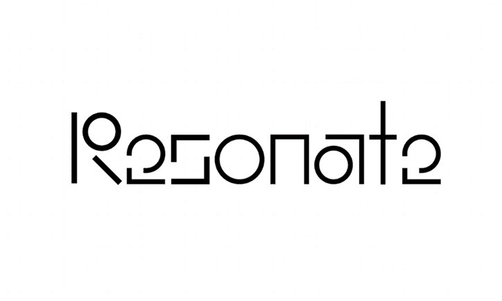
A minimalist black logo on a white background reads “Resonate”. The typography is highly stylised, using geometric lines and circles to form the letters.
Above

Jody Hudson-Powell & Luke Powell, Pentagram: Resonate
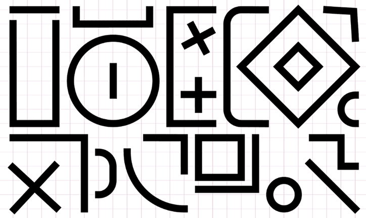
An illustration of various bold black geometric shapes and symbols arranged on a white grid. The composition includes circles, squares, crosses and a large diamond.
Above

Jody Hudson-Powell & Luke Powell, Pentagram: Resonate
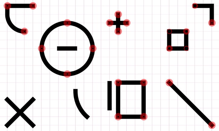
A series of black geometric shapes and symbols are arranged on a light grey grid. Several shapes feature small red circular markers at their anchor points.
Above

Jody Hudson-Powell & Luke Powell, Pentagram: Resonate
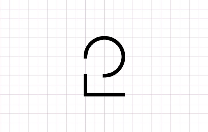
A black minimalist logo on a white grid background. The mark consists of a circle resting on a right-angled line.
Above

Jody Hudson-Powell & Luke Powell, Pentagram: Resonate
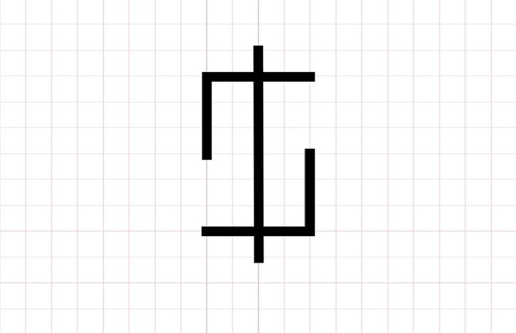
A black geometric symbol on a white grid background. The figure consists of a central vertical line crossed by two horizontal bars, with two right-angled lines extending from the sides.
Above

Jody Hudson-Powell & Luke Powell, Pentagram: Resonate
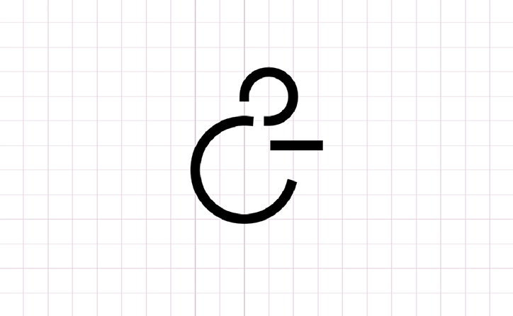
A black minimalist ampersand symbol centred on a white grid background. The character is composed of clean, open circular lines and a short horizontal stroke.
Above

Jody Hudson-Powell & Luke Powell, Pentagram: Resonate
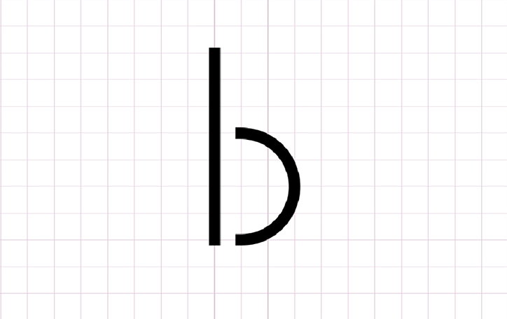
A minimalist black lowercase “b” is centred on a white grid background. The letter is composed of a straight vertical line and a detached semi-circle.
Above

Jody Hudson-Powell & Luke Powell, Pentagram: Resonate

Share Article

Further Info

About the Author

Rebecca Fulleylove

—

Rebecca Fulleylove is a freelance writer and editor specialising in art, design and culture. She is also senior writer at Creative Review, having previously worked at Elephant, Google Arts & Culture, and It’s Nice That.


It's Nice That Newsletters

Fancy a bit of It's Nice That in your inbox? Sign up to our newsletters and we'll keep you in the loop with everything good going on in the creative world.
